Wednesday, December 27, 2006


This was a recent commission. The client asked that I use a geometric style, as he'd seen me use it before and liked it. These are his four cats, done as close to their likeness and personality as was possible. The final version was printed out at 16x20. Besides some initial pencil sketches, it's all Illustrator.

Saturday, December 23, 2006


Happy Holidays to you and yours.

Tuesday, November 28, 2006

This is mostly what I do for art. While I can't say there's been intense study this past year or so, I can say that I've broadened my knowledge of cartooning and animation because of Fite!. Blogs of artists in the biz have really helped as have the couple of books about modern design and animation that I've purchased this year. It comes a little easier each week and I'm able to push things a little farther with each episode. Part of me would love to see Fite! move someday, part of me likes it just as it is.

The book should be ready for December.

Saturday, November 25, 2006

Aimee Mann, made from a random image off Google. Done in about 45 minutes, just for fun. A break from the comic. I'd really like to do more portrait work and should.

Sunday, November 05, 2006

Possible cover image for the possibly soon to be self-published Fite! collection. Illustrator and ink. I'm pretty happy with it. Now for the logo and such...

Thursday, October 19, 2006

Just a quick promo piece. Something to add to the blog.

Thursday, September 21, 2006

Otter in a different style. I've been wanting to play with a 'dark ages' style since there are so many similarities between it, cubism and 50s animation. I threw this together with ink and Illustrator. Sure beats the hell out of making egg tempera...

Sunday, September 17, 2006

This is a rejected character design for a counting book project. It's slick enough, I think, but too generic. I lost a lot of what might have made him special along the way. I'll have to go back and rework him using some more stylized inspiration. For now, at least I know I can do this kind of thing.

Friday, September 01, 2006

Grumpy me with morning hair. Ink and Illustrator. AI makes the brush look a lot smoother, which may or may not be a bonus.

Wednesday, August 23, 2006


A little quickie something for the Mario fan inside me. I've been reading and influenced a lot by the book "Cartoon Modern" lately. There's just some amazing art in there.

This one's the usual mix of ink and Illustrator.

Friday, August 18, 2006


Same thing only older. I got to flip through a copy of "Cartoon Modern" the other day and was totally taken in by the art inside. I've always had a love for art and design from the 50s and 60s. It's already had an effect on "Fite!" and now will likely have even more. So this is the same illustration as before, just done in a more retro style. Just some quick fun.

Wednesday, July 26, 2006


This is just a little copy from Frank Frazetta, to learn some more about action and weight. Guz, fire, sword. Illustrator and ink. Blah blah.

Saturday, July 08, 2006

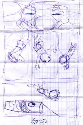
So, since no one asked, this is how I go about putting an episode of Fite! together. First I start out with a very rough sketch, usually on a piece of scrap paper. The looser the better. All I want here is the general sense of how the page will be set up and what the characters will be doing. I usually only have to do one of these, but sometimes, with trickier layouts, I do more. For episode 52, this is what I started with:


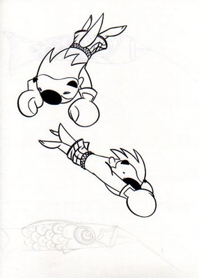
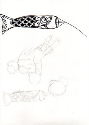
Now that I have that down, I go to the sketch pad and work on the figures in pencil. Once I have the ones I need, I ink the ones I like using a brush and Speedball ink (which has become almost like pudding and smells like fish). I like to draw the whole figure even though most are likely to be edited for their panel later on. Backgrounds are not sketched The finished, inked drawings are scanned and edited for smudges and the like:


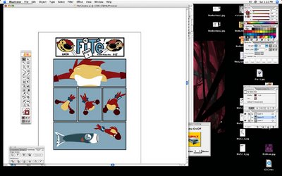
Once I have the images scanned, I open a fite! blank in Illustrator (this is just a white page with only the logo at the top and a simple box that keeps the shape and size of the strip standard). I then set up the panels as they appeared in the sketch:


The next step is to 'place' each figure onto a separate layer in Illustrator and convert the jpegs to vectors using the 'livetrace' feature (I love this part). Here, I resize the figures to fit the panels then cut and crop the extra bits where needed. I often lose a lot of the figure this way, but I feel the drawings look more full if I depict the whole character instead of guessing which parts will show and which won't. Eventually, I end up with a black and white outline of the comic:


The next step is to add color, which I do from below the black and white drawings. While it's not difficult to color the characters, it's time consuming. I also do backgrounds in this step (though there really aren't any in this particular episode). I generally know what I want, but to try and keep things a little fresher, I don't sketch these out ahead of time. This might be a mistake but for now, this is how it goes. This is a screen shot of what the color layer looks like without the drawings showing:


Finally, I go back and fix mistakes and add any special effects that might need to be on different layers, such as the contrails in this episode:


That's about it. Some episodes take more planning than others. Some require that I pose for some reference photos to get positions and details right (I need to do more of this). Part of doing a strip, I think, is getting the flow down so that one can just do the work without having to think about the process.


So this is the first entry. I'm looking to use Blogger as a sort of side room for all the stuff I use to create the weekly comic (as if I don't talk about it enough). This entry is just a test to see how this thing works and to give me something to play with for settings and such.