Friday, April 29, 2016

First is actually the last image I made yesterday. Tried adapting the recent characters to a Peanuts style because really, Schulz' influence is still as strong as ever and the temptation to play in his sandbox is pretty big. I could easily see trying a little existential strip with these guys though it might be a bit too depressing.

Beyond that is the final two versions of the Silas alley piece I was working on. The first was me trying to do the text and cat designs using the perspective tool. It felt too mechanical and really, for whatever reason, the character being outlined and the background not didn't work for me in this style, even though I've used it many times before. The final version is on the bottom. I went back to the original drawing, drew all the letters and cats out and inked them, then just colored sloppily as before. I like it and will be making prints at least for me to see if they might be sellable.

Tuesday, April 26, 2016

Working on the next Dimitri illustration, possibly for another print. I worked all day on this with the idea that the background, like the Digby/Marcel piece would be solely in Illustrator and that I could use the perspective tool. Well, perhaps because of the lesser amount of detail, though I spent a long time on it, the result was less than stellar. So I will go back to the figure page and draw all the stuff in by hand and ink it. I think it will just look a whole lot better. The cat is meant to be more of a character graphitti and the wording will be behind him, so that it's not obvious which he's currently painting. And, if this doesn't work, I'll just do it all again.

Latest two panels from the Party Line. I kind of cheated for the backgrounds, though the foreground characters and their fitting with the photos was a slight pain in the ass. Still, I kind of like the way they look together and people can see my messy studio.

Sunday, April 24, 2016

The last image of Silas I liked well enough but it felt like it was lacking something. So I'm working on another. Don't think it's going to be a comic, or if it is, it will require a lot more drawing than anything else. Silas always painted in images, not tags or the typical, large mural of just his own name. He was supposed to be telling people something as told to him via dream by the City (me). So that's why I had the cat face going on in the last one. But that's not all that interesting. So now I'm working not only on other images for him to be painting but also text which, like Smatt and Terry, will be in a graffiti style but worked more into part of the background. As I grow older, I find I like word balloons less and less. They just don't tend to mesh with the artwork they surround in general. An old buddy of mine noted that hand drawn letters always looked better than a typed font, and I think I agree, but those damned balloons look like ass and cause the reader to switch gears to make sense of the words. So I'm trying, like I said I was with Ghiroy to work any dialogue or monologue in this case into the art itself. Did some research on both images in graffiti, mostly from South America as they seem to have the most fun, image-heavy stuff for both the writing style and the cartoony guys Silas would paint. I want there to be more tags, like the first and more details in the alley itself. Also did another pose. I'm enjoying the research and assembly of an image in this way. I'm sure tons of other people do it as well, but I haven't, in general, done things quite so detailed as this before. Maybe I'm moving on from comics. Who can say?

Thursday, April 21, 2016

More on Silas. Why? Don't know though what I have noticed is that there's a lot of people on tumblr who like birds. Seems to be an under-served market. If, and I do mean IF there is a comic, I came up with a rather sibilant title for it; Silas: Silent City. Probably just Silent City. This marks the first time I've ever used those pre-printed comic boards, which means my stuff would be in a standard size. These days, this means less than it used to as some many comics are made in sizes other than the old standards. Still, they allow me to draw larger and my scanner can actually take in the whole page, which was a bit of a surprise.

And there's Silas, easily the bulkiest of my characters. I posed for this, shortened legs, lengthened arms and made an alley. Generally, I like the image but it's still missing something. I think the background is a bit too plain, not twisted or interesting enough in its depiction. The character I generally like but think the wrinkles are too literal and need to be less so. Oh, and what's the story? Damned if I know. And that's been the problem for the last eight years. So likely this, like every other comic I've tried to come up with will stall and go no further. But there you go. This interests me for at least the moment.

Thursday, April 14, 2016

Took the filters I was working on for the Silas images and applied them to Lucco. Well, to be fair, this was meant to be Madame Zelda, the tarot reader from Tamino but there was such a masculine feeling to the face, I went with the boxer instead. I think this will work out fairly well. To me, there's a solidity to the figures that allows for more abstraction in the drawing phase. Simple, inked lines, hand drawn shapes in Illustrator.

Wednesday, April 13, 2016

And I think we have a winner. I was looking through some old stuff, in this cat, the lower cat drawing and think I found the answer to what I wanted to do with Silas. Ten years or more ago, I was even more experimental than I am now, and did a whole bunch of more angular, nearly cubistic style fashion drawings (with animal people). While there was a hint of the real details, they were moved around to work more harmonically than the real thing. So I applied that 'formula' to the same drawings I'd been doing of Silas. There's a sort of hint of the Tamino style in there and yet not at the same time. The coloring I did specifically in a way that means I can't be precise. Don't want to be. So this might be the way to go. One detail to fill in with the story (the ending) and I might just go ahead with this, though not really tell anyone about it. If I've managed to finally come up with something, I don't want to jinx it.

Monday, April 11, 2016

And then there's this. I have been working on it, though slightly. I redrew the lines as the version I had was too thick and not detailed enough. I'd had to magnify the original lines which made them rather thick and unpleasant. Simple enough to make a new version. I've got nearly everything in place now. Had to shrink the fox a bit as he was too large in comparison. I'll also have to enlarge everything so that the composition is better (one of my common problems). And then the lighting and shadowing can take place as right now, it's way too garish and flat. This will be far more atmospheric. Promise.

The latest three panels from the Party Line comic. We have a third now, though I'm still only posting my own work here. A fun little thing that always makes me feel inadequate to some extent. I'm just not a consistent cartoonist, at least not like this. The third person in the group gets far more attention than the two of us that started. Maybe some of that will rub off. Still, another example of how I simply have no idea how to connect with people on the internets. So I do my thing and keep moving.

A follow up to the last set of images, this is a PS version using a new brush I got. Was fun to try it out. Otherwise, not a lot to report here.

Tuesday, April 05, 2016

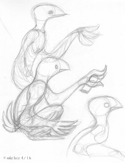
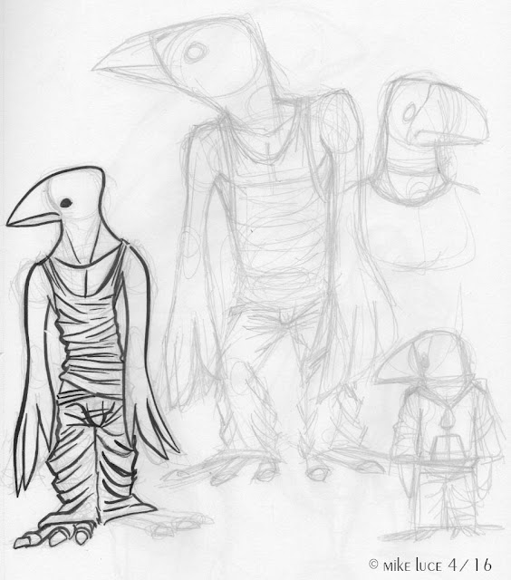
BIG sketchdump right here. I've been working on a character design for my crow, Silas for the past few days. Why? I have no idea. Perhaps he's trying to tell me something. I might want to do a comic or at least some images with him in it. In any case, I don't really want to stick with the style of Tamino, where he appears, I want something more advanced, a bit more detailed. I think the cityscapes I've been working on have influenced this, as well as some images I've seen of places like Tokyo and Hong Kong. Those places really really call to me; I get lost in their detail and it makes me want to do SOMEthing with all of this. Silas is my messenger, my graffiti writer, the most urban of my characters besides the mice. And I've done things with them lately.

So I draw crows. There are some decent designs in here, but so many of them lack that elusive -something- that makes them more than just a drawing, that makes them a character. The top image is the closet I've come so far. I wanted to keep his short, somewhat stocky appearance, long arms, tail, but I wanted him to be a bit more detailed as well so that he wouldn't contrast so starkly against more 'realistic' city details I might draw. So, lots and lots of crows. There are some mistakes here, missteps and that's fine. That's what sketchbooks are for. I think a lot of artists hide these mistakes, and some make fewer than others. But here are mine for all (Vince) to see. I think it's important to show those mistakes so others know it don't all come out right the first time. Also, one never knows where a mistake here might lead to a success further down the road. I check my old sketchbooks all the time and every once in awhile, there's a nugget in the mud.