Friday, December 31, 2021


 This is my personal best of '21. I was pretty happy with the number of entries here this year and, in general the amount of work until I realized I only completed one song for "The City Silent" this year. That means I have 20 to go and, at that rate, it'll take me 20 years. Gah. I was hoping more for three. Well, my mind wanders and I get interested in portraiture, I get lazy, work makes me tired, etc. Excuses. That being said, I really liked how Smatt's Crew's song came out. I have hopes for Digby's as well. And, in general, I think this year's portraits are better than those that came before.

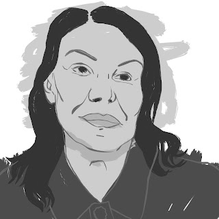
I have pretty much fully embraced digital art making. There's not a single, 'real media' image in the bunch. That being said, I think everyone one of these started as a pencil sketch. I'm learning to play more to my strengths, and pencil is one of those. For some reason, sketching on the iPad doesn't yield the same results, so I'll try and remember that, making it a sure part of my process. In the portraits of Greyson Perry, lower right, I manage to mix pencil, vector and a flourish of Procreate. The center self portrait I did three times until I got something that worked.

All in all, a good year except for quantity. Here's hoping I can continue to grow in '22 and make things that I like. Can't really concentrate on other people liking it or I'll never get anything done. 

Wednesday, December 29, 2021


 A little sketch, using a photo my partner sent me of someone's doberman in a hoodie. I thought it looked kind of cool and I had time to do something quick, so there it is. Feels solid enough if unremarkable. Don't like using that much of someone else's photo but as I don't plan to post this anywhere else or do anything with it, no biggie.

Sunday, December 19, 2021


 Here's a few more. I got a couple in the airplane that didn't turn out too badly. They feel to me as if I'm flying over Star Wars. The flowers were just two random from the bunch. Orchids just grow all over the place there. The red one... no idea what it is but it was really interesting. The other two were taken at the top of the volcano at a National Park. It was a beautiful day. I would certainly go back. My little iPhone SE takes pretty decent photos, though I could wish for a higher resolution. And the zoom isn't worth crap. Still, it handles color and contrast better than my Nikon.

Saturday, December 18, 2021


 I don't usually post this kind of thing, but I had a recent trip to Hawaii and my buddy Vince had one to Boston. He posted his photos which were very cool, so I thought I'd post a few of mine. These are just a few, taken with my camera. There are more I took with my phone, some of which are better. But this will give an idea of what we experienced and saw. There's tons more, some of LA as well which I might post. I love taking photos on vacation, better than pretty much anything else. Don't really want souvenirs, just want photos. So, well, here are some. I did also take a few for reference of my 86 year old father who I hadn't seen in over 30 years. Portraits are forthcoming.


Wednesday, December 01, 2021


 Here's all the stuff that went into the latest image. At the top is the pencil sketch. I didn't want to use a grid or anything as I wanted it to be slightly quirky (or, "off"). I was happy enough with the sketch knowing that I didn't want to include all the lines in the final. As I tried to make this image work with the style of the last one, I just kept getting frustrated. Made two separate tries and neither felt right. I then realized that there was nothing rough or random about her; she felt very "precise." So I went back to the straight forward AD style and it fell right into place. I don't mind posting some failures as it's all just stuff that took me, eventually in the right direction. It's the failures that just plain fail that I keep to myself.


This is the third try for this woman. She's another model from my favorite painting show (I really need to find out her name). As an older woman, I wanted to keep some of her age but not be cruel. I think I managed a minimum of detail to suggest without using things unneeded. I honestly think she's lovely though I know nothing about here. I wanted to suggest a beauty somehow. I tried the same approach as I did with the last portrait and it simply didn't work. It just looked a mess. Suddenly, I thought about just making things more precise and I think that was the right decision. It's not the most flattering thing ever, perhaps, but I think there's some truth and a bit of beauty in there. Or maybe it's just the sake.

Sunday, November 28, 2021


 Final version. I like this one a lot better but I don't think I caught the likeness. I'm struggling too much with this one and I think I'm done. There was even one more version I didn't complete. I like the image, just not as a portrait. Still, it's me progressing, so it's ok.

Friday, November 26, 2021


 I used a screen grab from an episode of Portrait Artist of the Year to make another portrait while I wait to be able to corral the next victim. I'm trying to keep things as minimal as possible while retaining likeness. I think there is some, but I would never have chosen this as a pose to work from. It's so dull. Then again, I could work on this more and get more of a likeness. Maybe I will. I already see things I'd change. The sketch, though was totally without tracing, which does make me happy.


Wednesday, November 24, 2021


 Final version of this one. I wouldn't have wanted him to be my sitter, at least not in this pose. His face is not very distinctive at least in this pose. He's a British actor of some sort; no idea who. I redid the whole thing but kept the original skin tone area which specifically did not match the rest, which I liked. Likeness is really hard with something so minimalist but I really like the simplicity. Guess it's not for every subject. Still, it was fun to play.

Tuesday, November 23, 2021


 Working on a portrait based on a screen capture from Portrait Artist of the Year. This was one of the sitters. I was having trouble with it when I suddenly just cut down the number of colors I was using and then it came together. Not quite done, I don't think but a lot further along than I thought.

Friday, November 19, 2021


 This is the final. There were minor tweaks done to the shadows, the shoulder and the mouth. It is not perfect, none of my stuff ever is. But I like it. It would look best at full size, which is 16x16 or even bigger. But the experiment did what I wanted it to do and I look forward to doing this again with another subject.

Thursday, November 18, 2021


 I put out a call to friends on FB to help me get some portrait practice in. I've done tons of me, but I need to broaden my skills. The process I'd want to employ, were I any kind of professional, is to sit a person down with a video camera recording them and just talk. Later, I can go through and find moments that feel not only very much like THEM but which are a lot more candid, real and not posed. With Nick, there was a moment where he was explaining something animatedly with his hands moving about, though barely in frame. I really liked the addition of at least one hand as it helps to break up and balance the composition. The top is the pencil sketch done in Procreate. The bottom is the 99% finished final. I want to go over it for some final adjustments. The shapes were done in greyscale an then I overlaid a couple layers using colors got from a peach faced lovebird, one of Nick's pets. It made a great palette, I think. I'll post the final later but I'm pretty happy with this one.

Tuesday, November 16, 2021


 Coming up later in this track is another switch of style, though it was one planned all along. I wanted to capture some of the frenetic energy of the "Lucy in the Sky with Diamonds" song in "Yellow Submarine." It was the only part of the movie animated like this and while it wasn't something I appreciated as a kid, I can find some beauty in it now. And, to be fair, I've been doing portraits in this kind of style for a long time. So I guess it made an impression. Just wanting to do a proof of concept, I took an existing image of Digby, inked it with a technical pen brush and then just kept the brushstrokes as loose as possible, assigning colors after the fact. I got what I wanted. I hope it adds a sense of movement, of dance when its done. Will also likely be looking for inspiration from the "Gotta Dance" sequence of "Singin' in the Rain," which is a part of that film that doesn't fit the rest at all. Time to have some real fun, I think, though the mice were a nice break from the more dreary parts with Silas.

Friday, November 12, 2021


 Finally finished another page. My pacing stinks on this comic. Messed a lot with the colors, so much so that there's almost no reference to the page before. But I want to get some color into this thing and while the mice were flashy, they were in primaries. The background was fun to stitch together and adds enough detail without its being a photo being a problem because of detail. 

Tuesday, November 09, 2021


 I've not been able to do my actual job in over 18 months. They canceled in-store classes not long after new year last year and since then, I've just been selling stuff. Yesterday, someone asked me to do a painting demo to show customers one of the cool things they could be doing on an iPad. Since I always have mine with me, I was able to use my own brushes and stuff which was fun. Didn't have many takers but I manages a fun little Vincent-like painting in about half an hour.

Friday, November 05, 2021


 This one took three tries. The first sketch was loose and the finished piece didn't work for me. The second one was too literal and felt dead, with nothing special. This one is more distorted and I like it the best. It's based on a French artist I follow on Instagram, Clement Louis. He posted a photo of himself, I grabbed it and decided to play with it. I'm waiting for the takedown notice. :D

Thursday, October 28, 2021


 I've been working too much, having too much to do these days and as such, haven't been able to draw much at all. But I want to. So I went through some old sketches and found one that I thought I'd finished but hadn't. This is me, posing for one of Smatt's panels, I think. Makes for an odd but kind of fun self portrait? Playing with colors, I went a little on the wild side. This came together in less than an hour as I trusted the sketch and didn't really edit it  much. I think it's fun and left me satisfied. Wish I had more time these days.


 As I knew would happen, I went back to this page, my least favorite of that song and expanded it. It was meant to be a stop in the song, a hold, and was meant to show the guys reacting to someone else's graffiti. It's what the following verse is about. When we see the final, it's a 2 page spread, obviously covering what was there but before, it was too squashed in. So now there are two 2 page spreads. Who else would make that much noise but the mice?

Sunday, October 24, 2021


 Another try. I'd left the shadows out of the first one which did change the mood quite a lot. It fit better with the style I was working with, but not with the subject, at least when it comes to the more melancholy images Rembrandt made of himself. While I liked my drawing, it wasn't "accurate," which I decided to work on for this version. Using a grid, I made my sketch from a gridded, zoomed-in version of the original painting with a similar cropping to the one I did. Once I got the sketch done, I worked it the way I'd done the other; making a new layer for each color then exporting them to the Mac. Once there, each is vectorized and reassembled in AD. I liked the palette of the previous one, so just used that. The final stages always take the least amount of time as, if I've done everything right, it's just a few clicks. There's a lot more emotion in this one and it's much more representational of the original. I still think I'd use a more simplified style for doing a portrait of an actual sitter.

Friday, October 22, 2021


 I added a line. One line. My partner thought the face looked flat and even caved in towards the center. I can't see it myself, but I appreciate his view. I will likely go back to this and try it again. I don't think of it as a failure, I actually love this. But if I can make it better, more appealing to other viewers, I should try to.

Tuesday, October 19, 2021


 I really wanted to listen to records and draw today, but as is often the case, I didn't know what I wanted to draw. When that happens, I usually either go to a self portrait or Rembrandt. Today was the latter. This style, which is still sort of the "cut paper" thing in that I try and boil the image down to the bare essentials. I also try to keep the color palette very limited as well. When I worked this out in Procreate, there were a lot more levels of gray but that was mostly just to help me keep the layers apart until I'd sent them through SuperVectorizer. Once I got them into AD, the color reassignment came pretty quickly. A last minute overlay brought the whole thing together. I'm pretty happy with it and think this is a very sustainable style, possibly even commercial. We can only see.

Friday, October 15, 2021


 And one more because I wasn't satisfied. I wanted something loose and brush stroke-y. I've done this style before but hadn't done one in awhile. Did it all in Procreate, working in greyscale and then, when I brought it into AD, I got rid of a lot of the color variance which flattens it out but which also brought it better together. Now, I'm done.


 A new version from the same drawing as the last one. I was playing with some ink brushes in Procreate. I do really like thick, textured brushes and simplistic portraits. I seem to be alone in this. More and more, my art is for me alone. So be it. This is another variation and I'll likely do more. Because I like them. And thanks, Vince.

Thursday, October 14, 2021


 Had a long day of chores and podcasting but I haven't been able to draw anything all week. I wasn't up to starting on the next page of City Silent, which sucks. Just wanted to do something. So, another self portrait. The text is from one of the last songs of City Silent and isn't meant to be legible, more like tantalizing or something. Played a lot with filtering; the whole image is done in blue with a blue filter of grey writing in the background and then an orange filter over the whole thing. It had unexpected results which I liked and kept.

Wednesday, October 13, 2021


 So this is the kind of thing that happens when all is "said and done." I woke up before the alarm this morning and had the idea in my head to gently fade the lines out of the mice in this page which transitions not only them to their line-less versions at the bottom of the page but helps transition to the general line-less style for the next song. Well, there you go. That's how this shit works when you don't plan ahead.

Sunday, October 10, 2021


 Page 110 finally came together, though I managed one last big mistake before I could call it done: the text originally said "track seven," even thought "end track five" is RIGHT THERE. Twice. Easy enough fix, if annoying. Then again, working with elements makes things tons easier. I just edited the original pencil sketch for the lower figure on the iPad without having to redraw it and then, with that, was able to "re-clothe' Digby without having to make him all over again. The final result is kind of a jumble that still leads the eye down to the lower right and, to me, has a feeling of a graffitied wall as well as a comic. And that's the point. Moving on.

Friday, October 08, 2021


 Already re-drew the main figure as I really just didn't like the old one. Once details are in and a few things are re-arranged, this will work better. And hey, why the HELL didn't I notice that the lower, dropped in figure was wearing TOTALLY DIFFERENT CLOTHES?!! So that will have to be redrawn as well. So will the track text. No big deal, really. This is why I like working with elements and layers.