WIP version 2. The graffiti is currently way too colorful, though that's the nature of the beast. Likely, there will eventually be a layer over it to dull it all down. Still, that's something I have to contend with. So odd for this to come on just as an article comes out praising my use of very -few- colors. Ah, well!
Wednesday, August 31, 2016
Tuesday, August 30, 2016
Did I start a new comic? I don't know... but if I do much more planning on this, I won't do it. So I took a page from my professional comic artist pad and drew out what could be the first page of Silent City. Like Tamino, I don't want to use panels or word balloons. When I see Scott McCloud next week, I will ask him if this means it's a comic or not, because I can. Place and time will be indicated by props and color only. Here I've posted the inked page with the penciled graffiti still there. The inks will be the usual character, the pencil is just there to make the graffiti in Illustrator. After all this, I'll make the lettering for the lyrics. I had a talk with an artist friend who made a good suggestion; shoe Silas either painting the lyrics or painting over them. Make that a shtick. So I likely will. Anyway, the second image is as far as I got coloring tonight. WIP. Here's hoping.
Friday, August 26, 2016
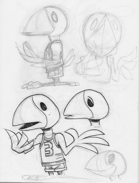
And now for something completely different...I downloaded a cartooning manual from the 1930s the other day and was kind of astounded at how easy the artist made it seem. That being said, I do love me some rubber hose style cartooning and animation. So I took the 'lessons' and applied them to Crow from Ghiroy. It was fun. I don't think this is the way to go for that comic, but it helps make my sketchbooks look like the product of a schizophrenic. :"D
Here's two images that don't go together. First is the inked version of the last image which I think came out well enough, and second is a proof of concept of what I hope is a long form comic. I've had real trouble starting one of these since Tamino and it bugs me no end. This one would be... a musical, really an opera as I don't know that I want dialogue at all, just 'songs.' It also would start right after Tamino ends, using Silas as the main character. I HOPE I can make myself follow through with this as I really miss having an ongoing project. So, well, here's hoping.
Saturday, August 20, 2016
Well, here's something I don't do. I know some artists keep 'secret' sketch books and such in which they might have nudes like this one or more risqué stuff. I don't. This is as racy as I get. Not even sure why I did it as but as is usually the case when I try and do anything even vaguely mainstream, it gets twisted and odd. Might ink this, might not.
Tuesday, August 16, 2016
So there's this. Did a strip just to see how hard it was to do. Very hard indeed. The composition's off and I really don't do lettering that well. In this case, the AI lettering isn't that good but adequate at best. I like the idea and writing of the strip. It has HEAVY Peanuts influence, which is intentional, and a bit of meta to it as well. The rest of the images are sketches, some of character designs, some of re-draws from the strip which are, of course, better than the drawings IN the strip. Ah, well. Likely won't go too much further with this, just use the characters in the Party Line comic but they're fun to draw and sometimes it's just about the joy of drawing and nothing else.
Thursday, August 11, 2016
Spent a lot of time messing about with this style, these characters today. Mostly with the coyote. It feels a bit more standardized now. There are real parallels to Peanuts comics, especially in the poses I drew in my sketchbook and the proportion. That being said, there's still that odd sketchiness about them, too. If they remain the style I use for the Party Line comic, so be it.
Wednesday, August 10, 2016
Tuesday, August 09, 2016
Still doing this comic with some folks I know and some I don't. I keep changing styles (surprise!) but this one seems to have particularly tickled one of the guys I know least. I tried to have something both more structured and more cartoony, and kept the image rough so that it would be even more organic when through into Illustrator. Did the coloring there with the pencil tool so it wouldn't be tight. Didn't have much to say on this subject as I don't feel I do pay homage or parody anyone when I cartoon though I do TRY and absorb or even replicate styles. I'm just not very good at it. :"D
Quick sketch dump to show I've been doing SOMEthing, even if it's non-productive things. I got distracted even though I have started the next illustration in the 'print' series. One of my favorite styles of cartooning is the 80s/90s version of the Belgian comic, "Spirou." It's so lively, cute and cartoony. And it's full of lovely ink. I -think- the artist used a pen, but It might be a combination of pen and brush. In any case, I let myself get distracted with that and the Ghiroy characters, which does no one any good. So this is just a bunch of pages from a recent sketch pad. Move along.


