Sunday, August 31, 2014

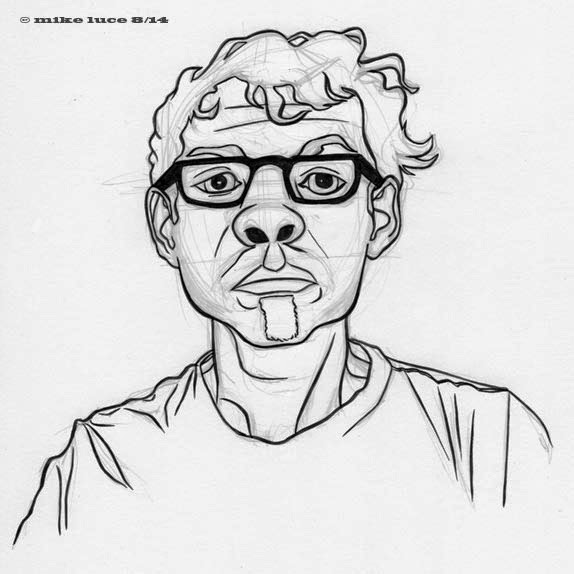
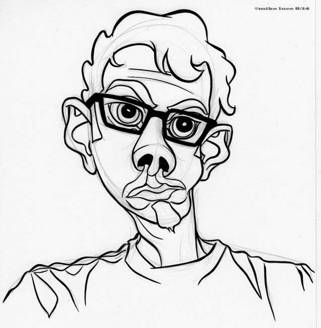
It's been a few days, mostly because of work and other necessary errands since I added to this. The rabbit I'd likely have to justify, partially because I did a version early on that shares some of his attributes but also because, well, it's a rabbit thing. Yes, it's cartoony, but it's also how I've been representing myself online and I am a cartoonist. So I think it's a valid entry. the second one is an experiment where I just inked every line I penciled. I also left out some of the details I've been putting in, mostly around the nose and mouth as well as the glasses. It's kinder in a way. Still going.

Thursday, August 28, 2014

#24. This one's a little subtler. The eyes are huge and the rest of the features are compressed, but I don't think it came out as obvious as I drew it. Which is interesting. And it still looks like me.

This one is meant to have a little more movement to it.

Wednesday, August 27, 2014

#22. A simple turn of the inside against the outside, but I think it's kind of neat. Throws things off just enough. Also, leaving the pencil lines means more on this one because I decided not to ink what was in the lenses at the last minute so the ghost of the eye is still there.

First up is a screen shot of the whole collection as it stood before today's first addition. This is how it's meant to be seen. Each piece is fine on its own but it's the whole where I think they work best. When I look at it, my eye wanders around picking out details, choosing, comparing. That's what this is about. The really nice thing about doing self portraits is I don't have to worry about offending someone. I can bend, shape, distort to my heart's content. If this were someone else, I'd be thinking and self-editing all the time, worried that the person I was drawing wouldn't understand or take things the wrong way.

Second is today's first. It's a bit weird but I think it still looks like me, moreso than some of the others. And it expresses a liking I have for cubism, though it's not really cubist.

Tuesday, August 26, 2014

Needed to take a departure on the last one here because I was getting too close to repeating myself and I hadn't gone off in a new direction with this in too long. Changed the inking style, went back to a more representational approach. Same brush. It's pretty versatile. The more I look at the group as a whole, the stronger I think the project is. There are some definite favorites but when looking at them all, I think they bring something more. At least I hope they do.

This is one of those that 'surprised' me. The pencil stage was not much to look at, so I didn't scan it. Inked, though, I think it holds together well. On its own, I don't think it's all that much to look at. Minimalist style is really hard, at least for me, because I keep wanting to add more details. The last stroke was to cut the pupils diagonally just a little instead of leaving them totally round, which totally changed the mood. The nose is probably even too complex. When put with all the others, though, it does what it's supposed to; provide another viewpoint. Moving on.

Monday, August 25, 2014

Ok, this one's a weird one, the oddest of the bunch so far. I was hoping that there'd be at least one in the group that might look like someone else had drawn it. So far, this is it. If I get more like this, or at least more that feel utterly outside the way I usually do things, all the better.

#s 15 and 16 of the series. Still interested, still think I have things to say though a commenter on tumblr pointed out that one or two of them looked like they'd gone through Apple's photo booth app, which is not the intent at all. There's room for humor here, but I really want this to be about different ways to interpret the same subject. In a way, it's kind of 2D cubism, right?

#14. Guess I was feeling fat today? Mostly I'm just glad that there's still energy and excitement in me for this project. I spoke to my partner about it last night and while he doesn't care for it, he's supportive and would love to see me do a show of any kind. I think the hardest part about this whole thing will be that I seem to be a cartoonist with a fine artist's sensibility. This is not to say I think one is better than the other, but cartoonists tend to look for a style, stick with it and use that to communicate their ideas. Fine artists seem to more want to find new ways of expressing themselves and are rarely satisfied with one approach or style. My outward style is cartoony though I don't think most of these images are meant to play towards humor at all. Because of that cartoonines, though, I think they're going to be hard for people to take seriously even though I do and mean them to be. We'll see.

Sunday, August 24, 2014

Ok, this is officially not my favorite of the group. I see where I was going but I didn't get there. But that's ok, too.

This one was probably the hardest to ink so far. Had to be really precise and the temptation to curve lines was really heavy. This one also surprised me. I didn't keep a scan of the pencils as I have of a lot of the others because I wasn't sure that this one was going to be all that strong. The ink made all the difference. So, #12.

#11. Last one before word. This one I think is rather silly, but there's room for humor in the series.

#10. This one surprised me. Whenever I start to do one of these, I don't really know where it's going to go. And as I do more of these, the more reason I can see to do more. While each drawing doesn't take that long, the point is the differences, the approach and how one differs from another. It's something that appeals directly to me as my projects show that I get bored with one style. This time, using the same subject, I can vent all that frustration with keeping something consistent by leaving the consistency in the pose and subject. Oooh, this all sounds so artsy fartsy.

I will say that these are harder than they look; I really can't afford a smudge, one of my usual problems, or a mistake. These can't be fixed in Photoshop and I don't want blobs of white out on the paper. Today's required a very thin line, which I didn't achieve all the way around, partially as I'm so used to putting in a lot more variance. Could have done it with the pen I suppose, but it wouldn't have the same feel and I want these to all feel as related as possible. Damn. I think I just came close to an artist's statement and I hate those.

Saturday, August 23, 2014

I lied. One more for the day. This brings the total to nine so far.

Eighth version. I think I should stop for today as I want a fresh perspective for continuing to interpret this image. Took the glasses off again as it felt right.

Another take. Still going.

Another for the day, this one a bit more linear, the head more blocky. I wonder how many variations I can make while maintaining a likeness.

Inking is an editing process. It's not just darkening the lines of what you've already drawn, it's a process of re-thinking and making decisions. And unless you draw the brushstrokes ahead of time in pencil, the inked version will have a very different emphasis than the penciled one because of the variance of line. Every line you ink is a decision, an edit. Everything can change from pencil to ink. Some extra line weight here and there can make a change between innocence and anger. Not that I think I've done that here, it's just something that was going through my head. For whatever reason, I decided to scan the pencil version of this one before inking it so I have a record, even if I'm not erasing the pencil in these. So yes, here's the fifth version of this from the same photo. This time I left the glasses off and was a bit kinder to myself. I think I look a lot younger and less sad, hopefully more inquisitive. Or something.

Woke up feeling lousy but was finishing watching a documentary on Chuck Close. Needed to keep going with this for whatever reason. This time, while only referencing the last drawing, I went back to the photo as well. This is one of the more abstracted versions but has a lot of observation in it as well, more perhaps than the one I did first though I still used that one as a sort of structure somehow. Now I'm watching a movie on Basqiat which I also love. There needs to be more movies on artists, that's all I'm saying.

Friday, August 22, 2014

Bunch of stuff from yesterday and today. Quick post. The red and blue lined drawing was done through Photoshop for a layout for an upcoming Ghiroy page. Should do that more often as it's a really good way of drawing more than one character together. The three ink drawings were done one after another today, the more realistic one being done from a photo, and the subsequent ones just using the previous drawing. Abstracting is easier that way.

Wednesday, August 20, 2014

And one last pinup for the day. Got a lot of inking done today. What this says to me is that I love inking. And drawing. Wow, what a surprise. Really have to work on backgrounds, though. If I can put as much effort into those as I do the characters, I just might have something hear...

Page 26. And what's different? Those lines are back! Seems it's hard for me to be rid of ink. I love it so much. Will this be how the comic goes from now on? I honestly don't know. With such a small readership, I can really do whatever I want. This isn't to spite anyone it's just a freedom I have when I have no one to answer to. And there's something about the ink that I think adds immediacy. Every time I step away from the brush I come back to it. Might be that that's a big fat clue staring me in the face. I do envy those cartoonists that can just settle on the one style and go about their business not having to think of things like this. I really do. I get bored and want to experiment and then I change my approach which is generally not how one engenders an audience or visually invites readers in. Might be that I'm better sticking with short stories. Dunno. But I'm doing this now. And I answer to me.

Monday, August 18, 2014

Some quick and dirty elf images (not dirty in THAT way, Vince!) for the evening. Obviously, these are extra slinky and twisted. And of course they make me second guess myself and wonder if Ghiroy would look better with line work after all. Sometimes I can just draw like this and a lot of the time I get too tight and things feel constricted and less free. This is why consistency can be hard for me. The fact that Tamino made it all the way through with no real style changes is pretty amazing. Artistically, I get bored or I rediscover something and get all caught up in it. I've been watching a lot of Warner Bros. cartoons lately and I think the one of Mikilo tossing the knife has a definite vibe from that. The other one is just inspired by the two inked rabbit drawings I did lately. Must push on. Must not get distracted. Must write in complete sentences...

Friday, August 15, 2014

Page 25 which took too damned long to finish. Too many things got in the way, and I think I wasn't as excited about this page as I was some of the others. Structure is creeping in here and there, something that's likely and inevitable. And we do need to get to the action fairly soon or I risk losing my reader. :"D

Thursday, August 14, 2014

Another rabbit for the day. Ink feels really good today, so I did some more. Lots of wrinkles, big hands. I like the lines better without the spot blacks, so I might not go back. Who can say? Still, pinups don't really get me anywhere except inking practice. And making me happy.

EDIT: Took this into ArtRage and painted it just because.

Took a little break from the comic to limber up my inking skills. The ink hadn't been opened in a couple months and was nearly the consistency of pudding. This has it's pluses and minuses. On the upside, the ink is pretty dead black. On the downside, sometimes it can be hard to work with this thick, but I just added a little more liquid to it and it was fine. Used a new #4 brush so the lines were pretty thin. The blue one I left open, no spot blacks deciding I wanted to play with some brushes I got for PS that I never use. They're kind of fun. Lichtensteinian. I can see wanting to use these with digital paint at some point, working in some textures. For now, it was just good to pull out the Yiynova and mess around.

Thursday, August 07, 2014

Things have been slow with the comic because lots of other life things have popped up and demanded my time. The work schedule, too hasn't been as conducive to drawing as I'd like it to be. Still, here's the next page. Our hero wakes slowly.

Tuesday, August 05, 2014

Page 23. My drawing schedule has been erratic, but it seems I can get as much done before work as I do after, if that's where the time is. This is my favorite page so far, mostly because I feel I captured a sense of movement, of, should I say it, animation. Learned something big with this; it's pointless for me to try and draw everything on one page. I simply do not draw small well. I need SPACE. So there are two pieces of paper used to make this, scanned in and resized to fit what I wanted for a composition. Again, final composition comes nearly last. I would never recommend anyone work this way. But it's how I have to. My best results come this way, I think. So Ghiroy/Crow is in a deep...hangover. I imagine that a lot of the fantasy heroes we read about go through this, though it's rarely written of. While making this comic, the title, "What Becomes a Semi-Legend Most" kept going through my head, which is that title of an old Joan Rivers album. NOT a big fan of hers, but the phrase kind of fits what I'm doing. Anyway, another one down, many more to go.

Sunday, August 03, 2014

First page of the main comic. Less dreaminess, more mundanity. I totally changed the swatch set I was using which, I think, made it feel a little more 'earthy,' or at least less dreamlike. I have many ideas for this comic as I said. Just really glad that I'm still enthused and still looking forward to drawing more. This one I started before work, but had to finish long afterwards. But the fact that that's what I wanted to come home and do makes me hopeful for the whole thing, however long it ends up being. No, I would not recommend that anyone make comics the same way I do. I would recommend that each person found what works for them and just focused on that. Trying to make things someone else's way is counterproductive, though it's always good to learn process. You never know what elements you might take away from the experience.

Friday, August 01, 2014

Page 21, which means 21 pages in a month. Not too shabby, especially since there's no pre-planning or anything. Start to finish as been one page at a time. And I have a lot of ideas starting to flood in. This is a good thing. This is the project I was looking for 5 years ago when I finished Tamino. All that development for other projects did not go to waste; it will all feed into Ghiroy. What I wanted to do with Delve Deep was a quick, fun D+D comic. And then it got too complicated, structured and, what I realize now, no fun for me. If I know every little aspect of a story, I get bored and have no fun telling it. This is better for me. I get to experience it as I go along. So, the prologue's over and things will get less weird from here on in. I've kept a couple themes or ideas from other comics. Dreams seem to be central to what I do, from Fite, through Tamino and even in Crawford and Cromwell to some extent. This one starts with a seeming dream sequence, too. The other continuing theme is the crow. He seems random now, but he does have a purpose. And his name is Silas. In my comics, crows are messengers. This one is no different. Best get going on the other characters and such. They're going to be needed really soon.