Saturday, May 30, 2020

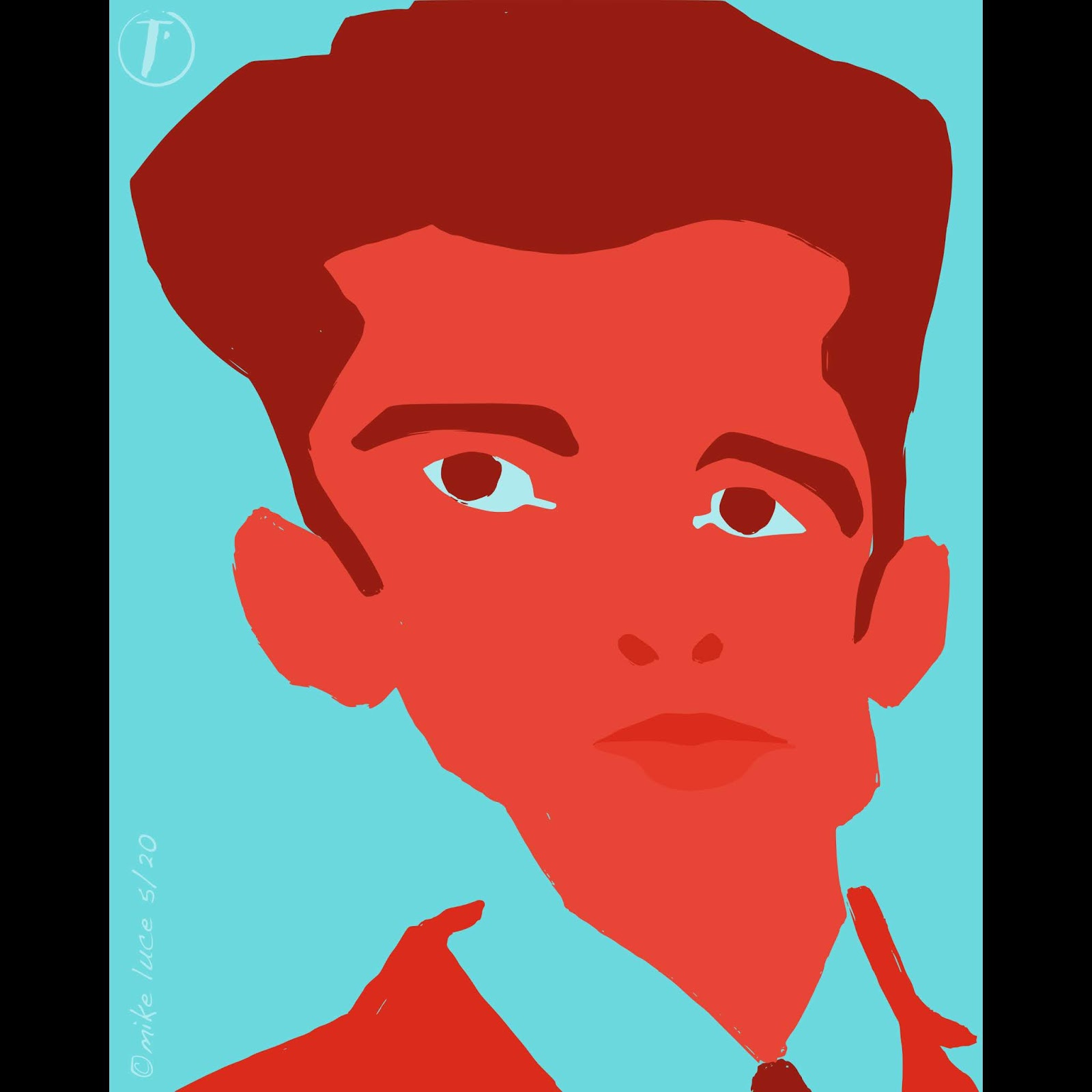
My current project is a book. Awhile back, I decided I wanted to do a book of my work. I'd really like to do a giant, all-encompassing catalog of all the stuff I've ever done but that seems Herculean as a task and pointless from an audience standpoint. That being said, I have a lot more portrait work than I thought I did. I doubt there's really an audience for this, either but as I don't know that I'll ever have work in a gallery, collection or, most unlikely, a museum, I'd like there to be SOME record of what I did and why I did it. Every time I feel like my work has really reached a point of relevance, I then see or hear something that makes me think I'm just a rank amateur who makes junk like so many other tens of thousands of would-be artists. Putting it in a book, things chosen, chaff expunged, feels like a step in the right direction. I only worry that people will see this as egotistical or me trying to put myself above my station. Whatever. I like my work. If no one else looks at it, that's fine. I could die tomorrow and be happy that I made these things. This is just the first page of one of the chapters. I try and break the work down into separate pieces: Shin Hanga, Cutouts, Self portraits (there are a LOT of these), the Selfie Project, my one and only show, and pretty much everything else. Right now, there are 168 pages which is a lot more than I thought there'd be. An my passion for portraiture is only growing.

When done, I'll put this up on my Gumroad shop for free. Anyone that wants it can download it. In that way, my work will be out there a little. And, if I ever get the guts to try and do another show, I'll have something to hand out or email to prospective galleries to show what there is, what I've been doing.

Tuesday, May 26, 2020

There was a project for at-home training that involved art. They actually want me to show how I'd copy another artist's work with store products. Nothing could be more up my alley. So I spent some time copying this Van Gogh. It's much harder copying someone whose work is really stylized, especially with heavy brushstrokes. That being said, I'm not trying to fool anyone. I think it came out reasonably well.

Wednesday, May 20, 2020

Something different with more or less the same approach. I love Van Gogh's iris paintings, a lot more than I love his sunflowers. The colors in those feel almost dirty at times where the irises seem to glow. I was lucky enough to see one of the originals at the Getty a couple years ago with my sister. Looking at some online, I decided to try some myself, though I had no real ones, just image search results. That being said, I think these are three different species, types or whatever. Wish I had real ones but it's the wrong time of year and there's this plague. Sketched in pencil first, most of which is a contour sketch (meaning I don't look at the paper much at all), I then just snapped a photo from within Procreate and went from there. Originally was not going to have outlines but the strokes of paint didn't convey what I wanted. I did a layer of outlines, wasn't convinced and set it aside. Tonight, I went back, deciding to ink the lines like normal. Also decided to add texture to the background. Ten minutes later I was satisfied. I think it came out reasonably well. I could see doing more of this.

Sunday, May 17, 2020

This was a quickie, done from a photo of Brad Pitt from a terrible movie called, "Cool World." There's a couple shots of Brad looking at himself in a funhouse mirror. I liked it so snapped some screen shots for later. And now I used one. I ended up liking it better than I thought I would.

Friday, May 15, 2020

Did this one as well. It's one of the very few images I've made of my favorite role playing character. It's based on an underwear model because why not though made a little less like him. I rather like it especially as it's not perfect. So far, I'm a minority of one.

A close friend graduated today. We were supposed to be down there to see her walk and get her doctorate but the current pandemic nixed those plans. She posted photos today, one of them a selfie that I knew I wanted to draw. So I did. This one is the most literal of the bunch and not my favorite, but had I made it more abstract, I would have lost the likeness. As it is, she liked it which made me happy. So it's a success. Sketch by hand, didn't ink it, went right to colors. THOSE had to be played with a LOT.

Thursday, May 14, 2020

Tonight, I took one of my older portraits, already sketched and inked in Procreate and went about doing the 'cut paper' thing with it. I added eyebrows and removed the mouth (his having facial hair didn't hurt). There might be too much detail but the likeness is a lot more apparent. There are two versions, one with blue, one without. I eventually chose the one without as the blue one felt more kitchy or like an album cover. While Matisse, who's the inspiration for this whole thing, used very bright colors, I wanted to reference the Dutch Masters and the original portrait and used rich browns instead. This is my partner, the subject of the original portrait, "Dr. Hutchinson."

Wednesday, May 13, 2020

Ok, this went in a direction I wasn't foreseeing but which I like. Still have Matisse in my head. I had drawn the landscape painter again last night and warped the pencils, trying to see if I could keep the likeness of someone other than myself, if I had the ratios and placement right before warping. Then I inked the drawing but thought the eyes too small, so enlarged them. After all that, I sat on the image overnight. After posting the last one, I thought about doing something with this so, layer by layer, painted large areas of color to represent the different parts of color, sort of like I was making stencils for a silkscreen print. Bringing each of those painted shapes into AD, I changed their colors, trying to use much more vibrant a palette than before. And... I really like what came out. Not my usual at all, but I can totally see making art this way, at least for awhile.

Was watching a documentary about Matisse last night. He's not one of my favorites usually but I do like some of his work, notably the cut out paper work he did towards the end of his life. I kind of deal with this all the time; whenever I bring an inked image into AD to color, I'm essentially cutting out bits of colored paper to be put under the inked lines. Sometimes, I turn the ink layer off and like what I see. I did this last night and liked what I saw. This morning, deciding to take it a little further, I added in the pupils and upped the colors quite a bit. Initially, I added the eyebrows as well, but that was too much and was leaning more towards representation. I think I like it but I'm not sure if I could get this to work for likeness of anyone else. Then again, does that matter so much?

Tuesday, May 12, 2020

While it might not look it on first glance, this was a big experiment. I took a photo, notched the placement of all the major details then warped the crap out of that exceedingly basic sketch to see if the likeness would hold. And it did. Sure, I could have just caricatured it, but that's not really the same thing. Once I'd warped the placement, I drew the details, inked it and proceeded as normal. I'm pretty happy with it. My partner doesn't like the washed out colors, but I'm still thinking in a woodblock print kind of way. Perhaps I should play with that next.

Saturday, May 09, 2020

Another attempt at this young man. Someday, I will look up his name. I got the ref from a screen grab from an episode of "Landscape Artist of the Year." I just don't remember which one. I did a digital painting before but wasn't utterly pleased with it. Worked a lot on this, leaving it for a few days as I wasn't sure. Watching a documentary on David Hockney, I thought about changing the color of the outline to something less in keeping with the rest of the image. That's what made the difference. This fits the current 'style,' still in the sort of semi-Japanese woodblock print style I've been leaning towards. Still not a precise likeness but I like the image.

Tuesday, May 05, 2020

Tonight's portrait is Egon Schiele. He's an interesting guy with some interesting art. Died far too young. Started out with a photo ref. Did a pencil sketch, scanned that, brought it to the iPad, inked it, sent it to the Mac, vectorized it and did the final colors in Affinity Designer. That's pretty much my process these days though it's kind of been that way for a long time. Fite, my first full-length comic was done this way and I started that 15 years ago. It's only the inking that's changed. I might try and hand-ink one of these just to do it, but I'd miss that really nice, textured brush on the iPad. It feels like a brush that's been kind of mistreated and that's hard to replicate without messing up brushes. For now, I'll stick with this. I wonder if anyone would pay for something like this...

Monday, May 04, 2020

Tonight's little mess. It started with a photo of artist Roy Lichtenstein. I could go on and on about what I think about his work, how I think he spent most of his career basically making fan art of other people's stuff, how re-interpreting other people's creativity is creative and derivative at the same time and how he DID have a few good ideas in there somewhere, not leaving out that Pop Art kind of ruined art for art's sake but I'll just leave that stuff aside. I liked the photo and decided to try and do a portrait more or less in the style of the one I just did of me. It's hard, sometimes to push far enough. The first version went WAY too far into the kitchy, cheap-effecty side of things. The drawing was too literal, too and while it looks like the subject, it's not really very interesting. So there's a pencil sketch, the inked version from Procreate and then the over done first version. Sometimes I need to draw things more than once.

The second version I tried to be more bold, more like -me- whatever that means. While distorted, I left it that way and actually distorted the inked version a bit more. The bottom one is the final, the one I liked best and posted. Couldn't keep to primary colors as they just didn't work with him yellow. That being said, I think it works though, again, works better much larger.

Saturday, May 02, 2020

Today's little thing. I started with a VERY old photo of me and my best friend, taken in England in 1985. I've been trying a lot, during this time of imposed isolation to do as much with art as possible. Part of that is to really dig into who the hell I am as an artist and how -I- make art when not trying on someone else's shoes. So I threw this sketch together in my pad in about 15 minutes, poking at it while on a video call over the next couple hours. When done, I was going to try and paint it in a more detailed way but then just decided to attack it with Procreate and my favorite ink brush. After that, it seemed natural to do the different colors and shadows with layers in Procreate and bring the whole thing over to Designer, which is what I did. It's not a great likeness but I like the drawing. So, do I continue in this way and try to refine this process, making this MY way?