Wednesday, April 28, 2021


 Decided to have a little fun with the pinhead. So here he is, in lively green. Because why not? Just a bit of fun.

Tuesday, April 27, 2021


 I love to draw. The simple act of drawing, not working towards something else, any kind of goal, just drawing. Tonight, I felt like it. I put on some music, opened the drawing pad and just drew. They're a bit caricatured but so what? Might do something more with these, might not. Doesn't matter. I like my pencils really short. I've said it before but this drawing pad has been a really good one overall. Digital is mostly my range, but sometimes I just need pencil.

Saturday, April 24, 2021


 This is my second attempt at And Oliver, one of the models on the 2019 series of Portrait Artist of the Year. I thought I might try and do the same models they have, one for each episode but I'm limited to screen grabs so don't get to choose my angle or pose really at all. So while this is, I think, accurate, it's not flattering. The point is to try and make something in the same time allotment as the contestants; four hours. I have no idea how digital media would go over on the show and whether or not I'd be required to have a physical print at the end of that time or not. Be a hell of a lot of equipment to lug if I did. Since I'm not British and will never be on the show, what does it matter? It's a good exercise.

The first version, which I'm not showing here, was in the current 'cut paper' style and just didn't work. I think it was all the harsh lines. Something about Andi's face needed a more organic approach, so I went back to the Procreate + Affinity style. This is the second version of that. The first was more naturally colored. I thought to try a more brightly colored, poster style as an alternative and decided I liked that one better. There's almost a kind of Warhol feeling to it? Which is fine. She's a lot lovelier than I paint her here. 

Thursday, April 22, 2021


 This is Phillipa Perry, wife of Grayson who I did last week. To me, this is a successful portrait and it's also unremarkable in any way. There's likeness and some style, but it's dull. I'm still glad I did it though I won't be posting it to most of my social media. It's not a mistake or a failure, just not interesting. It's still work and I still learned from it. Perhaps I can do something further with it but for now, I'll leave it be.

Tuesday, April 20, 2021


 Finished piece. I was wondering if you could mix portraiture and comics and I think you can, but I also think it could get gimmicky very quickly. In a way, this feels more like yelling than anything subtle. Then again, being subtle doesn't get me anywhere. If I was doing a show, I think I'd keep it to just one that had words in it. Any more would feel like too much. Maybe even this one is too much. I think it makes one look, which is a good thing. In general, I'm happy with how this came out though I notice that I'm getting less and less abstract with each one though really, this is still way off. Instead of fixing that eye placement, I extended the glasses on the other side. And it balanced out. Well, I'm making art. That's a good thing.

Monday, April 19, 2021


 So, working on another one. This time, I'm going to mix portraiture and comics in that there is going to be a word balloon or two with a statement. It might seem heavy handed in a way but it's something I'd like to try. The pencil sketch, made from another image taken for comic reference, came together weirdly easily. It is off, and that's fine. I want it to be. Part of me wants to fix that eye and move it closer, but the rest of me doesn't. The colors on this one are more challenging but that's fine, too. These are really exciting me. So far, I've made 23 portraits since the book came out last year. I hope to keep making more. Oh, and get back to the damned comic, too.

Sunday, April 18, 2021


 Today's portrait, British artist Grayson Perry in his Claire persona. I have no idea how this came together so quickly, but it did. The sketch I did, based off a screen grab, was not my best and not as stylized as I'd hoped. But somehow, I think I managed to get not only a likeness but a touch of masculine, a touch of humor and a touch of Bette Davis. I really don't know why this worked as well as it did, at least to me, but I'm happy with it. Pencil and Affinity Designer with some extra details done in Procreate. That last bit made certain things, like the hair, way easier as I could just quickly draw them and vectorize.

Saturday, April 17, 2021


 Still in this mood, so did something a little different. I have taken many, many, many reference photos of myself over the years for various comic projects. Somewhere, hidden away (unless I finally threw them out) is a box full of polaroids of me doing various silly things. Since the digital age, there's no real reason not to keep them, so I do. This time around, I decided to take one that I used for the mice and, instead of putting a mouse head on it, just did me. Also, instead of keeping the palette limited, I decided to expand it, with each item, except the hat, getting a mid tone, shadow and highlight. I rather like how it came out as it feels dynamic. There's caricature but not to the point of being a mockery, at least I don't think it does. It was fun and was good for me art-wise.

Friday, April 16, 2021


 And one last entry for the day. Did some sketching of someone I follow on instagram. I didn't get the level of likeness I wanted, but I might continue working on it. This is a drawing pad I think shows a lot of depth and work and is one of my favorites.


 Made another one. This time, I interpreted a portrait of King Philip IV of Spain as done by (the workshop of) Diego Velazquez. My mom used to call the portrait "the pinhead" as it's not only a very tall canvas (perhaps 7 feet tall) but the head is indeed too small for the body. There is a bit of humor in this version and I'm ok with that. He is a very pink and self-important looking fellow but I guess that's pretty normal when you're king.


 Did a little sketch last night as I was looking up portrait artists from a book I really like called, "Painting People: Figure Painting Today." I experimented in the sandbox of Chinese painter Yi Chen for awhile, which was both fun and too easy to just ape his style. So I reached for pencil and paper and tried to work in one of my own abstract ones as that was the mood. The original idea was to paint something, perhaps mixing 2D and 3D styles. After messing about with Procreate, I decided to go back to my usual inking brush and let the lines be lines. When that was done, the natural thing was to go into AD, which I did. As soon as I got a couple colors down, I turned off the ink layer and knew that this was the way to go. I tried to keep the palette as limited as possible. As it is, there's about three colors more than I wanted but if I hadn't added them, the image would be TOO flat. I sampled colors from the reference photo, which was taken from the camera on my Mac, which is not wonderful, but shows me illuminated by the screen. I wanted to convey a feeling of sitting in front of the computer for too long and I think I managed that. Had I the space, I would transfer this to paint as big as 3 or 4 feet a side. I really like the idea of big, flat shapes painted on larger canvases. But until someone else thinks this is a good idea and ponies up the money, it'll stay digital. Perhaps I'll have it printed out some day.

Sunday, April 11, 2021


 Sat down this afternoon to exorcise this one from my head. Billie Eilish is someone whose music I've recently got into. I watched a documentary on her and found it to be a very interesting look at fame as well as someone who went from no one to global icon in a very short time. It's not perfect but I didn't really want it to be. I made a very quick sketch from a screen grab I took and let things be a little wonky on purpose. It was not a good moment for her which is why I wanted to take the photo in the first place. She's as off-kilter as she could be in a documentary like this so I hope some of that comes across. After the pencil sketch, I took a photo of that from my iPad from inside Procreate, did the usual thing of one layer = one shade, then exported them one by one to the iMac where I put them through SuperVectorizer and assembled them in Affinity Designer. That way, I could adjust the grays all together. In the end, I decided color wasn't necessary and wouldn't bring anything to the final image. So, this.

Friday, April 09, 2021


 Finished page 97. This one's the most abstract of the group so far but I think it works fine. Might do more with the non-traditional backgrounds in this song as I really want a feeling more than I want a specific place. I still have the stage in mind when doing this, and dancing and song. Actually making this an opera would be a nightmare but I'd go see it.


 Forgot to post this, it's just a quick, little character portrait. I've drawn Estarion before. This time, i was inspired to go back to an older style, one I developed based on some old pinball machine art. For a quick sketch, I thought it worked out fairly well though it wasn't exactly received with much enthusiasm. That's fine. Stretching is always a good thing.

Thursday, April 08, 2021


 I haven't been posting much for WIP on this page mostly as it's been coming slowly. Also, once I complete an element, say one of the mice or the graffiti, I play around with it a lot, and then all the other elements as well. So most of what I've been doing has been fiddling. And that's how I got to this tonight. While there's no precedent for lineless work in this chapter, or perhaps the comic so far, I think when I stick Rooster in, he'll be up close, will still have his lines and therefore the lack of lines in the rest will visually set it further back. Or so I hope.


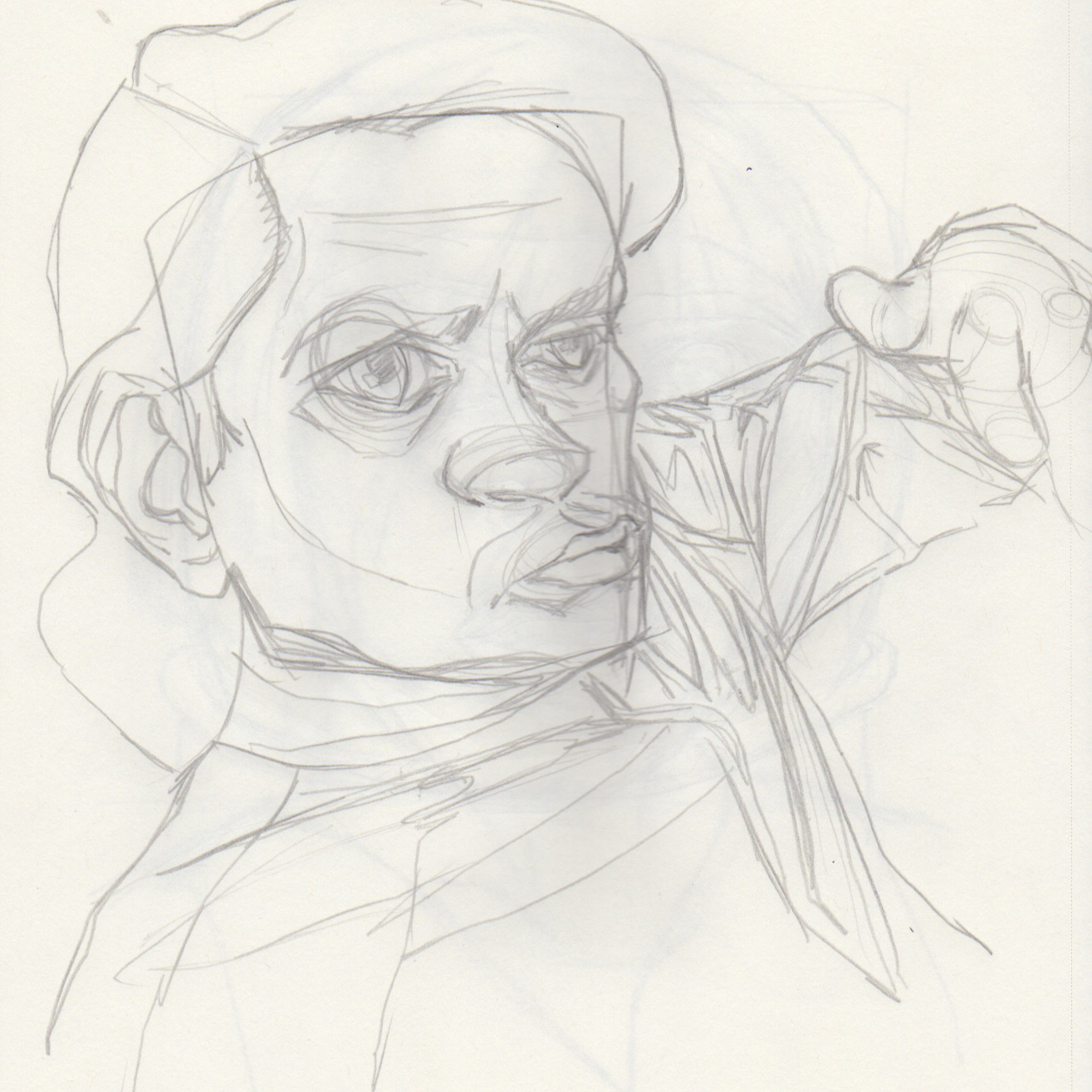
Seems almost a waste to go through sketches and inking with these guys just to drop out all the drawing part but if that's what it takes to get where I'm going, that's what it takes.

Saturday, April 03, 2021


 Why the hell do I do these things? I was flipping through my Flickr galleries and was kind of missing Ghiroy. Between the human version and the rabbits, I put a lot of work into that comic. What happened was that it ended up being too much work for what it was meant to be. That being said, I looked at the 2019 reboot and thought it wasn't too bad at all. When I got to page 11, I did a HUGE style shift that makes me scratch my head now and wonder what the hell was wrong with me. The original was a little stiff, very inorganic but it was also kind of graceful in its way as well. So, to get things out of my system, I remade page 11, the original version of which is the 2nd image, into the original style. It took longer than it should have as I no longer had any palettes, if I ever had them and had to copy and paste a lot of things. That being said, it still only took about 2.5 hours. Wasn't a difficult page as it was just Crow. So...there. I did this. I can go back to doing other things. I hope. I won't talk about the three pages of Ghiroy sketches I did yesterday...

Friday, April 02, 2021


This page kicked my ass. Mostly, it was the graffiti. I designed it a number of times before I got something I thought would look decent. Even then, in plain, black lines, it didn't fit and I had to re-ink it with the same brush I used for the mice. Then it had to be warped to fit the scene. Then the colors, then the overlays which involved cutting a hole around the graffiti so I could lessen the opacity and really make it stick out without competing with the mice. And finally, the text. It's not my favorite page but it works, I think and I can move on. It's pages like this that slow the whole thing down and show the real weaknesses in my process. Then again, even if I skipped over this from my meticulously sketched thumbnails (I never do these), I'd have to come back to it eventually. At the end, a rare admission of me dressed and posing for Terry. Yah. I do that.