Tuesday, December 31, 2019

It's that time again, year's end (no card this year) where I look back on what I accomplished, what I didn't and try to make sense of this whole thing. There are more entries than 2012 but I fell short of last year by quite a lot. I started the year with pages of Ghiroy and City Silent and both of them petered out to a dribble then a stop. Ghiroy is still the least popular thing I've ever done and honestly, it's more work than it was ever meant to be. I love drawing the characters, but it was only ever meant to be a quick and dirty little D+D comic. I never seemed to be able to keep it down to that; it always got more complicated, they style kept changing and I was redrawing a comic I'd already started twice before. Will I come back to it? Maybe. Answer hazy, try again later. City Silent... that's a whole other thing.

I am disappointed that my drive for that comic seems to have really come so close to a stop. I don't really know why I had this huge, six month hiatus on it. I really do hope to get back and finish it. There's a lot of passion in that project and I do want to see it through, even if no one ever reads it. I still think there are pages where I achieve beauty. And there's really nothing visually like that I've seen. I feel like I'm breaking ground but no one else seems to think so. We'll see.

This year saw the return, briefly, of Harlon. That strip worked for its time. I have no regrets about making the new ones, don't feel I need to add more. It took the place of Biograph this year and that's fine. Biograph and Harlon are nearly the same thing. Might or might not so more journal comics next year. Often, I just don't feel I have anything to write about.

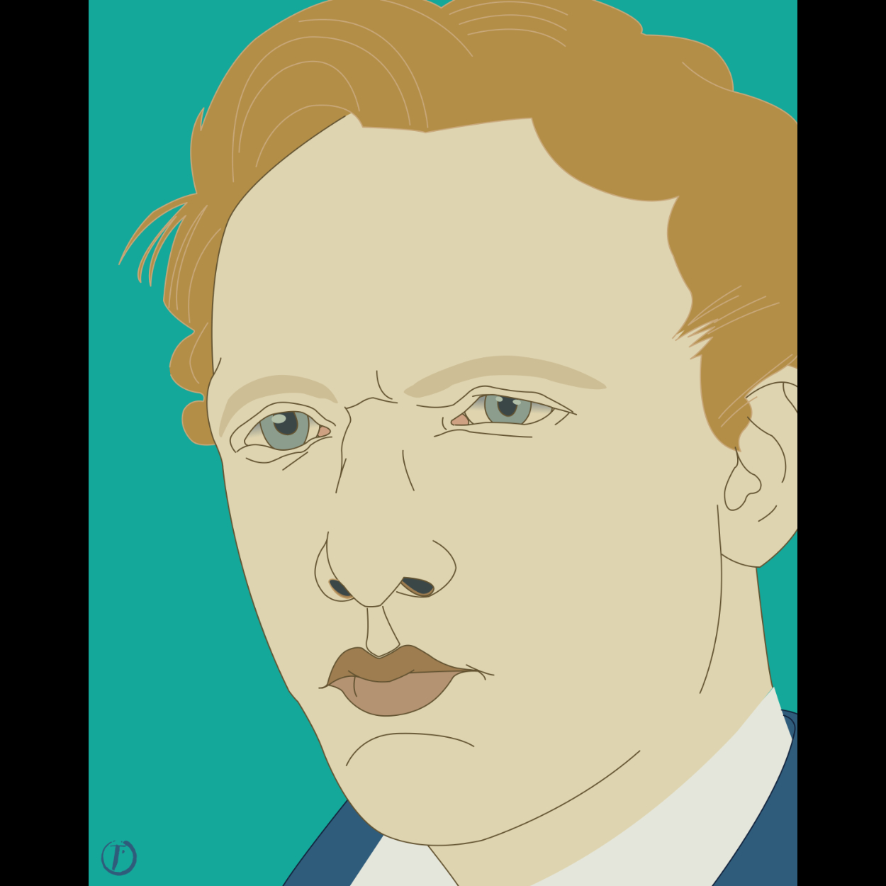
What DID happen this year was that I kind of went nuts on portraits. Part of that was finding the show, "Portrait Artist of the Year," on YouTube. It's a British competition show on painting, something we'd never get in the States. And it really did inspire me. I did a whole bunch of portraits, especially towards the end of the year. I made a lot of prints which are now hanging in my house and I think they look good. I'm still experimenting which is healthy, moving from abstract to more representational. The only sad part is that I think the portraits are things my mom would have liked. She never cared for the comics or the abstract stuff.

I did tons on the iPad and it's become my go to tool. I still had the pencil and pad out here and there, did one inked drawing, did a couple large sized paintings with real paint. I got some clay and tools and will be playing about with sculpting as well as, again, I found videos that inspired me.

On top of all this, I've continued to do the podcast with my best friend. Before 2020 is half done, we'll hit the 100 episode mark which, to me, is pretty great. We don't have a lot of listeners but we have some. At the very least, it's something I get to do every week with Max. It's worth it just for that. I'm also still gaming and in one of those games, playing a Bard, I've written two 'songs' which aren't horrible. I think they'd actually be considered filk songs which... I'll just leave that there.

So 2019 was not the most productive year I've had. I still think there's some pretty solid work there and, as long as I'm moving forward, I'll be content. Here's looking ahead.

If one is good, two are better! What the hell am I doing on the last day of the year? Well, I've been thinking about an extended approach to the current 'style,' if style it be. Instead of just the one view, I'd do three, trying to capture a little bit more of the subject. I'd want to do this with a person and not just some actor but that's what I had to work with. I've done trios before, but it was a long time ago and wasn't a portrait at the time. But if I could capture three moments of a person, I think I could have something. So here are the first two of this guy. We'll see what the completed version looks like in, well, the coming year.

Monday, December 30, 2019

This one was made from a still frame I took off an episode of "Ultraman." He's a ubiquitous mad scientist of sorts. As I was drawing him, I started thinking about Japanese demons or oni, one in particular that has gold eyes and teeth. I thought he might look cool done in that palette, so here he is. I think he works pretty well. There's a slight cartoonishness to him but there's also a pretty penetrating stare. Tried to make the lines more harmonious, letting them stray from what was truly there to make a better composition and I think it worked. Another one for the series.

Thursday, December 19, 2019

Quick and dirty experiment before I record this week's podcast. Took a random sketch of Smatt from my sketchbook and adapted it to the current style. It worked better than I thought it would and I think it would look really good at a very large size. Hmmm.

Worked some more on the Basher image as there were things that bothered me about it. First off, the mouth didn't make a lot of anatomical sense, though that is a problem with the mask. So I widened the opening of the mouth to accommodate the tusks properly, filled in the teeth a bit more, added a filtrum below the nose and brought the nose more together at the bottom. Also, the two straps and buckles were of very different sizes. While that might be true in the photo, it bugged me enough to change them about.

These days, I tend to use Procreate for my sketches but as I'd used my iPad so much that day it was out of power when it came time to do this one. So I pulled over the sketch pad and did the old grid. Worked out just fine and proved that I can still just draw when I need to. The iPad is just a tool, not some magical device that allows people to draw with no skill.

I post this totally just for myself. 11 days ago, I tried something new. This is what I made in that time. It's enough for a small series on its own. And I can see making more in this style. In fact, I want to though I need to take more photos myself as that's part of the process. This means more subjects. We'll see. Regardless, it's more work than I think I've ever completed in as short a time.

Wednesday, December 18, 2019

Damn, this never happens. Got a third done for the day. To be fair, I haven't gone over it with the usual comb, but still, managed to get it mostly done. This is my cosplay orc, Basher.

Tuesday, December 17, 2019

Two for today. Managed an adaptation of a Vincent self portrait and then an image of Silas both in the current style. Pretty happy with both. I can see why it might not impress people as they style makes the image look simple and simple = easy for a lot of people. There's a LOT of fiddling around and the sketches are very sketchy. Tons of editing done as I'm making the lines in AD. That being said, I think I should do at least one of these in an actual painting. We'll see.

Monday, December 16, 2019

Another Shin Hanga series portrait, this time of my friend, Matt. I think it's the most successful of the bunch so far. And he didn't hate it, so that's good, too!

Saturday, December 14, 2019

This one was more of a struggle, though I don't think that shows in the final version really at all. This is a portrait of John Ruskin, a major figure in the British architecture gig. I was watching an episode of "Landscape Artist of the Year," and saw an image of him flash by. I liked his look enough to do a search, find a photo and do this. The likeness was a bitch, at least in the penciling part of it. Strangely, it really came together in AD. Part of me wants to make real paintings of these, or one in this style. Another part of me wonders if I only want to do that to appease the art world which is still not ready to accept digital art as anything real.

Thursday, December 12, 2019

Another one in this Shin Hanga sorta kinda style. These were prints made in the early part of the 20th century and show a distinct influence from western art. There was more detail, images were more representational and there were, sometimes, uses of shadow and highlight to further develop an idea of form usually missing from Japanese prints. For me, it's the balancing act of minimalism that seems most interesting, deciding what details should be present and how many I can get rid of without hurting likeness. For example, there were originally highlights on the glasses which I took out. When I looked at some actual prints for reference, those details stood out as unnecessary, visual clutter. While I might want to add shadow, I don't because it doesn't really add to the design and here, I get the feeling that the design, the image is more important than is reality. Or so I pretend. Anyway, a fun exercise.

Monday, December 09, 2019

Second in a series? Tried to look a little more at the 'Shin Hanga' format, figure out where I might play with its rules a little. Since I'm neither Japanese nor a woodblock print maker, I figure there's no reason not to experiment. In this case, I thought to do Van Gogh. While he made a lot of self portraits, I decided to look for photos instead. As it turns out, there's only one, taken when he was likely a teenager. Using that as a base, I adapted the color palette from one of his later self portrait paintings. I think that Shin Hanga didn't always have black lines as the color on their key block but I don't know that they went so far afield. I'll have to look into it. While I sampled colors at the start, I don't think any of them stayed the ones I took from Van Gogh as there needed to be more of a balance. I think it's pretty successful and I could totally see doing a series of these. We'll see. I seem to be allergic to prolonged bouts of style.

Though the original looked well enough, being started at work, I hadn't made the file of the right size in case I wanted prints ever made. (Or hell, if anyone else ever wanted them printed...) It seemed obvious that I could remedy that if I remade the file in Designer. So I did. A few tweaks were made, but I didn't change much at all. There is a signature stamp down there which is likely a bad idea in that it brings back the old T', Thomas Blue name which I haven't used in a long time. Then again, maybe I should split some art off from others. Whatever. I don't have to answer to anyone.

Saturday, December 07, 2019

This is the portrait copy I referenced in the last post. Another work demo, about 45 minutes.

I've felt like I've been in a kind of artistic hole lately. I started trying to sculpt clay and found that, while the idea of the shapes is easy in my mind, doing the actual sculpting is not. Nor should it be as I've never really done it before. That and being sick has made me feel like I'm not capable of making anything of worth, beauty or quality. Looking at other people's successes online wasn't helping either. Tonight, I had a chunk of time in front of me, a want to do something creative and quite a few things I could be working on. Indecision often leads to video games and then later, more guilt. Instead, I pulled out the iPad and the Rembrandt I'd copied recently (which I suddenly realize I haven't posted) and re-interpreted it in the style of one of my favorite Japanese woodblock artists, Natori Shunsen. His is a very minimalistic style leaning towards realism. I thought it might be a fun exercise to take something complex like a Rembrandt painting, which is all about light, shadow and texture and make it something almost exactly opposite. I think it worked pretty well. It's almost TOO simple in a way and looks, in some ways, 'easy.' Nagel had that problem and I think his stuff very quickly went from fine art to shopping bag. It's a really fine line because you want the work to show but not for the work to look anything but elegant. Don't know if I achieved that, but I like what I did. The pencil sketch I inked over is below. Made me feel good to do this.