Thursday, December 13, 2007


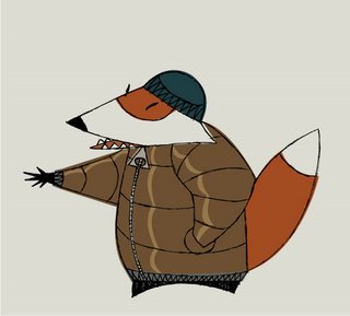
This year's holiday card.

Monday, December 10, 2007


A break between comics. I'm trying to paint while breaking most of my own rules, trying to leave out thought and just let the paint do what it wants. As always, sense of composition and color makes itself known eventually. Utterly non-representational work is quite hard to do, at least for me. This one's acrylic on brown paper. 2x3 feet or so.

Sunday, December 02, 2007


That's the cover to the second and last collection of the web comic.

Thursday, November 08, 2007


An almost promo piece for the next comic. It's needs a little more work, the aesthetic a tiny bit more tweaking. Still, it's progress and I finally got a name for the comic.

Sunday, November 04, 2007


And one more of these, left in Rocco's modern life style (don't like how this turned out) and the right, more like Ren and Stimpy. Angry, manly Lucco!

Friday, November 02, 2007


And for that matter, what would Lucco look like were he a Nicktoon? Why I believe something like the above.


Another what if kind of thing; what if Ghiroy were going to be a Nicktoon? Just playing about with other people's filters for fun.


Another bit of practice, making an animation-style background from a specific reference photo. The next step, I think, will be to abstract things a bit more as for now, they're a little too realistic. Still, helps me learn.

Friday, October 26, 2007


Did this as a quick exercise for a friend. He wanted me to try doing an animation-style background using something real as the reference. So I did. All this is good practice for learning to sponge paint with PS.

Thursday, October 25, 2007


That's the last episode of my web comic. It was a fun two and a half years and I learned a lot from doing it. Next up will be compiling everything for the book releases. And then on to two other projects. Ink and Illustrator as always.

Saturday, October 06, 2007


Had some time today and as I'm poking at PS, trying to learn the program, I thought I'd make a quick comp for Ghiroy. This is pretty much the look I want though when I have more time, I'll have a better palette and composition. This was a 90 minute start to finish, unplanned sketch. Character in ink and AI, the rest is PS.

Wednesday, October 03, 2007


Getting towards the end of my first web comic. I'm about three episodes away. This is the most current and will mean nothing on its own. That's ok. I'm pretty happy with the thing as a whole and look forward to the next project. The whole thing is at WCN:

http://www.webcomicsnation.com/mike_luce/fite/series.php

Friday, September 21, 2007


Toys. I like toys. Toys are fun. So why not design some? Peg people are so iconic and icons are fun to play with. I wanted to play with the shapes as much as I could while not letting the abstractness go too far.

Saturday, September 08, 2007


Started playing more with Photoshop today. I need to learn to use it a a painting tool instead of just using it to scan things. This is my first attempt at coloring anything with it and I am pretty happy with it. Feels like watercolor to me. One of the more geometric/primitive styles; an otter sleeping.

Thursday, August 23, 2007


This is the lastest two page spread of Fite. the story has been leading up to this since I started. While I'm pretty happy with the pages in general, two years of anticipation have sort of felt unfulfilled. It's points like this that storytelling is, for me, the hardest. Between this and the next episode, there aren't many bigger moments in the comic. We'll see how it goes. In the end, Fite has to be for me, I guess. Perhaps the next comic will be more for other people. Probably not. Besides, I like the work. It makes me happy.

Thursday, August 16, 2007


Another bit of practice emulating Art Lozzi's work from HB cartoons. This one is from a Yogi Bear cartoon. The top version is a screen grab from the cartoon. The second is my recreation using AI and PS. While it's not utterly identical, it's close enough for what I want which is to learn the technique. Thanks to some new brushes I was given for PS, I was better able to copy the overall feel of the original. Next step is to design my own background using the same techniques. It's all good practice and research.

Wednesday, August 15, 2007

Here's another quick and dirty Art Lozzi background recreation. I think this one is a tighter one than the last, but now I want to branch out and do one of my own. The brushes in PS are still eluding me to get a complete match, but that's ok as it's more about learning the ideas behind the textures than the actual textures themselves.

Monday, August 13, 2007

Digitally recreated Art Lozzi background (from a Huckleberry Hound cartoon) and a character from the comic make a decent pairing, I think. I tried to copy Lozzi to see if I could get something close to the same effects he had with AI and PS as they're easier for me to use than real paint for a comic. This was a quick and dirty recreation but I learned a lot by doing it.

Friday, August 03, 2007


More color tests. I also want to make sure that this more lineless style will emote enough, and will accept the stretch and squash I've worked on in Fite. So far, I think it works just fine. I suppose this is more or less what not "keeping to model" means, and that's fine. While I love some modern animation and some UPS stuff, it seems that in many cases, the characters didn't drift out of model so much and so energy was lost. I want to do both. We'll see if I can manage it.

Thursday, August 02, 2007


Working more on Ghiroy, the next comic. I've been in love with the black line on white, the thick and thin inkbrush that I've used on Fite. I'm no master but I've come a long way. And there's something utterly enticiing about the tool and the ink itself. Last night, I was playing around with some comps, one of which was meant as a simply color palette test so I could get one of the character's generals down. For whatever reason, I dumped most of the black lines out and rather liked the results. So now I have to wonder if I shouldn't move the comic's style more towards this kind of thing as it's not only a departure from Fite, but because it may have a slightly more serious edge to it which would better fit the story. Hmmm...

Tuesday, July 24, 2007

Sometimes size matters. I was pretty happy with the figures for last week's "FIte!" but because so much had to happen in so little time, the figures were quite small by the time the comic was done. For whatever reason, I threw them together in a bigger size and present them here. Ta da.

Thursday, July 05, 2007


A milestone for me. The 100th episode of my web comic. It's coming to a close. Then I'll start another one. There's no money in it of course but this is what one does when one has comics in one's blood.

Friday, June 29, 2007

Bought some real watercolors (not the Crayola schoolkid ones I've been using since gradeschool) and am trying to learn to use them. This is a first attempt, a simple sketch of Lucco just to try and get a feel for them:

Monday, June 18, 2007

Some more character work as well as some inking practice. Just for fun.


Monday, June 11, 2007

More boxers. I had someone ask me to develop one of the characters that appeared only as part of a background montage. Seemed like it might be fun to put an alligator through the fite filters and I could certainly use the practice for character design. This is just an initial sketch to get a better idea.

Wednesday, May 30, 2007

A little behind the scenes. This:


Helped me get this:


After taking a few weeks off, partially to go to the UK with mom and sis, I'm back doing Fite and I find that the break did me good. I'll have to remember this when I start the next comic as feeling stale effects the work. And since I'm only doing this for me and not some boss, why not take some time here and there?

Friday, April 13, 2007


Working on the first of a small series of stencil prints to be finished in spray paint. Mixing up a little cubism, futurism and pop art. The comp still needs a little tweaking but I hope to have something done for the fall to perhaps shop around to galleries, a first for me.

Thursday, March 22, 2007


Another comp from the New Cat comic, this time inside, trying to use the aesthetic in a smaller space. Two characters, the rhino pole dancer and Zippa waving his buck. I think a strong, primary palette works best with this style. The comic will be much like this; one page, one panel at a time.

Wednesday, March 21, 2007


Decided to change some things around for the upcoming "New Cat" comic. Besides taking a shadowbox approach, I think I'm going to keep with a backwards, bright colors for the background, duller ones for the character style. This was really rough, just to get the general idea down to see if it's worth pursuing. It feels more like a play or an opera. Perhaps it's a Hockney influence I didn't realize was there. This is generally how I think the comic is going to go.

Saturday, March 17, 2007


Did a sample set-up for "Ghiroy" today, trying to get a better feel for the backgrounds as well as how the characters will work against them. I like the town here (though it needs to be more mott and bailyish) and the general layout. The character could be a lot more interesting but he still has a purpose. I might have to tone down the texture just a bit as it otherwise makes the background look like it has a haze instead of texture.

Friday, March 16, 2007


Another bit of El Tigre fan art and one of Lucco in a more animation-friendly style? Done just before heading off to work.


A little 'fan art' for the "El Tigre" show, though I actually haven't seen it yet. My interpretation of the main character based upon seeing the blogs of folks that work on the show. This was thrown together in about an hour, which explains the lack of interesting pose. Still, it's good inking practice and it's not a bad idea to play in someone else's playground once in awhile.

Friday, March 02, 2007


Quick color comp for the new cat comic. This is getting closer to what I want but it's not there yet. This is Tamino heading into The Mouth, which will probably be episode three or four. More research and sketching.

Thursday, February 22, 2007


More stuff for the Hero comic, this time some fooling about with character design, background style and texture. The background style will eventually be looser than this, but I was pretty happy with the addition of the watercolor paper texture to help split the fore and backgrounds. This will make the comic look more like animation, which is what I'm hoping for. So, ink, Illustrator and watercolor paper. No Photoshop, which is also an aim.

Saturday, February 10, 2007


Someone new for an upcoming fite! comic. He's not going to last long but I was watching a lot of Tom and Jerry cartoons and was inspired to design him ahead of time. Ink and Illustrator as always.

Monday, February 05, 2007

The other comic. This is a character from the other comic to come after fite!. The fox is named Zippa. I'm trying to keep a more abstract approach to this comic both as contrast to the hero comic and to what I did in fite. No otters! The others are coming along. I'm also trying to keep away from the brush as it's too easy to just use the same tool all the time. This is micron and AI. Likely I'll switch to dip pen later on.

Wednesday, January 31, 2007

Still poking about with the character designs for the next comic. I was heading in a more abstract direction, at least in my head but have decided with my hand to head a little farther in the other direction. The newest style (the one in color) seems to offer the most emotional potential. The black and white image shows what looks just like a character from Fite done as a human. Been there, done that. The backrounds are probably where I'm going to try the most abstract stuff thanks to "Cartoon Modern." I like the contrast a lot. I also want to add some texture, something that was lacking in Fite. There's a lot to learn from folks in the animation industry and I thank them all.


Monday, January 08, 2007

My webcomic, "Fite!" will be coming to a close probably within about six months so I've been working on character designs for two other projects. The first one is a heroic fantasy type thing. I'm trying to keep the characters as iconic as possible while using what I've learned about animation's stretch and squash. The first attempt was the peg-people image at the bottom which fit both criteria but which felt a little too gimmicky to me. The second attempt looked a lot too much like South Park with a Sword. There's a third version which I like best but won't post til later. At the very least, doing comics is a good way to make sure I draw on a regular basis.