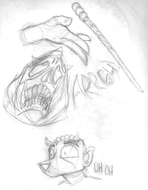
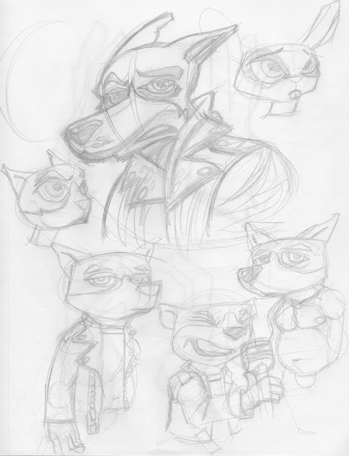
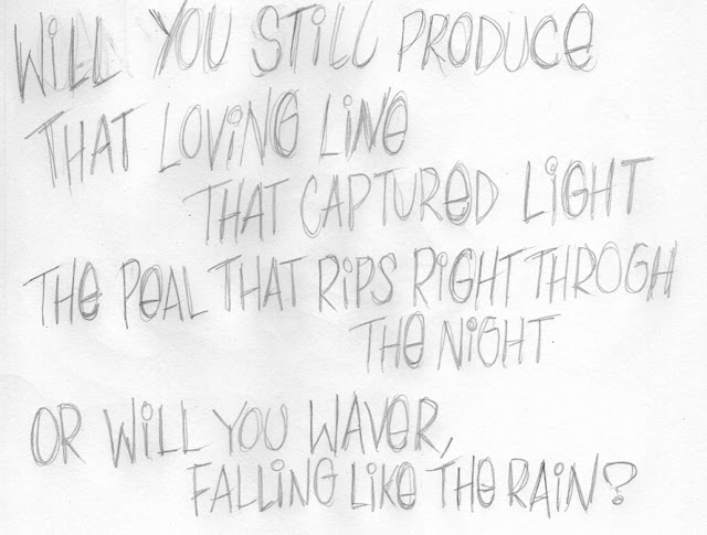
More inking trials on the iPad with different new brushes purchased. For this sketch, shown first, the brush I used before looks far too grundgy though I liked it with digital paint. Other brushes did a pretty good job, in slightly different ways and each time I inked the same drawing, I learned a little more. One of the benefits of this over real ink, besides a lack of smudging, is that the light from the iPad is far less of a glare than that of my lamp and table. That light gets bounced around by my bad eye and makes it a great deal harder to find the tip of the brush. Also, I can enlarge things which makes it a lot easier to get those sharp points. Tonight's experiment was very interesting, to me, in a lot of ways. While there's not a lot of variation in the different results, it shows me that digital inking might be in my future. And I thought I might never make the break. I never will fully. But for quicker production... hmmmm...
Wednesday, January 31, 2018
Monday, January 29, 2018
This is a sketch, nothing special except it's the first time I've inked something digitally where I was actually happy with the results. I found a supply of new brushes for Procreate and have been poking at them a little at a time. Did a quick sketch in pencil of my rabbit-thing character and wondered if I shouldn't try just taking a photo with the iPad and dealing with its finish in Procreate. I'm pretty happy with the results. The inked lines look pretty much like my inked lines. The paint, sampled from a photo, was fun to sloppily slosh on, again with those new brushes. It feels like I'm finally getting a handle on this new tool.
Sunday, January 28, 2018
Nothing much, just messing about with the iPad and some of the new brushes I bought for Procreate. I found someone that makes them the same way that guy used to for PS, though he sold out and now they're only available for people who subscribe to Adobe, not that I'm bitter or anything. To be fair, I don't paint much with PS and AM doing a lot with Procreate so, whatever. There's some good brushes out there and I'm finding the iPad a lot more useful than I thought I would. So, a selfie, Rooster and some Harlons.
Thursday, January 25, 2018

One of these things, Ghiroy 1-20. I put them together to keep motivation up for making the comic as well as to see what everything looks like all together. Like City Silent, I will go back and 'fix' some things when I get to some kind of stopping point. Since this comic is very different and not really planned, I have no idea when that might be. Since it's for fun, who cares?
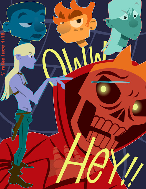
Page 20 of Ghiroy. Went to my old first edition Monster Manual as reference for the kobolds as this comic is very much meant to be a love letter to my days playing D+D in high school. While I still play fantasy RPGs, there's a big difference; they've become more complex with a great deal more attention to plot and character development. I wouldn't change that for the world. Yet there's still fond memories of the goofier days of gaming knocking about my head. That's what this is for. This page was a real collage as I started on a piece of paper with the one kobold, took a photo with my iPad and sketched the second one in Procreate, then sketched elements back on paper that filled in the rest of the page, though each one of those was rotated, scaled and moved about. There's a lot going on, perhaps too much, but I think it gets the point across. Still fun to do.
Saturday, January 20, 2018
A little exercise to see how things look all together. This is a cheat as there are two pages missing, which I'll have to go back and do once the opening sequence is done. Still, it helps to see the flow. Once the final page is done in the sequence, I'll go back and do some fine tuning, make some changes. For example, page 11 has no green filter. Makes it stand out. Will fix that. The figure on page 13 is too thin. Will have to redraw him. There will be more scrutiny and poking. I just have to balance it so I don't slow myself down. This is going to be a LONG haul.
Thursday, January 18, 2018
So this is the stuff that didn't make it into page 19. The original idea was to move all the way into graffiti for it. So I did some more research and was trying to get Howard down in the style of traditional graffiti characters. Something I had forgotten was Vaughn Bodē's influence on these characters, so I went and looked his stuff up as well. While I got some stuff I liked the look of, none of it felt like it was going to work in this sequence. I still need to push this style farther for when we are dealing with the actual graffiti. I'll just chalk this down as research and move back to the thumbnails I already drew for the opening bit.
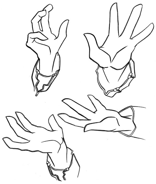
Page 19 of The City Silent. There were a lot of false starts with this one, which I'll document later. Woke up this morning, or was I thinking about it late last night, I don't remember, where I thought of moving in for a close up then decided to go to Howard's hands instead of his face. I think they still tell a story and they're something different than I've done with the comic before. I tried to 'emote' with my hands while taking photos. I think it works.
That being said, there's something that I'm starting to re-think. It's the three fingered hands. When I started "Fite!" fifteen years ago, I was trying to emulate animation as I wanted action. Traditionally, animation uses three fingered hands because it's cheaper and quicker to draw three fingers instead of four. Or so I read. That being said, I can make it work with hands like these, ones that aren't entirely unrealistic and are less cartoony. But should I? It's a lot harder to leave one finger off, to redesign anatomy I don't really understand in the first place. Should I keep doing it? I don't know. When we get to Silas, he'll be using feathered fingers, so I don't know if it'll matter. I threw the question open on tumblr though I don't expect any responses there.
Saturday, January 13, 2018
Thursday, January 11, 2018
Reached my goal of three pages this week, which feels pretty good. Had a thought either in dream or when falling asleep about how to do the text in different ways and am glad to see that it worked. I wanted to keep from using AI, but had to a few pages ago because there are no perspective tools that I know about in AD. That being said, it came to me that I could just do my usual sketching of the words, bend or fold paper as need be, take a photo of that and just use the resulting image as my tracing guide. Worked like a charm. I will remember this in the future as it's far easier than even using a perspective tool in the first place.
Getting closer to the end of this first song. It's feeling a bit claustrophobic in this setting. Howard's going to really let loose before the end and I can get a chance to show a bit more of how I want this all to work. But Howard's section is meant to be the anchor and so has to be a bit more realistic. I'm also getting tired of drawing my leather jacket. There are still two very detailed pages from the beginning that need to be addressed, but I'll come back to them, do final edits and then release the whole thing as a package for download so that people might actually read it. No bets on that.
Tuesday, January 09, 2018
The beginning of the end... or something like that. Was able to redo the text on the first page as I really wanted because now I have the right tool to do so. Don't know why I changed 'overture' to 'prologue,' as this was always meant to be a musical of sorts. Spray paint brushes on Procreate brought over into vectors. Will be using this a lot on this comic.
City Silent page 17. Started the drawing last night, inked it this morning. According to the thumbnails, and I'm trying to learn to trust my instincts, this was meant to be a page without lyrics, a quiet pause in Howard's rant and a chance to re-establish the setting. When doing this, as I often do, I turned off the line layer and decided to move ahead without the inks. When all of it was done, I found I didn't dislike the lines as much as I thought I would so have made a copy of the image with the lines put back in here. I can always decide later. All that being said, I like the way this makes the stage seem a much smaller place, is probably the most 'realistic' representation of the club so far. After this, I think things get a little crazier as we get towards the end of the song.
Monday, January 08, 2018
Ok, I lied. That text was bugging the crap out of me. So I went back to Procreate thinking there must be a way to make a guide. Sure enough, there was. Also found the perspective tool which is kind of amazing. Will have to look into that some more. Anyway, redid the text a few times until it was more centered and straight. It's still rough enough to feel somewhat spontaneous but doesn't look all wonky. Better.
Another page (finally) of City Silent done. The thumbnail for this one simply said, "lyrics with paint-over." Since discovering that Procreate does nifty things with spraypainting textures, I decided to do the lyrics on the iPad, exporting the image and shoving it through Super Vectorizer with a reasonable number of colors (15). Setting them to multiply did the trick. I also wanted an underlayer, one that had graffiti on it that was noticeable as graffiti but wasn't necessarily legible, as if someone had painted over a wall and someone else had come around and painted atop that, much as real graffiti is done.
Originally, I was going to have a layer between lyrics and old graffiti that was a stylized Howard, such as Silas would paint but decided that this would be too visually confusing. Casually dropping a silhouette from page 7, I decided that was the way to go so I quickly posed, made a sketch then a shape in AD. The silhouette is sandwiched between two separate layers of digital 'paint' from Procreate meant to look like that paintover. Pretty happy with the results as it did exactly what I wanted it to. The text isn't as straight as I might like it to be, but it feels like quickly written spray (it wasn't; I did this at least ten times). Next page won't be like this but here's hoping to a better frequency this year on this comic. I'm ALMOST out of the cafe.
Thursday, January 04, 2018
Early, for me, morning character design. The next page of Ghiroy will have a bit of a 'reveal,' and for that I have to introduce two new 'monsters.' Since this comic is based on 1st edition D+D (for those nerds who care), I wanted to base the ancillary characters, races etc. on the descriptions and art from the original books. These are the ones I used in high school, the game that got me into this whole thing. That being said, the source material is...sketchy in some areas, to put it kindly. The drawings were crude in a lot of cases, but they were all we had and we took what we could get. That being said, these guys, Kobolds, were -meant- to be short, lizard people. The artist in question gave them a kind of dog-like snout and scales. I honestly think that Kobolds were designed so that entry-level characters had something they could safely kick around. These guys came out kind of cute, which isn't a bad thing in this case; they're not meant to be frightening at all. They're also not affected by the plague everything else is. Perhaps we'll even see some in town, when we eventually get to one.
These came together rather quickly and easily, which is a nice change. The top image is the sketch page I did on the iPad, the lower is the colored versions done in AD.
Wednesday, January 03, 2018
Another new page of Ghiroy. It's damned cold and snowing out. Perfect day to draw. Started out on the iPad but went to the sketchpad. Drawing the full figure of Mikilo felt a little weird on the iPad, so went to the pencil and it worked out fine. Still enjoying making this comic. Wish it was more popular but that's true of everything.
Monday, January 01, 2018
Well, managed to squeak in a new Ghiroy page before the end of the first day of 2018. Haven't done one since October, but City Silent has been taking front and center, as it should, and there's really almost no way to get much done during the holidays. I was also a little stuck on this page; for some reasons, I just couldn't get it down. I think I was trying to make it more complex than it needed to be. That being said, I was able to literally whip up a simple layout on the iPad, then get the thing done, all in about two hours. Which is nuts. It works, and the comic remains fun to do. No one reads it, but that's ok. All my art's for me. Something else to work on for this year. Also trying to think of this more as a cartoon. Will see if I can't structure it that way. Personally, I think the show would do great. So Cartoon Network, give me a call!
First post of the new year. I guess I wanted to start on a productive note. I like and don't like the photo format of this. It feels more complete and less cartoonish at the same time. This one's not too deep, either, almost a place holder though it's also true. Today's not a bad day. Had a good time at a party last night, and, at least right now, I can see moving forward artistically. I have a lot of new, good books to read (including Chris Ware's Monograph, a book on artist James Jean, the art book for Coco and, well, the books from the last page of this comic). Am also re-reading "7 Days in the Art World," a very interesting book about what the Art World is like behind the scenes. Murakami was the focus of one of the chapters, which is how I even heard of him in the first place. Lots to think about, which is good. Reaching constantly out for new facets of art and how people see can't be bad, unless I allow it to shift my focus or lose it entirely. I do have my little side trips. Otherwise, we'll start the 12th year of this blog, the longest journal I've ever kept on what's at least not a downer note. Let's get making.


