Tuesday, December 31, 2019

It's that time again, year's end (no card this year) where I look back on what I accomplished, what I didn't and try to make sense of this whole thing. There are more entries than 2012 but I fell short of last year by quite a lot. I started the year with pages of Ghiroy and City Silent and both of them petered out to a dribble then a stop. Ghiroy is still the least popular thing I've ever done and honestly, it's more work than it was ever meant to be. I love drawing the characters, but it was only ever meant to be a quick and dirty little D+D comic. I never seemed to be able to keep it down to that; it always got more complicated, they style kept changing and I was redrawing a comic I'd already started twice before. Will I come back to it? Maybe. Answer hazy, try again later. City Silent... that's a whole other thing.

I am disappointed that my drive for that comic seems to have really come so close to a stop. I don't really know why I had this huge, six month hiatus on it. I really do hope to get back and finish it. There's a lot of passion in that project and I do want to see it through, even if no one ever reads it. I still think there are pages where I achieve beauty. And there's really nothing visually like that I've seen. I feel like I'm breaking ground but no one else seems to think so. We'll see.

This year saw the return, briefly, of Harlon. That strip worked for its time. I have no regrets about making the new ones, don't feel I need to add more. It took the place of Biograph this year and that's fine. Biograph and Harlon are nearly the same thing. Might or might not so more journal comics next year. Often, I just don't feel I have anything to write about.

What DID happen this year was that I kind of went nuts on portraits. Part of that was finding the show, "Portrait Artist of the Year," on YouTube. It's a British competition show on painting, something we'd never get in the States. And it really did inspire me. I did a whole bunch of portraits, especially towards the end of the year. I made a lot of prints which are now hanging in my house and I think they look good. I'm still experimenting which is healthy, moving from abstract to more representational. The only sad part is that I think the portraits are things my mom would have liked. She never cared for the comics or the abstract stuff.

I did tons on the iPad and it's become my go to tool. I still had the pencil and pad out here and there, did one inked drawing, did a couple large sized paintings with real paint. I got some clay and tools and will be playing about with sculpting as well as, again, I found videos that inspired me.

On top of all this, I've continued to do the podcast with my best friend. Before 2020 is half done, we'll hit the 100 episode mark which, to me, is pretty great. We don't have a lot of listeners but we have some. At the very least, it's something I get to do every week with Max. It's worth it just for that. I'm also still gaming and in one of those games, playing a Bard, I've written two 'songs' which aren't horrible. I think they'd actually be considered filk songs which... I'll just leave that there.

So 2019 was not the most productive year I've had. I still think there's some pretty solid work there and, as long as I'm moving forward, I'll be content. Here's looking ahead.

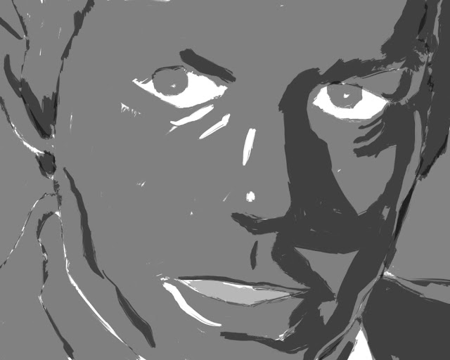
If one is good, two are better! What the hell am I doing on the last day of the year? Well, I've been thinking about an extended approach to the current 'style,' if style it be. Instead of just the one view, I'd do three, trying to capture a little bit more of the subject. I'd want to do this with a person and not just some actor but that's what I had to work with. I've done trios before, but it was a long time ago and wasn't a portrait at the time. But if I could capture three moments of a person, I think I could have something. So here are the first two of this guy. We'll see what the completed version looks like in, well, the coming year.

Monday, December 30, 2019

This one was made from a still frame I took off an episode of "Ultraman." He's a ubiquitous mad scientist of sorts. As I was drawing him, I started thinking about Japanese demons or oni, one in particular that has gold eyes and teeth. I thought he might look cool done in that palette, so here he is. I think he works pretty well. There's a slight cartoonishness to him but there's also a pretty penetrating stare. Tried to make the lines more harmonious, letting them stray from what was truly there to make a better composition and I think it worked. Another one for the series.

Thursday, December 19, 2019

Quick and dirty experiment before I record this week's podcast. Took a random sketch of Smatt from my sketchbook and adapted it to the current style. It worked better than I thought it would and I think it would look really good at a very large size. Hmmm.

Worked some more on the Basher image as there were things that bothered me about it. First off, the mouth didn't make a lot of anatomical sense, though that is a problem with the mask. So I widened the opening of the mouth to accommodate the tusks properly, filled in the teeth a bit more, added a filtrum below the nose and brought the nose more together at the bottom. Also, the two straps and buckles were of very different sizes. While that might be true in the photo, it bugged me enough to change them about.

These days, I tend to use Procreate for my sketches but as I'd used my iPad so much that day it was out of power when it came time to do this one. So I pulled over the sketch pad and did the old grid. Worked out just fine and proved that I can still just draw when I need to. The iPad is just a tool, not some magical device that allows people to draw with no skill.

I post this totally just for myself. 11 days ago, I tried something new. This is what I made in that time. It's enough for a small series on its own. And I can see making more in this style. In fact, I want to though I need to take more photos myself as that's part of the process. This means more subjects. We'll see. Regardless, it's more work than I think I've ever completed in as short a time.

Wednesday, December 18, 2019

Damn, this never happens. Got a third done for the day. To be fair, I haven't gone over it with the usual comb, but still, managed to get it mostly done. This is my cosplay orc, Basher.

Tuesday, December 17, 2019

Two for today. Managed an adaptation of a Vincent self portrait and then an image of Silas both in the current style. Pretty happy with both. I can see why it might not impress people as they style makes the image look simple and simple = easy for a lot of people. There's a LOT of fiddling around and the sketches are very sketchy. Tons of editing done as I'm making the lines in AD. That being said, I think I should do at least one of these in an actual painting. We'll see.

Monday, December 16, 2019

Another Shin Hanga series portrait, this time of my friend, Matt. I think it's the most successful of the bunch so far. And he didn't hate it, so that's good, too!

Saturday, December 14, 2019

This one was more of a struggle, though I don't think that shows in the final version really at all. This is a portrait of John Ruskin, a major figure in the British architecture gig. I was watching an episode of "Landscape Artist of the Year," and saw an image of him flash by. I liked his look enough to do a search, find a photo and do this. The likeness was a bitch, at least in the penciling part of it. Strangely, it really came together in AD. Part of me wants to make real paintings of these, or one in this style. Another part of me wonders if I only want to do that to appease the art world which is still not ready to accept digital art as anything real.

Thursday, December 12, 2019

Another one in this Shin Hanga sorta kinda style. These were prints made in the early part of the 20th century and show a distinct influence from western art. There was more detail, images were more representational and there were, sometimes, uses of shadow and highlight to further develop an idea of form usually missing from Japanese prints. For me, it's the balancing act of minimalism that seems most interesting, deciding what details should be present and how many I can get rid of without hurting likeness. For example, there were originally highlights on the glasses which I took out. When I looked at some actual prints for reference, those details stood out as unnecessary, visual clutter. While I might want to add shadow, I don't because it doesn't really add to the design and here, I get the feeling that the design, the image is more important than is reality. Or so I pretend. Anyway, a fun exercise.

Monday, December 09, 2019

Second in a series? Tried to look a little more at the 'Shin Hanga' format, figure out where I might play with its rules a little. Since I'm neither Japanese nor a woodblock print maker, I figure there's no reason not to experiment. In this case, I thought to do Van Gogh. While he made a lot of self portraits, I decided to look for photos instead. As it turns out, there's only one, taken when he was likely a teenager. Using that as a base, I adapted the color palette from one of his later self portrait paintings. I think that Shin Hanga didn't always have black lines as the color on their key block but I don't know that they went so far afield. I'll have to look into it. While I sampled colors at the start, I don't think any of them stayed the ones I took from Van Gogh as there needed to be more of a balance. I think it's pretty successful and I could totally see doing a series of these. We'll see. I seem to be allergic to prolonged bouts of style.

Though the original looked well enough, being started at work, I hadn't made the file of the right size in case I wanted prints ever made. (Or hell, if anyone else ever wanted them printed...) It seemed obvious that I could remedy that if I remade the file in Designer. So I did. A few tweaks were made, but I didn't change much at all. There is a signature stamp down there which is likely a bad idea in that it brings back the old T', Thomas Blue name which I haven't used in a long time. Then again, maybe I should split some art off from others. Whatever. I don't have to answer to anyone.

Saturday, December 07, 2019

This is the portrait copy I referenced in the last post. Another work demo, about 45 minutes.

I've felt like I've been in a kind of artistic hole lately. I started trying to sculpt clay and found that, while the idea of the shapes is easy in my mind, doing the actual sculpting is not. Nor should it be as I've never really done it before. That and being sick has made me feel like I'm not capable of making anything of worth, beauty or quality. Looking at other people's successes online wasn't helping either. Tonight, I had a chunk of time in front of me, a want to do something creative and quite a few things I could be working on. Indecision often leads to video games and then later, more guilt. Instead, I pulled out the iPad and the Rembrandt I'd copied recently (which I suddenly realize I haven't posted) and re-interpreted it in the style of one of my favorite Japanese woodblock artists, Natori Shunsen. His is a very minimalistic style leaning towards realism. I thought it might be a fun exercise to take something complex like a Rembrandt painting, which is all about light, shadow and texture and make it something almost exactly opposite. I think it worked pretty well. It's almost TOO simple in a way and looks, in some ways, 'easy.' Nagel had that problem and I think his stuff very quickly went from fine art to shopping bag. It's a really fine line because you want the work to show but not for the work to look anything but elegant. Don't know if I achieved that, but I like what I did. The pencil sketch I inked over is below. Made me feel good to do this.

Friday, November 22, 2019

Haven't drawn anything in weeks. Bronchitis has made my energy levels low and I haven't really felt like making anything. I've been content to be a consumer, sitting and watching things or playing video games. I used to wonder if I even COULD become just a consumer instead of some kind of creator and the idea seemed impossible. Maybe it's not so impossible. Apathy can really grind you down over time. I have seen two operas recently, one I hadn't seen before (Madame Butterfly, via the Met) and one I had (Magic Flute via Bergman). It has made me think about "City Silent," making me realize that it needs to be restructured as the interaction between the main character and, say, ANYONE is kind of important. That being said, I haven't done anything about it at all. The other day, I did make some sketches including this page of Mickey Mouse which I did for reasons I can't fathom at all. Never really drawn him before and don't know why I did this time. I did then sketch Smatt, Terry and Digby whom I miss and I have been toying with the idea of working something out in clay, but so far, haven't moved on it. Maybe it's partially because the holiday season is upon us and I have really learned to hate this season, being in retail and all. Just want it to be over. All obligation, no rest.

Sunday, November 10, 2019

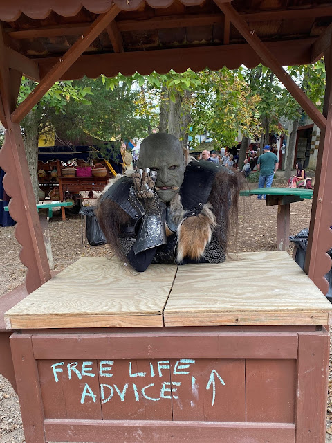
Though sick, I managed one more outing as Basher this year. Went to a Halloween party with my partner in full orc costume. It was nice and cold outside, a little warm inside but we wowed them and won a costume contest. That being said, I think the highlight was the photos taken outside on the deck by the fire. My partner managed some really good shots, of which this is one. The costume is now officially away for another year.

Thursday, October 31, 2019

Haven't done a portrait in too long. I took some reference photos while in Boston, some snuck during lunch with my old boss, Tony Davis. Did something a little different with this; it's in very subdued colors, mostly blue-greys but then threw a layer of bright blue to bring up the overall contrast and tint it. Then went back and accentuated some things in the shirt. The hard part is to stop before it gets overworked. Might have gone half a step too far. But I am happy with it. Wanted it to have a kind of jazzy feel, as Tony is that kind of guy. We'll see what he says.

Wednesday, October 30, 2019

Haven't really been drawing much since I got back from Boston. Feeling lazy and then sick, which I still am. Haven't done inktober but for the one quick sketch, which was satisfying in its own way. Haven't done a skater in forever. So I penciled something quick then photographed it and finished it in Procreate. This, too was satisfying. Not great, but something. I need to use the turpentine brush more, and in fact, this might help me on a portrait I was working on and struggling with. So, Smatt to the rescue.

Tuesday, October 01, 2019

This sort of counts as Inktober as the initial drawing here is a kind of ink. Trying to do a very large scale painting of Basher; 32x40 inches on canvas. This photo doesn't really give an idea of scale. Penciled a grid, did a sketch, inked with a kind of graffiti marker I ordered online called Krink. It's alcohol based, permanent and doesn't smell. I think the canvas really ripped up the felt head and I'm not sure how long it's supposed to last. I plan on taking this out to the garage and using house paint on it. We'll see.

Haven't touched real ink in probably a year. Maybe more. When I had cataracts, not having any depth perception made it almost impossible to ink with a brush or pen as I could never tell when they were about to touch the paper. Too frustrating. So I put my table and lamp away and went digital. I don't regret it and I don't regret doing work with the iPad. I've been able to grow and learn a lot that way and I'm not cluttering up the house with extra stuff I don't need. And I think my work has improved because of it. That being said, I do miss the brush, the black ink. So I pulled out the pad, pencil and brush and did a quick sketch from an old Frans Hals painting. I was very happy to find that I hadn't forgotten how to ink, that I could see just fine. I hadn't lost anything. Of course, I also smudged and got ink all over my fingers but that's part of the charm. Don't know how far I'll go with Inktober this year, but I'm glad I did at least one.

These are the final photos of cosplay this year at the local Renaissance Faire. That's me as Basher, the friendly orc that hands out treasures to kids and poses for photos. There's one in there with my partner, Corso. The armor is real and heavy. In the rain? Heavier and stinkier. The last day of the faire had pouring skies and we loved it, had a great time. People weren't leaving and kids that were sad were made just a little happier when the scary green guys handed them some trinkets and or took a photo with them. In one, Basher is pretending that he's friends with a mermaid. My favorite is the center one, taken in the parking lot just before we shucked the wet armor and went home. It was a great day and a lot of fun. That armor, 50-60 pounds and that mask, a full head, silicone job weigh a lot. It's still a good time and we had a lot of people tell us that they remembered us from previous years and/or show us photos from before. Very glad we did it and also glad it's over for the year. Wish it was cooler all around, but it's a blast. See you next year, Basher.

Tuesday, September 24, 2019

Yet another abstract. This one probably needs to be adjusted as the layers aren't so visible as they should be. Easy enough to do. Sometimes, I like to paint just to paint. Can't make any more prints, though; we're out of wall space.

Thursday, September 19, 2019

Likely the last work demo for awhile. With new items coming in, I don't imagine they'll want me drawing so much. Did another Rembrandt as I find him challenging and relaxing at the same time. Procreate.

Saturday, September 14, 2019

This post looks a lot like the last one. I did some touching up of areas that were not nearly dark enough. I didn't want to mess with the energy of the painting so really just sought to add to overall contrast. Didn't take long, but it was what the painting needed. 28"x52", latex paint on canvas.

Thursday, September 12, 2019

I've wanted to do this for a long time; go and get real paint, canvas and do something abstract and big. This isn't done but I had to stop to let it dry as all I was doing was making everything grey. Black and white house paint on canvas, roughly 28x56? Not sure. It's fun, daunting and awkward at the same time. No undo. Messy. I don't really have a proper studio for this, it's just the garage which is fine for now but in as little as a month won't be suitable. It was hard getting into the movement, getting what I wanted and I didn't think I even liked it all that much until I left it alone and walked away. Now, it's growing on me, showing me some of that graffiti-vibe I was hoping for. SO different from digital. Not better, worse, just different. Will take more photos when I've done more. Oh, and my drips are real, not added for effect.

Wednesday, September 11, 2019

Sometimes stuff just happens. I had an hour at work the other day where no one was coming in to learn, so I did one of my usual work demos. This was just messing about, doing some more graphic abstract stuff based on the old Lucco-speak. And I liked it. And I took the iPad I was using, put it back on the rack and forgot about it. And that image bothered me for two days until I went back and made sure to airdrop it to my own iPad and bring it home. I'm doing an experiment where I upped the DPI and am having a print made. It shouldn't work but the file looked ok. So we'll see. And if that's the case, that it does work, I have a couple others I thought couldn't be printed that will be.

Thursday, August 29, 2019

I am amazed this page came together as quickly as it did. I started it after dinner, after an episode of "Face-Off" with my partner and still got it done before 11. I did take a reference photo the day before, but still, I'm amazed. And I'm really happy with it. Even though it's a 'filler' page, one meant to show movement, action only and gives a break in the song, I like how it turned out without really any prior planning. The way things fit came as I made each piece. Once in awhile, things seem to just WORK.

Tuesday, August 27, 2019

Six months between pages. Well, it happened in Tamino as well. Maybe I needed a break, maybe I needed to deal with things, maybe I had to wait for that fire to re-light itself. Don't know. While there's no audience for this comic, it's nothing new with the rest of the catalog either. Maybe I've come to better terms with that and can continue on. Because I want to see this done. I still believe that this will be my last long-form comic. This page is one of the reasons; consistency is not one of my strengths and the difference between this page and the last is rather stark. Looking back at the comic as a whole, it really stands out. Well, so be it. I'll embrace that. I changed materials; none of this was done on paper and it went a lot more easily. Procreate has become my main art-making tool. I'm sure at some point I'll have some kind of issue with that, like finding old drawings whose ink has faded or turned color. Nothing is forever. For now, I hope I can keep going with this. 61 pages in and I've only just got started.

Thursday, August 22, 2019

Late last night, morning abstract. Been watching people make abstracts on YouTube and I kind of missed it. I miss real paint a bit, too. While the iPad and Procreate are awesome, there are things that feel utterly different with paint. So there may be some rolled canvas and house paint in my future. My sister liked this well enough that she wants me to make a print of it for her. So... success?

Friday, August 16, 2019

Did a test fit tonight. This is the new Basher, minus the black makeup around the eyes and mouth. It's HEAVY. Think it looks good, though. I'll do a follow up tomorrow after I've died. :"D

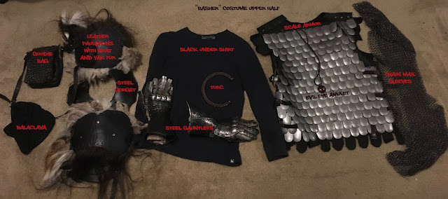
It's Orc Season Eve! Tomorrow is the first day of the local Ren Faire. My partner and I will do our usual cosplay which is somewhat involved. For whatever reason, I've never documented the whole costume. I changed almost the whole thing from last year. The only parts that remain from the old costume are the pants, boots, mask, gauntlets, chain and goodie bag. The armor, kilt and shoulders are all new. This adds a lot of weight I managed to strip off but I think it helps Basher look more rough. The Lorica and cloak I had made him look too clean to me. We'll see how it goes. There's usually some adjustments along the way. The kilt is the only hand made part and it was a pain in the ass. My partner did most of it. He also did most of the initial grunt work in drilling holes to attack the yak and goat fur to the pauldrons as well as the padding that will make Basher look about twice as broad as he actually is. It's all good fun. And we get a lot of people who want photos. This year, we got one more fan than we knew about: the Faire itself. My partner texted me this poster the Faire is using to help sell tickets. Makes me kind of tingly to be noticed that much. And before anyone asks, no, there's no compensation for this and that's fine. We don't want to be beholden to the Faire in any way. Then they get to tell us where to be, what to do. We go as customers, not workers. That way, we're free to do what we want.

Sunday, August 11, 2019

I started re-reading the Sandman comics. It's been a long time. Decided I wanted to do a quick sketch of Dream. Since I'm the easiest model for me to use, I used me. Quick, easy sketch and it worked out pretty well.

Thursday, August 08, 2019

Finally finished this after having a whole day of bad attempts. I kind of wanted something very painterly but it just wasn't coming together. Sometimes I think the image knows what it really wants. After looking over my recent attempts at portraiture, I saw that I was going back to lines, something that has been central to what I do for a long time. So I inked the sketch instead of painting it. That was a misstep but I came back and inked it again and this time, I think it worked. Something came to me either in bed or the shower, two great places to get some thinking done. I decided to ink only him to help him stand out. All the rest of the shapes were done separately in Procreate to keep those nice, textured strokes. This tested Procreate as I went way past the limit of 14 layers at the size and DPI of the file I was making, so I had to keep making marks, exporting then clearing layers to get it done. In the end, the folder with stuff made for this holds 65 elements from original sketch and brushed shapes for shadows, highlights and details to the vectorized versions of the same. Once I got the process down, it actually went pretty quickly. I wanted to spend the most time on his face and make the rest of the details less defined. I think it works. For the palette, I sampled colors from one of Rembrandt's self-portraits. I do love brown but wouldn't have otherwise chosen it as with the inked style, I tend to lean towards brighter and less natural colors. I think the browns work well here, even if I cheat and use them for things they wouldn't really represent, like the lights. Overall, I'm pretty happy with it. Dr. Hutchinson, though, won't let me hang it in the house. :"D

Sunday, August 04, 2019

After having watched all those portrait shows, having ordered a really good book of contemporary portraits ("500 Portraits; 25 Years of the BP Portrait Award")I wanted to try something with a lot more background to it, something more of a scene. As it turned out, I had managed to snap a photo of my partner while on a crowded T train when we were visiting Boston last year. His expression seems rather vulnerable and candid. It's both him and not him and I really wanted to paint it. So I spent a bunch of today working on the drawing. Just had time to start with the digital paint tonight. I think it's going to be black and white with only slight color but we'll see. Here's the WIP.

Thursday, August 01, 2019

Two alternate views of the Straker image. One has just the grey parts, each used for a different color in the final, and the other has the grays and the black lines of the portrait. There's something to be said for all of them.