Monday, July 25, 2016

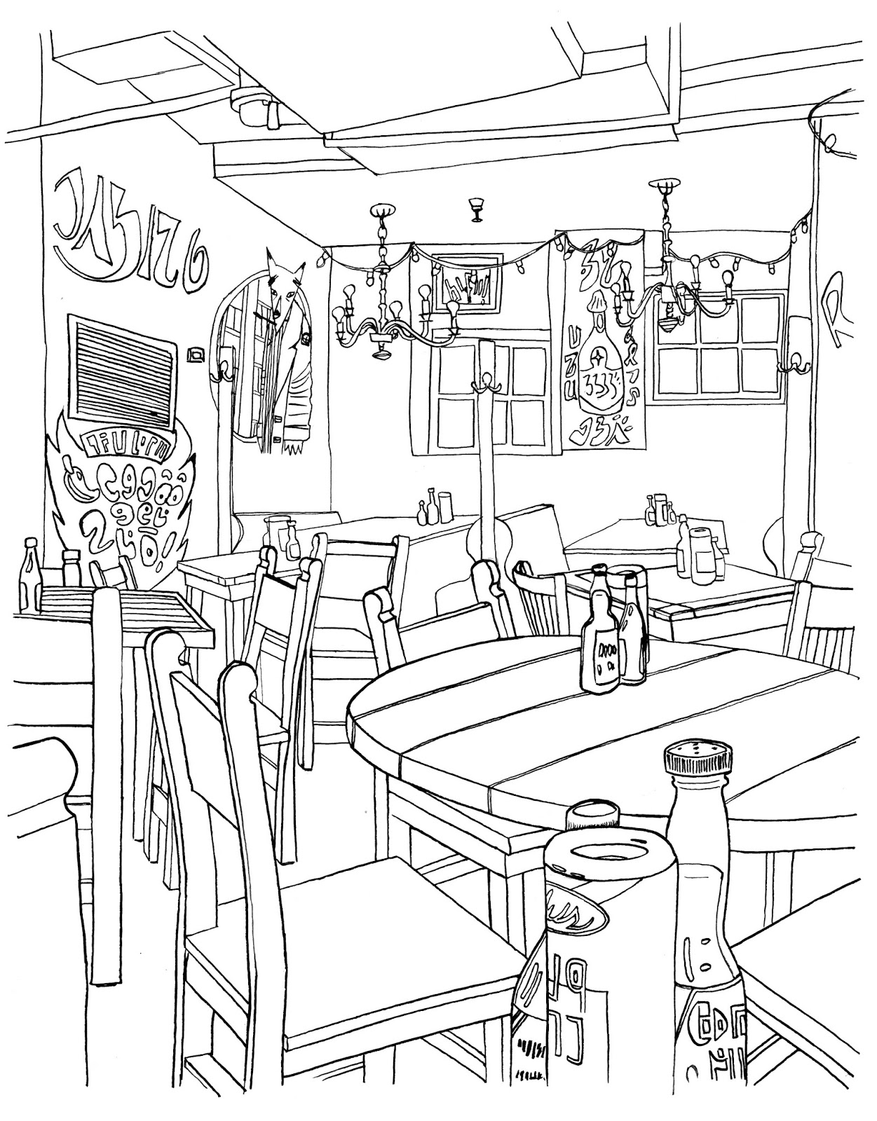
While I might do some final tweaks with this one, I think it's pretty much done. Made a lot of editorial decisions since the last version, not least of which was to cool down and darken the background considerably, warm up the foreground and tone down the color in the condiments at front. The photo I took at the Border, which was strangely empty, something that rarely happens there, is at top. The inked images I used for characters and background are next. I do them separately because it leaves me options for editing later on. I made a grid over the photo in AI, made another grid on paper and freehand drew it which helps things stay a little wonky. Wish I'd done this for the Tokyo print but live and learn. While that one was twice as hard to do as this one, it had more to do with my bungling of my own workflow. So this will be another in the 'print series,' which is just me doing some more detailed stuff to possibly sell later on. I like the big prints and once you have something done in giclee, it's kind of addictive. Not sure what the next one will be but I might go looking through some of my Europe photos and try to come up with something. There's lots of stuff, especially in Italy with tons of small details to obsess over.

Saturday, July 23, 2016

I've been working on this a bit here and there, mostly today. Pretty much all the color has been done, though none of it is final. If you compare this version to the last one, there have been some obvious changes. I both darkened and cooled down the background, swerving from the original reference photo. I'd like to make this more representational but the layers of different lighting colors and strengths would have made that, I think, rather unpleasant in this form. I also warmed up the colors of the foreground characters and I think they have more punch. Still to do; the lights along the sides of the alcove, perhaps some enlarging and cropping and final color balance. Still, it's 95% done.

Saturday, July 16, 2016

"New WIP of this image. Did a lot with the background which likely doesn't show so much. Decided to erase most of the background lines, especially around the light bulbs. The color palette and balance is going to be key with this, and currently has a warm-medium overall tone for it. What's going to be most challenging is keeping the characters forefront, separate from the background but keeping the whole image coherent.

Friday, July 15, 2016

A work-in-progress shot. I wanted to do the bricks without line work as I think it would push things back. Though I drew the signs and paintings with lines, I'll end up pulling them out when this is done. So the back wall will mostly be just done in AI. The colors for the characters aren't final, they're more like placeholders. The back alcove will also, I think have a shading layer over it to further set it back and for the lights to show up better. Already I have better feelings about this one than the last version.

Tuesday, July 12, 2016

Two things; first off, this month marks the tenth anniversary of my blog here. I have no idea how much longer I'll keep doing it, though I have no plans to stop. The internet has changed so much in that time and blogs are pretty much passè which I think is a damned shame. Everyone's moved on to things that last less time and which require more and more content produced with less and less care. Must mean I'm old. Still, I'm pretty happy with the fact that I have a decade of work here, and a record of how it was made and evidence of my progress. If no one else reads it (hi, Vince!), I will.

Then there's the image above. It's a new version of the Border cafe image. After the one of the comic shop, I realized that the reason the old one was stalled was that it was just too dependent on technology and trickery to make it work. Since the Tokyo image was all Illustrator, I thought this one had to be, too. Thing is, the Border, like the comic shop, has a kind of shabbiness that's must harder to achieve without lines. So I redrew it and changed the characters out. And I'm much happier. Progress has been much faster and I think it will make a decent print when done. So far, I have the characters and background inked separately, put together in AI and I've started coloring the African Wild Dog part. Didn't really think about the species per se, but what we have is a predator/prey situation here which, I think could have a lot of connotations impressed upon it. And that's fine. Today's political and social climate could be said to be reflected in something like this and I won't deny that there could have been some influence on me. Or it's just a furry drawing of a wild dog and an antelope in a Tex/Mex restaurant in Cambridge.

Wednesday, July 06, 2016

Got the test prints back from the printer yesterday and they're delicious. What I mean is that the quality of the print job is amazing. They look like screen prints. I got them made at 16x20 which is four times the original size. Usually when you blow something up, it gets weird, jagged or the level of detail doesn't match. This time, I think it works fine. I don't think the final image would have really benefitted from being drawn at full size, either and that might be a product of having been turned into vectors. I think I might continue to make prints like this, in very limited editions at this size. Seeing work like this is a totally different experience than looking at it on screen. While I made small prints of earlier works, the larger size makes quite a difference. I'm dying to see the Tokyo print like this as that one's even more detailed. They're not entirely unlike paintings, in a way. I think I won't make more than 10 of each one, maybe fewer of those that aren't as 'appealing.' The Picnic one kind of had a built in audience. Others will be harder to sell. We'll see.