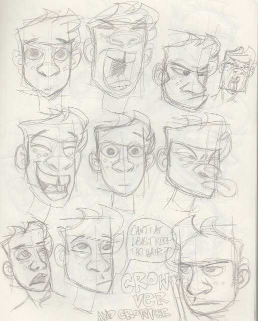
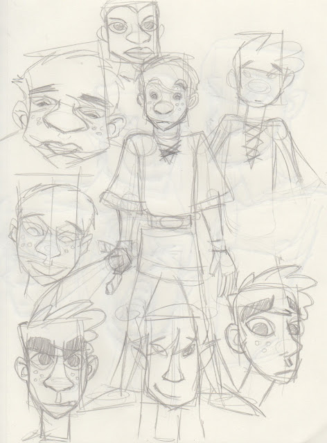
More of this crap. Foozer is the name of the comic I'll probably never do, but there's no character that's actually named that. Strangely, this comic will work best, I think, when I don't think at all about it. No sketching, no plotting, just DO. Harder to do when sober. Well, we'll see. The characters are strangely soothing to draw. It's all meaningless. Just fun. So be it.
Monday, April 13, 2020
Remember when I said no more comics? Ignore this shit. I got in a mood for Vaughn Bode stuff the other day, even though I've never read it before. I just remember selling it when working at the Picnic. But there was a freedom of the earliest of underground comix, where one didn't have to plan, one just did. And I was looking through some of my older stuff and came across Joe Flash, a character that only I liked. I wondered if I could do stuff that had no real plot, no point, was just kind of hippy and fun. And I -might- do this shit and post it under a different name, not tell anyone and just make it because it's fun. I hope it gets a lot weirder than this, and more pointless.
Sunday, April 12, 2020
Friday, April 10, 2020
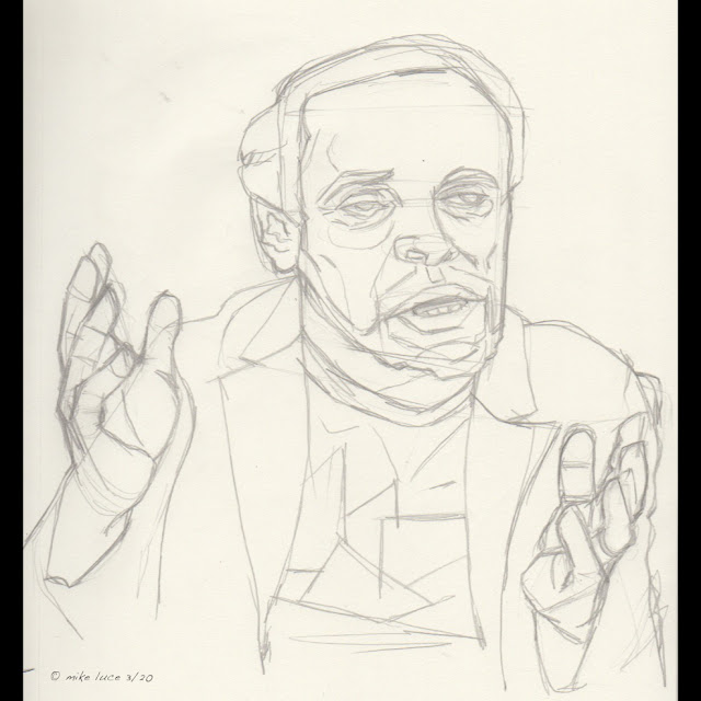
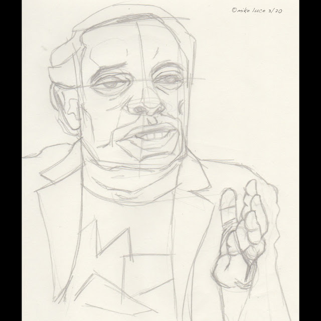
Tonight's sketches. Sometimes, I just want to draw to draw. Tonight was one of those nights. Wasn't time to work on the painting but I still wanted to do something artistic. So out comes the sketchpad and pencil. I started with goofy little doodles of nothing, really, went back to an old character and ended with a portrait sketch of another artist I still framed. Might paint him, too.
Thursday, April 09, 2020
Still working on this portrait with yet another version. I ordered a set of four paints through the mail and they came today. Worried that I might just like the idea of painting more than actually doing it, I used the sketch I did yesterday, married it with the original sketch, printed that out and transferred the drawing to a canvas board I happened to have. Most of the night was spent just getting the outlines done, then getting the whole thing covered in paint. After that, I started doing some observation and dabbing colors here and there. The Zorn palette (just black, white, yellow ochre and cadmium red light) is really tricky to work with. The black is the only remotely cool color. Greens, such as the grass behind him are impossible. What was interesting was that, just as I put the brush down for the night, I realized that I was able to get a very bluish grey on his jacket. Lots of work to be done still, not least of which is learning to use this palette. Also might be one of my best starts ever with real paint. Which means I have plenty of room to screw it up tomorrow.
Wednesday, April 08, 2020
Tuesday, April 07, 2020
Two updates
Continuing on with this portrait. I did one on the iPad in a more painterly style, which I liked. Then I decided to experiment with lineless version in Designer. I like the designer style; it something I often find by accident when working on a piece that has inked lines and I turn the line layer off. In the case of a print I did a few years back, I decided I like the version without the character or inks better and so posted it today:
I think, in this case, I need to adjust the drawing as it looks a little too cartoony for me right now. That being said, I think I want to paint a version like this.
Monday, April 06, 2020
No more comics.
Does this mean I'll never do another comic, ever? Don't know. But for now, comics are not going to be on my docket. I love the ones I did, glad I finished the ones I finished, feel badly about the ones I didn't. Now, it's time to move on.
Saturday, April 04, 2020
Friday, April 03, 2020
Thursday, April 02, 2020
Been watching a lot of "Landscape Artist of the Year," and I realize I could probably use some practice in observation and strict paining, meaning no sketch or anything. So, this afternoon and this evening, I did just that, using a cheap little kids mask I had hanging around. iPad and Procreate and looking.
This is also an experiment with palettes. I've been reading about the "Zorn Palette," based on the artist of the same name. It consists of only four colors: Yellow Ochre, Cadmium Red Light (originally Vermillion), Ivory Black and Titanium White. Great for portraits, apparently, terrible for everything else that might have actual blue or green in it. Since the mask was red, black and yellow, seemed appropriate. Tried mixing colors on the page using the blending tool but it ended up being too awkward, so I tried to only 'add black,' or 'add white' or some such while painting. Wish there was a different way to mix colors but that's me trying to make one tool act like another.
Tuesday, March 31, 2020
Monday, March 30, 2020
It's not Billy Crystal but I like the image. I started with a number of sketches and approaches. One of them was the usual inked version, one was big areas of watercolor like texture. The final, because I'd seen someone on Instagram do this, was more of a traditional approach using a brown-scale underpainting, building color up on top of that. It's not a good portrait, and I'm ok with that. I think the approach is worth remembering. Again, I like it. And I suppose that's a good thing.
Thursday, March 26, 2020
Tuesday, March 24, 2020
Got to work on the next portrait because why the hell not? Was watching a video with Billy Crystal in it and I paused at what is not the most flattering frame ever. But something attracted me so I took a screen shot and, tonight, started a sketch based on it. Already started inking it in Procreate. We'll see how it goes from here.
Monday, March 23, 2020
Even with the shutdown, shut in, whatever I haven't done a lot of art. Instead, I've been cleaning the house and playing Animal Crossing. Well, there you go. I've been rewatching painting shows and finally dug out some old work I that I liked but which didn't sell. Always liked the Giacometti portrait I did for my one show. I kept the reference so here's an updated version of the same thing. Procreate.
Sunday, March 15, 2020
Thursday, March 12, 2020
Thursday, March 05, 2020
That third panel was a problem. Thanks, Vince for pointing it out. When I read your comment and looked at it the next day, I was really unhappy with it. So I changed the angle and redrew the whole thing. I think this works better. I especially like Crow's face in this as it has a mix of youth and weariness I was hoping for. Also, there's a slight feel of the sinister with the goblin even though he's just a waiter.
Wednesday, March 04, 2020
Monday, March 02, 2020
Had a hard time drawing tonight, though I figured out the problem; I was leaning far too hard on the photo ref. After about six tries on this one pose for Crow, I gave up and decided to work on the goblins, in this case, a bartender. First shot and I was happy with it. So here's a sketch of what a goblin in Ghiroy will look like.
Saturday, February 29, 2020
This is more like it. Got a comment from someone yesterday that the brown lines from the promo piece were worth keeping. I'm using that poster as a kind of key to how I want the whole comic to go. So I redrew this, dumped Mikilo for the moment to concentrate on Crow's loneliness. Pretty happy with it.
Thursday, February 27, 2020
So the last re-design of Crow got a resounding "ugly" from two separate sources. I don't see it personally. I liked that design. Kind of a lot. And while I don't think the hero has to be some handsome hunk, I do need him to be at least appealing. So I tamed down his eyebrows and his janky teeth (not seen here), put back his original hair and made this. At this point, I think I honestly don't know what other people like, because I like this style a lot.
Wednesday, February 26, 2020
Tuesday, February 25, 2020
Learning to draw like myself. Been trying my favorite pastime again; re-designing Ghiroy characters. This year, I really want to try and make a go at SOMEthing I do. I turned 55. That seems pretty damned late to leave things if I really want to accomplish anything artistic. Ghiroy seems my most likely candidate for any kind of commercial presence. D&D is big right now, bigger than it's ever been. Strike while the iron is hot. Thing is, because of all the styles, I find I don't really know what my style is. I try and adapt, playing with styles that are more iconic and lend themselves more towards toys and cartoons. But are they really mine? So I sketch and sketch and honestly get nowhere. I LIKE a lot of the designs I've done but I have to stick with ONE and try and make it work. I've seen a lot of other people make do with less. Perhaps one of the reasons Ghiroy hasn't gone further is that I keep re-treading old water. I have to, this year, promise, pick a damned style and stick with it no matter what. If the comic doesn't succeed, I'm no worse off than I was.
Friday, February 21, 2020
Sigh. Ghiroy is a constant problem for me. I THINK it could be something, especially since D&D is kind of huge these days. What this comic needs to be is appealing, simple and easy to produce. So far, I've not had any of those things. Today, I took ten minutes before work and just doodled the main characters on the backside of another sketch. Things came easily and are relatively appealing. There's a Disney quality to them I'm not totally proud of but mainstream isn't so bad a thing to aim for if I'm trying to get people to read the damned comic. I really feel for anyone that's given Ghiroy a try; I am a TERRIBLE cartoonist when it comes to consistency.
Thursday, February 20, 2020
Let's see if this works. Process video of a work demo. I can't show the reference photo as it's one of the demo photos in the equipment we use at work so is likely copyrighted. Didn't use anything but observation for this one. Started off doing Mikilo but didn't like it, wasn't inspired so went to portrait mode. You'll have to trust me that it looks like the guy.
EDIT: Nope. You just see the final. Oh, well.


