Saturday, December 19, 2015

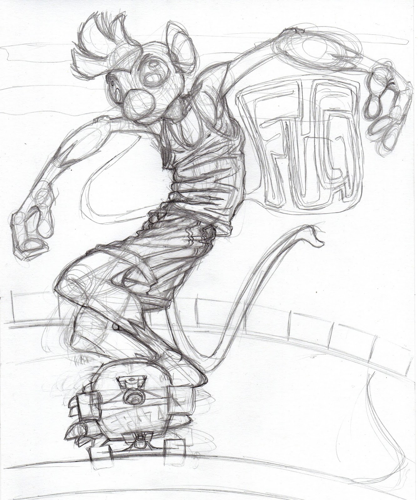
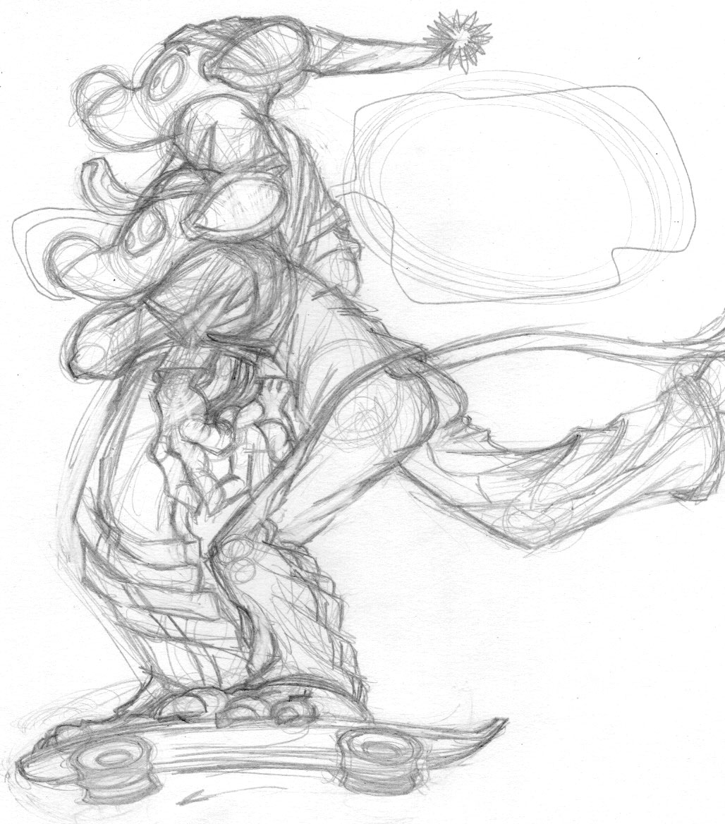
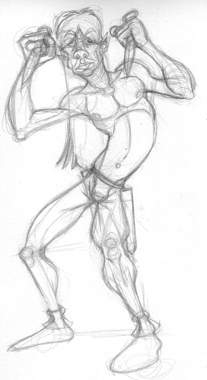
Ooh look, an image dump! Well, really what this is meant to be is a 'how-to' for anyone (hi, Vince!) interested. I start off with a pencil sketch. So far, I just can't loosen up as much digitally as I can with a pencil and paper. I scan that, bring it into Illustrator and set it to the top layer and drop the opacity to about 50%. Then I draw in shapes the figure below it. Once that was done, I selected all the parts of the figure and pasted them atop the figure on a layer above. I melded those pieces into one silhouette, colored it orange and dropped its opacity to about 50%. At this point, I noticed that, as usual, while the orange layer affected the one below it, it flattened out the contrast as well. I figured I'd have to assemble this all in PS, which is fine. It must means an extra step.

After this, I did the same thing I did with the orange layer, but used it to make a shadow layer that I placed atop everything else. Then I went about cutting holes where I felt the light would be hitting the figure. This was probably the longest step of the whole process.

After this was done, I poked at things like the background, added a few very transparent clouds by using the same gradient as the background but reversing the flow of dark to light and dropping the opacity to about 10%. I wanted them to barely be there.

With all of this done, I had to export the image in three pieces; the main image with no lighting or shadows, then the lighting (orange) layer all alone and finally the shadow layer all alone. I opened the main image in Photoshop then each of the other layers separately. I selected everything in the orange layer, pasted it on the main one, erased out all the parts that weren't orange then did the same thing with the shadow layer. I had to play about with the opacity and layer settings, finally deciding on 'multiply' for the orange layer and 'illuminate' for the shadow layer. This way, the details all remain visible and the colors are deeper and richer. I wish layers worked this way in Illustrator so I wouldn't have to lose quality but I can always make another version of this at any DPI I want.

There, a little 'tutorial,' like I'm one to teach. Thing is, I rarely meet other artists that use Illustrator and some folks are just afraid of it. I admit, it does have a steep learning curve. Vectors, though, are SO useful and highly used in the animation industry for good reason.

Monday, December 14, 2015

Did this yesterday as a quickie. Was doing chores most of the day and wanted to do SOMEthing. Rooster's still in my head. Don't know why, he just is. Strangely, this one and the last one of him have done better socially than other recent work. Don't know why that might be, but I'll take it. Might be because I made the comics free. Anyway, just a quickie as I try to add posts to my yearly total. I know this year is down from last and it's weighted heavily towards Ghiroy and the mice. Should be more variety. Or something. As long as I'm still creating things, I don't suppose it matters.

Sunday, December 13, 2015

Been a few days and I've neglected this little blog. Big news, such as it is, is that I've finally re-packaged the comics other than Tamino and made the available for download on Gumroad. Fite is now in one volume, Harlon is back up and all the short stories, mice included are collected for the first time. The only thing I didn't bother with was Biography. Can't see that anyone would want a collection of THAT and even if they did, well, I just didn't feel like bothering.

After that was done, I went back to play with Rooster and PS, wanting to get more of a painting look to one of him as I did with the other two. Thing is, it really just didn't work out well. Couldn't get the hang of it. So I took the same sketch (last image) and threw it into AI as I always do. Tried to keep the lighting behind, which was new and I think worked out pretty well. Very happy with the image even if it's without context. I kind of thought of it as 'Rooster in heaven,' or something like that though I don't believe in such things. Whatever, it was fun and a half-level up from the rest of the comic, a kind of maturity of style. Or something. I liked it. There, I said it.

Monday, December 07, 2015

Another couple images from the finished comics. There are a few things I want to go back and tighten and this page was one of them. I really didn't like the head on Smatt in the original so I redrew and replaced it. Easy enough with Illustrator, a pain in the ass if I had painted this. The other image is another painted version of one of the figures from the comic that I'd inked. I like the approach but I think I need to work on the overall aesthetic. Still, good to use some of those brushes I keep buying.

Monday, November 30, 2015

I've been looking at the work of Ashley Wood recently and really enjoying his loose and flowing brushwork. To be fair, I've done this kind of thing in previous work, mostly with the portraits I've done in acrylic. I've been buying 'real media' brushes for PS for a long time and only rarely using them even though I like their effects quite a lot. So, since the comic is pretty much done, I thought I'd take one of the images I'd inked and poke about with some digital paint as well. I can totally see doing a comic in this style thought I MUST RESIST redoing this one all in this style, as appealing as it might be. A good bit of fun before work.

Sunday, November 29, 2015

Last page of the comic. It turned out a good deal sadder than I thought it would and I'm ok with that. I'm sure tragedy like this happens to young people all the time. It's likely a reflection of my own grief in the loss of my mom as well. I think, too that there is still a huge pressure on the 'average straight man' to not show emotions other than anger or some happiness, the latter only mostly in regards to sports or other 'manly' things or with intimacy. Anger is ok for some reason as it's 'manly' or something. I don't know. I know that when it came time to grieve for mom, I couldn't do it in front of anyone, not even my partner. I have no idea why. So this throwaway comic is for all that, more serious than I thought it would be and it allowed me to explore some stylistic things as well. I'll likely continue with this style to some extent in Ghiroy, though not so wrinkly. I can easily see painting more with this kind of style and will likely do so.

This is the longest piece I've done since Tamino ended. Not sure what, if anything that means.

Friday, November 27, 2015

Page 30 of what is definitely not the happiest comic I've ever done. One more to go. Then I'll likely go back and edit the thing as a whole. I've had some feedback here and there on it, and it's quite obvious that I didn't do this all at once. The style change from page 1 to now is quite startling. Then again, I kind of like that, too. It's almost as if we're watching Smatt grow up.

Thursday, November 19, 2015

Inked another one of these. I might well ink them all. At the very least, it preserves the drawings better than leaving them as pencil only.

Wednesday, November 18, 2015

Today's live stream went pretty well. It started out a bit quiet but that's ok. At the very least these things have helped me be really consistent in getting work done. Seems like a good addition to making Ghiroy and I plan to make it a part of the process. Pencil sketch, finished page and the poster I did for the live stream. This is not the happiest comic I've ever done. That's ok.

One other thing I did today was to update the Gumroad page that has Tamino on it. I did this because they now allow multiple images, which is something I think has been very lacking. I also sent a link to the comic to io9 because they say they're always looking to showcase 'cool' artists. I'm not that, but I've seen worse promoted there. And since the comic is free, I would think it's a draw. I wouldn't mind the exposure at all. I do wish I had a functioning web site, but even my clanky old one is down for good now. Too much to do, too little time...

Sunday, November 15, 2015

Two more inked images from recent pages of the Smatt and Terry comic. While I don't want to go back and change the look of the comic, I did enjoy inking these and like the way they turned out. I miss ink and all that that implies. If anything.

Friday, November 13, 2015

Snuck in another page yesterday. Didn't do it as a live stream as I wasn't planning on getting to draw and didn't want to overcomplicate things. That being said, it went just fine. Today, I decided to ink the pencils just because it's been a long time since I inked anything and I miss my ink. That being said, there's things to be said for either approach though I'm glad I went with the direction I did. One thing likely lost here is that the caption at the bottom actually applies to Smatt, not the unseen characters. The point of the bottom captions, originally, was to translate the graffiti-speak because my partner (and likely others) couldn't read it. Then it became a way of interjecting some humor as well, as the captions obviously were sort of the 'polite company' version of what was being said. Now they're translating for things that Smatt simply can't say or express, and that's the point of the comic. A lot of men in American society are still made to expect that showing emotion other than excitement or anger simply isn't 'manly.' As such, they can be somewhat broken inside, unable to express what they feel without worrying about showing weakness. Smatt is very much like this and, to some extent, so am I. What was a little throwaway comic has become something of an expression of my feelings of loss over my mom two years ago. So there you go. We all deal in our own ways.

Tuesday, November 10, 2015

Here's the comic as it stands right now. Kind of interesting to pull back and look at it abstractly. Will it work when it's all done? Guess we'll see. Likely there will be tweaking when all is said and done.

Including something different here, one of the ref photos I posed for. Tried to look as fat as possible to mimic the mouse. Too fat for my liking, really, but that's what 50 will do to a person. Four pages to go. The pose won't change again til the last page. While doing the live streaming for this today, a couple of artist friends and I were talking about the 'typical American male' and his approach to emotion. Well, here's Smatt doing exactly that. He's broken and will likely never deal with the guilt and remorse he feels about this because that's just not what MEN are supposed to do, right? Streaming is helping me out a lot, especially by being able to connect with other people. So I'll keep doing it through the end of this comic at least.

Thursday, November 05, 2015

Newest page for Smatt's Journey (though I think it's going to be called Smatt's Odyssey when it's all done). Another page done while live streaming. I'm only getting a page a week done this way, not finding time to do them otherwise, or am I saving them to have content for the stream? Could be some of both. In any case, it might be worth keeping all this in mind when starting Ghiroy. If I do that combined with a Patreon, something I would never expect to actually 'pay the bills,' it might be the motivation I need to keep a regular schedule. And it doesn't matter if I get the page done during 'the show,' as long as it gets done and a good amount of work is done because of it. As far as this comic goes, there's five more pages to go, and those a lot easier to draw as the central figure won't appreciably change.

Tuesday, November 03, 2015

Hey, I can bitch about this HERE because it's my blog and only one person reads it, right? Anyway, I was going through a list of supposed 'top level,' 'hot' character designers from animation, games and comics. Each had a page with representative images from their blogs, portfolios and published works. I didn't get a third of the way through it and I nearly wanted to puke. So many of them are filled with the same old pin up girl T+A crap. Haven't we gone further than this? Why is this kind of thing still lauded and expressed? It's just so awful. And some of the artists, I'm sure, think they're making "strong women characters" by having the usual nude or bikini-clad girlie carry a gun or sword, though she still has kissy-lips, a pout or is adopting a pose that's nearly physically impossible. This is a rant, indeed. It's just so ridiculous to see this kind of crap still being produced and people still being proud of it. The male characters aren't much better in that they have to be these gigantic, muscle-bound morons. It's like there can't be but one kind of each sex. I don't know. Maybe I expect too much.

Thursday, October 29, 2015

The results of yesterday's live streaming. I've really enjoyed doing these as they seem to bring people together, not because of me doing art, which is totally fine, but because the folks that do come share their art, links to other artists and give advice to each other. This is the third page I've done in this manner and I've got six to go. What began as a simple ten page comic is now going to be 31 and deal with a broader topic than I was aiming for. Which is fine. Not the best way to make comics, but there you go. Short stories allow for more experimentation, I think. Anyway. Pencil sketch, the page as it was when I shut down the stream and finished version.

Thursday, October 22, 2015

Finished page 24 which is about 4 from the ending, I think. Then there's a snapshot of the comic as a whole so far. I think I need another 'meanwhile' page in there between the truck and the boys back on the steps. This isn't the most consistent comic I've done, but I like it and it's certainly leading stylistically towards what I want to do with Ghiroy, just a little more extreme.

Wednesday, October 21, 2015

The results of today's live streaming. I'm getting into this whole thing. While it's cool that people seem interested in the art and perhaps the making thereof, it's even cooler that diverse people meet and get together while I'm drawing and making a fool of myself (in a good way). So I'm going to keep this up. This page isn't done, but it's close enough. I was online for 4 hours today and a good number of folks were there the whole time. More than a little amazing. I know how this comic's going to end, I just need to get there. Perhaps with this kind of thing going, it'll keep me interested long enough to finish.

Saturday, October 17, 2015

Yesterday was a sort of impromptu test. A friend has been streaming his work in real time for his Patreon backers. Sometimes this can be really interesting to watch and sometimes less so, but it is an attempt at building community. I've streamed once and had some people show up. I never did again because the kind of work I do, mostly in Illustrator doesn't seem all that interesting to me. It's almost like watching someone connect the dots. Most of the 'creative' part comes from the penciling, or so it seems to me. Still, after starting to work on the above illustration for about a half hour, I decided to give the streaming a try. I posted a link on my tumblr account and Facebook and then texted the above friend just so he wouldn't be able to say I didn't tell him. I also emailed Vince (thanks, Vince!). I had the sound on, so the viewers could hear me and I could respond to texted chats. It was actually a lot of fun; it felt like having a studio-mate. I'd toyed with the idea of making a Patreon of my own just for the possibility of building a community of my own. Will I always get even the two people I did? Perhaps not. It was still fun to do and something I should think of doing more regularly. There's nothing lost letting people see me work and swear.

The other part of the experiment was something visible in the two images above. The biggest change is the pose; the above friend noted that while the figure was good, the silhouette, the most important aspect of a pose in animation was ambiguous as drawn. With Illustrator, such changes are no big deal, so I changed his one arm. The more useful thing, though was playing with the layering options in PS. They're not available in AI, which is rather annoying, so this means that I'm not only going to have an extra step for "Ghiroy," but if it ever comes to being published in print, I might well have to redo all the output pages to meet the demands of printing. Still, one of the problems I've had in the past is using a transparent overlays. While they unify the palette and add feeling, they tend to make the image more chalky. I have to bump up the contrast in PS after the fact and that can do weird things to the high end of the tones. In this case, I made a silhouette of the figure in bright green, brought just that over in PS and pasted it atop the figure while changing the layer option until I got a much better look. In this case, I think the figure on the left looks a lot like he's in moonlight. While I want this world to feel alien, my partner thinks that I need to keep from going nuts when doing this kind of thing. He might be right.

Lastly, I was timing this as the style I've finally chosen for the comic is rather detailed and as such I was worried that it might take too long to render it all. It didn't, though it took longer with an audience. The image is only half done as the background is missing. Still, this represents a full page as I've found that as I go along, I don't really like panels all that much. I can't think of the last comic I did that had them. I prefer big images occasionally with floating images above for my 'panels.' Don't know why this is, but I've moved away from them since Tamino. The other thing I've been working on is the text. I've seen so many comics that are lovingly rendered that just have a word balloon with comics sans slapped on top and it's so visually jarring. Also, when I read comics, I can feel a mental disconnect when my eye moves from the image to the text. I'm going to try and integrate the words into the image, much like I did with the Smatt and Terry comic, though I wasn't even thinking about that at the time. In this case, the choice of lettering style is going to matter a lot. Each character will have their own. In other words, I have a lot of work to do.

Friday, October 09, 2015

Posted this yesterday in various places and got way more response than I thought I would. Friends who read the page came out and wrote really nice, lengthy responses to me, letting me know that they like my work, that there's belief in me and generally nice things of the sort. It was warm, welcome and somewhat embarrassing. I say the latter because I want Biography to be truthful, sincere. On the other hand, I don't want it to be seen as some kind of pleading for attention. I don't know. Maybe I'm so unused to reactions to my work that I've forgotten how to react to it. I get all squirmy and somewhat weirded out, trying to shift attention away from me and back towards something else. On the other hand, I do want to talk about this kind of thing, about the loneliness, the bad feelings regarding my work's lack of acceptance. It's a hard balance I don't really know how to address.

I've found that I've been learning to settle a lot; expecting that things won't go over well, learning to face the oncoming silence whenever I post work or eventually when I post Ghiroy. I've already decided that the comic's only going to be for me, that I'm not shooting for any kind of readership. Perhaps it's a way of keeping me from being disappointed or maybe it's me trying to be realistic and as such not be so disappointed any more. Strange that this particular page got people to read it for some reason, even though I obscured some of the words, tilted them and kept them behind little windows cut out of the comic covers.

This is the first page of Biography that isn't in the hardcover book I made. I hope I keep doing it. I just hope it's a little more interesting and less whiney as things go on. I think it's important to do, though I don't know why I think this, but I don't want it to just be one big complaint, either. I was wondering if I should just retitle the comic "Adrift" and be done with it. Or something. Or not.

Monday, September 28, 2015

Did this today. Yah, it's another re-draw of an earlier promo piece. But it's important, at least to me in two ways. First, it shows the new style working with the old pose. Second, it shows what some of the vegetation is likely to look like. It's alien and has the right level of detail for what I want to do. All in all, I'm pretty pleased with this, including the intermediary low opacity magenta filter over the background. Each page/panel will be composed like a poster/woodblock print. I've got a friend who is a pro artist helping me with the stylings for the backgrounds. All I need to do is actually START this damned thing and then follow through. Easy, right?

Friday, September 04, 2015

Another one of these, this time with the elf. I think he kind of looks like Iggy Pop. I might want to do more with exaggeration of the body with him though I think he makes a decent counter to Crow's broader, squatter build. I -think- I can sustain this style for a comic. It means a lot more drawing and surety of anatomy, which I don't really have. I've received a few compliments from artistic folk, which kind of surprised me. If I can do this, I will also have to be careful of things like proportion. For some reason, I tend to draw Mikilo's legs too short, as can be seen here between the pencil drawing and the finished one. Illustrator is my inking stage, so I have no trouble making corrections along the way.

So more of these. An artist friend of mine, who generally doesn't say anything about my work, though it's usually nice when she does, said she'd love to see a comic done in this style. And really, the drawing part of this is easy enough. For some reason, abstraction comes easily to me and these caricatures are just fun. Cartooning is always a challenge for me. While I think I was onto something good with the other styles, this is indeed something different. Grotesque, even. So can I make a comic in this style? Well, we'll see. Crow is still the easiest to draw, but I think the elf was the best portrait of the three. Francesca came out far better than she has in any other version. And the full body versions here of Crow are, well, twisted and interesting to my eye. Another artist friend of mine is offering to help me bring the style of the backgrounds into focus as its his fortè. This project has, really, been something I've been working on for like seven or eight years and there's NOTHING to show as of yet. I can trace this back to the original Ghiroy and tons of work done then. Delve Deep came long after, and there was tons of that. I really need to make this a STORY and not just study after study. I hope this is the kick in the ass I need.

Thursday, September 03, 2015

Did these today for fun, and because I was messing about with PS and some brushes I never really take advantage of. I'd done a caricature of me just to test the brushes out and then got in that mood and, well, did these. They're grotesque but also have a certain something to them. Anyway...