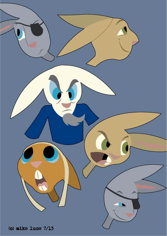
Had time to do another one of these after the Bio comic. They make me smile, they're relaxing and fun to do. And I think they're the more commercial thing I've ever done, which is both a good and.. well, other thing.

Ok, so I did another one. So sue me. The deal is, this is an experiment in trying to be commercial. That's the experiment, for me, behind Delve Deep. That being said, I don't think I want to go THIS far, unless I want to pitch this as a cartoon. I think the version I had before this has more of a wide appeal, especially, perhaps in Europe. Which is shooting far, dreaming high. What the hell. That all being said, I did this just to prove I could. Now it becomes just yet another version of this character and the style in which I want to tell this story. There's still part of me that wants to do something weird and strange like Tamino, I just don't have another story right now. So, this.


A test image for a planned short comic that will introduce one of the characters of "Delve Deep." Yah, they're cute, and this COULD be considered "Delve Deep Babies," but this is really just a snapshot, a memory from Sharp's past that I thought important. And it's unlikely that this comic will end well. That's the point of this kind of thing.

Yup, the bunny stuff just doesn't get a lot of hits. My partner says it's because I've been diddling around with the designs for so long and producing no actual comics that people are tired of that. I'd agree with him except for the fact that I see lots of other people do the same thing, posting either the same character in similar poses over and over or even just doing the usual pinup and they still get notice. At some point, it has to be me. I accept that. The flipside of this is that what I'm doing now really makes me happy. I like looking at my own work. This goes against most of my life where I struggled to be able to even look at it, never mind appreciate it. So, I stopped posting work in places that didn't seem to care. And doing comics like this one I think are unhealthy. At some point, if I haven't passed that point already, I might start making this kind of comic, me being miserable on purpose just for attention. And that cannot be healthy. So I should probably stop doing Bio, too. Or just not focus so much on the negative. Or something.
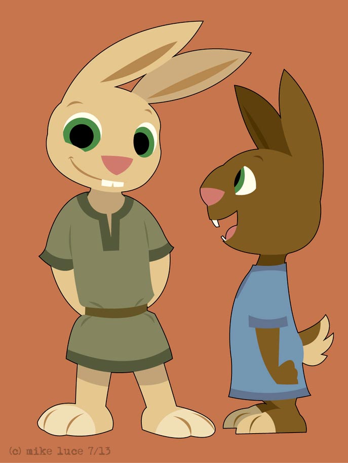
Ok, I know this is going to seem like "Delve Deep Babies," but it isn't. My partner suggested that, until I'm ready to do the full comic, I might want to do a short story just to generate some interest. For each of the main characters, I did this "ask them 100 questions" thing so I could better flesh them out and it turns out I wrote about an incident when Sharp was little that would work well for this assignment. So, I designed a little Sharp and his brother, Adrian.

Morning warmup drawing more trees. These are kind of habit forming. For a final, I'd do some editing here and there but I just wanted to extend the style a little bit. Kept this one more centered on one color and as such I think it has a kind of dreamy quality. Started with one green and just adjusted the color from there.

Well, didn't get the Nickelodeon gig I was really hoping for. That was a blow though not a big surprise. Have to keep moving. So before work, I did this quickie tableau with Sharp and one of the new monsters. I think they're going to work out well. Also, mono-chromatic backgrounds should not be overlooked. I need to coordinate my colors a bit better, pay attention more to mood. I think this forest has a good deal of creepiness to it. Also helps to make the characters pop.


Another quickie for the morning. Trying again to add a lot more gesture and energy to the poses. Haven't done a lot with Benny, and I really should. He's the thief of the group and as such will be the most physically expressive, I think. At least there's a lot of room for this and a lot of opportunity to really push my usual drawing skills. I have no idea what he's try to stab; perhaps he's just looking to slice a coin pouch string. Wouldn't be a bit surprised.

Another adaptation of a baseball swing for sword practice. I'm sure the fencing enthusiasts (if any actually ever see the comic) would have my nuts for this kind of thing but I really like the parallel of these two things. Sharp is meant to be good with the sword, but not some kind of graceful expert. Lost a little kinetic energy in this one; it's a little less cartoony, too close to the original ref. That's a problem I constantly struggle with. Moving on.

This is a morning warm up, a quick mock up of the boys adventuring in the forest. Just trying to get a feel for my backgrounds. I received a copy of a collection of UPA cartoons in the mail yesterday and they have indeed been inspiring me (not that this is the first time). I may try some texture on the trees but when I tried it on one, it looked like it was just adding busy lines instead of really adding to the image. I tried really hard not to have anything in this image be the 'proper' color, to force myself to think outside the norm. And it works, I think.

Doing a little more stuff with this style. This time, I referenced an old Marvel western comic for the pose. Poses are still sometimes one of my weaknesses. I'm so used to thinking flatly that I often don't get creative enough with posing. This retains the cartooniness of the style while adding a bit of seriousness as well.

Felt inspired to do another one of these before work. This time I planned out the background a bit along with the figure. It's just Sharp wandering off into adventure, but I think it gives a good overall feel of what I'd like to do.

Another little diversion from tonight. Went and saw, "Monsters University," and came home just wanting to draw something. The bunnies are the closest thing I've made to being something commercially viable. I haven't actually -made- the comic yet as I've been experimenting ad nauseum on the designs. Well, this, coupled with a style from the old UPA cartoons for backgrounds is, I think, it. I tend to make things too complicated, too 'deep,' too steeped in the idea of being some big THING. The bunnies were supposed to just be a fun little D+D comic and I've let that get out of control. There's nothing wrong with a little fun, and I think the bunnies would be best being just that. To that end, might as well keep the designs simple as well, something smooth and flowing without unnecessary detail. This pose was taken from a pitcher about to throw. I equate Sharp with baseball a lot. I think he swings his sword not as a master fencer but more like a jock. Blah blah. Anyway, there it is.

Had to change the layout of my blog after seven years as, for whatever reason, Blogspot was refusing to upload my images the way it's been doing so for all this time. Couldn't figure out how to change it as nothing seemed to work. So the hell with it. Anyway, took the Joe experiment from earlier a little further and reproduced one of the pages of a short story with him in this style. Fun to do, don't think I'll do more with it. At the very least, it's good to use the brush every so often.

Took a break from other things and styles yesterday as I came across some images from 60s manga and decided to play around with them a bit. Because of the big eyebrows, I decided that Joe Flash would be a good character to adapt. So I did. It's fun to see how someone else approaches a given subject, how the abstraction changes from place to place. This era of manga has a more 'Mickey Mouse' approach to it than current day stuff. By that I mean that you couldn't really rotate the head logically, that some details are drawn utterly differently than they would appear from other angles (such as Mickey's ears) based on aesthetic rather than spacial concerns. For me, this is often a hard step to master as I'm so used to trying to make designs work three dimensionally, to make visual sense. The Mickey approach is fun, too and is far more abstract than the usual. Tamino was like this. Lucco wasn't. Anyway, just an excuse to push in a different direction for a moment. Moving on.


Another auto image, this time the less iconic, but more personal Austin America. This was our family car for most of the time I was growing up. My sister and I nicknamed it the Awful Awful though really I don't remember it being that terrible. Well, maybe it did break down a bit. I think my mom hated it. I'll have to ask her. Would I drive one today? I'd take the chance for a ride, that's for sure. Nostalgia is a powerful force. Ink, Illustrator.

Most recent image, this taken from a photo I found online (I got permission to post this from the photographer). I like the idea of pairing Digby (the fox) with quirky transport. I already have some other ones in mind. Cars are hard to draw but totally worth the effort as there's a familiarity and solidity to them that I think resonates with people. Or I'm just making this up. Ink, Illustrator.
Nothing big, just an icon I was asked to make to represent myself for an online project. While I'm waiting for Apple to get back to me and verify my iTunes account for selling, I'm sitting on the finished Tamino comic. I'm itching to finally make it available to folks. I really should be looking into the horrors of formatting the comic for the Kindle, but I haven't felt like it yet. Was going to do it for the Nook but with the recent announcements, why bother? Man, as usual, B+N seems to be handling their Nook publicity pretty badly. Case in point? My mom, who knows little about these things and therefore represents a good deal of the population said to me tonight, "So, Barnes and Noble is dropping that Nook, huh?" Sigh. It probably will mean something like that soon, but if that's what people think there is going to be a huge amount of returns at work. And we won't be able to sell one to save our lives. Hope I don't get stuck at the digital counter...

This is TOTALLY just some fluff, a blatantly commercial piece. And really, I did it just to experiment with the monkey's facial expressions. He's a rare character of mine in that he's not inherently grumpy or dour (see: Lucco, Guz, Tamino, Harlon, Ricci, et. al.). He'd fit in with Crawford well enough but might even be TOO friendly and happy for the crow. Dunno. Cromwell would like him well enough. I should definitely have a break from the, shall we say, 'less happy' stuff and do something a little more enjoyable and, likely, more commercial. I'm getting to the point where if I don't make some kind of money from my work, it will be too late. And it's fun. I know I'm doing this whole thing backwards, having started off making far more abstract art, heavy, metaphorical comics and am now aiming at something more shallow, bright and colorful but there you are. There are likely even some who are disappointed that I am moving away from the 'less difficult.' There's no saying I won't go back to it. For right now, this stuff is fun. And that's really all there is to it.