Keep forgetting to update here. These are the next panels in my half of the ongoing "Party Line" comic. Looks like we might be inviting others to join, which might broaden the conversation. I think this is a cool thing. This time around, I went a little nuts and poached a bunch of my older styles. Was nice going back through some old art. I really did used to experiment a lot more than I do now. Some of it I miss, some of it ran its course. That being said, I like the first and last panels the best and have soft spots for the rest. More to come.
Monday, March 28, 2016
Thursday, March 24, 2016
Haven't forgotten about this one, but I had to do some prep work for the sketch of the characters. I did one version, which I inked, and which I liked rather well, but something I forgot was that the ref photos I posed for weren't done at the restaurant in question, the angle was off and I needed to make sure they'd fit the already started background. I've thrown in the ref photos on this one. First is that of myself in two places, thanks to Photoshop at my kitchen table, 'acting' out the parts. Then comes the original I took at the Border Cafè, then the current version of the illustration. I think I'll likely print out the sketch I have now, as it fits and do a final version. The one I have was drawn small and had to be increased in size and as such, all the little mistakes are really obvious. So that's where I am as of now.
Wednesday, March 23, 2016
I know only half the conversation is here, but there you go. My cartooning buddy had a lot of work on his plate, so the update was a little long in coming, which is fine as this is meant to be something fun and something to stimulate us each into doing things. This time out, I was pretty long winded and took six panels. We're starting to get more personal, which is a good thing and we're thinking of inviting other artists in to see what happens. I mean, the whole thing is about conversation.
Friday, March 18, 2016
Thursday, March 17, 2016
This is what I got done today. The lighting, highlights and shadows are going to be really tricky in this one. Still, I managed to wrangle the perspective tool for the left hand wall's painted signs, and I think it worked pretty well. Glad there were far fewer bricks than there were cobblestones. I hope to get a good deal more done tomorrow.
First process shot of the next image. It's kind of hard to see what's going on. Mostly it involves drawing a lot of bricks by hand. Why by hand? Because it gives a lived in, organic feeling that I can't get by cheating. And since this setting will have a lot less detail than the last, I don't really want to skimp on it. I've already set some of the signs in place. I found, after wrestling a bit with the perspective tool last night that I'm going to be better off using the tool for things like the signs on the side wall and not for the rest of the drawing. It's actually more work to get the points in the right place to work with the drawing and then move things around. Far easier to have done an underdrawing with everything in place. So that's how I'll do it. And that's fine. Still saves me work and allows me to make signage and such that is far more interesting than was in the first one.
Wednesday, March 16, 2016
Today was spent in sort of prep work for the next of these more detailed illustrations. The pencil sketch is the layout of the restaurant Digby and Marcel will be in. It's taken directly from a photo I took at my favorite restaurant, Harvard Square's Border Cafe. I've eaten there hundreds of times... well tens, anyway. I used to eat there 3-5 times a week with a local friend. It's never disappointed even if it hasn't really changed much in 30 years. Before I knew about this here perspective tool (thanks, Vince!) I traced the very least I could to get the layout of the place and freehanded the rest, which is in pencil. Since I now know I can do things flat and stretch them later, I decided to make the signs, which are painted all over the walls, ahead of time. They're all in Lucco speak (and the little otter will make a cameo in the very back of the place). I want to keep the feel of the place very much but I will also customize it to keep it from just being a copy, as I did with the Tokyo image. If this works, it will not only make things a lot easier, it will give a more organic feeling to the image as I won't have to have things quite so square or the signage so dull. Tamino obviously makes a cameo as well. No idea what he's selling but I'd totally recommend the hot sauce Lucco's huckstering. I'm sure it's awesome. :"D
Tuesday, March 15, 2016
After finishing that image yesterday, my comic buddy posted another panel so now it was my turn. I drew and inked these last night but didn't have time to finish up til this evening. I think I've settled on at least one thing; I like coloring these in PS with a brush called 'turps scrape,' or something like that. Its kind of oily and watercolor-y at the same time. The more I draw this little guy, the easier it's coming. There's a lot of Peanuts in him, I admit that. Trying to keep him loose in pencil and ink. Even the colors are meant to be loose, with bits of random colors thrown in there to give it almost that Richard Scarry kind of look to it. Loved his work anyway, so why not?
Monday, March 14, 2016
Barring some minor tweaks, I'm finally done with this image. It was a series of lessons on how NOT to make something like this. I had no idea there was a perspective tool in AI that might have helped because, quite honestly, I'm a tool. :"D That being said, I'm pretty happy with this. There are two versions as I haven't decided which I like best. The upper shows less detail but feels more like night to me. The lower one shows more of what's going on but doesn't showcase the characters as well. We'll see. Can't wait to view a giclee print of this at full size.
Saturday, March 12, 2016
Had to work the job today, so only had a couple hours tonight. That being said, I got the wall under the marquee plastered with flyers. I only had to make one of each type then adjust each row for the proper perspective. Worked out well enough though again, the detail is kind of nuts. Getting close to done with this side. Just have to do a sandwich board in the lower right corner, then it's off to the left side. Also adjusted the shadows on the characters and put a shadow layer in behind them over the whole background to help contrast.
This is a close up of the magnification that I'm working at and how it generally looks at regular size. Thing is, I want the final print to work at say 16x20, so this is more necessary than it looks. This was also taken before the work I did in the post below, so it'll show how long five hours ends up giving me. This is why this is driving me nuts. The other two in this series will NOT have this much to depict. Just. Won't.
Did about five hours work on this today, which equals the shop with the sushi in the window, the cart with noodles, pork and fried egg in front of it, the blank marquee, some of the flyers and adjustments to the other background stuff. This thing takes a LONG time. And while I'm making it, I start to think about who owns the shop, what happened to it, what's in the food, and all that sort of thing. It's fun and tedious at the same time. Still, when done, I think it will be cool. And it's meant to be one of three in a little series.
Thursday, March 10, 2016
Panel 13. I've been using PS to color these. I bought some new watercolors (expensive ones at that) to do this but like the results better in PS. The brush I'm using is called a turps scrub, which works almost like a oily marker. Thing is, when you lump one color atop another, it doesn't add it seems to partially add and partially obscure, which is cool. The little color daubs are a little too pronounced in this one, but I like the 'dirty' quality it's bringing to the comic. I really need to do a palette so I can keep the colors consistent, which they are not.
Wednesday, March 09, 2016
Tuesday, March 08, 2016
Thursday, March 03, 2016
Panel 4 (my second) from that recent side project. The first one was the original, which I posted and was unhappy with. I slept on it and decided I didn't want to leave things the way they were. Since my buddy hadn't posted another panel yet, I decided to give it another try. Another friend of mine had posted about how a lot of his art students ruin what was a perfectly good drawing because they thought it just a sketch instead of working it into a final version. Taking his words to heart, I penciled the panel out again, left it alone, scanned it in and did some quick PS watercolors over it. I like the version a LOT better. Ink, to me, is also for editing and in this case, I think it edited too much out. A lot of times, I think ink adds a LOT to my work. This time, not so much. So I 'fixed' it and am happier for it.
Wednesday, March 02, 2016
This is my first panel for the collaborative comic that my buddy is calling, "The Party Line." It's just meant to be a comic conversation. Others might join in, we'll see. For now, there are two panels, and they're viewable, or will be soon, here: Partyline Comic
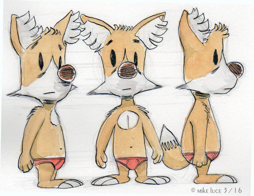
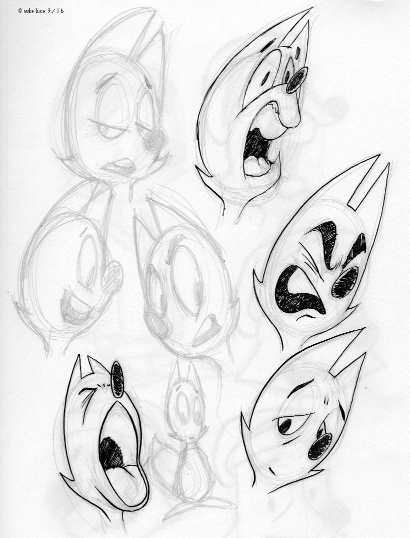
A friend approached me yesterday about possibly doing a little back and forth comic. It'll be us having a conversation, possibly about art, possibly about whatever the hell we want. This person is what I consider a -real- cartoonist, i.e. he doesn't sketch, he has his characters down utterly pat and can just MAKE those things without having to diddle and fuss over them. So I needed a new version of me that would kind of fit the daily strip style of comic. That being said, I decided I'd color it in PS anyway. So what's here represents about an hour and a half's work, pretty much the fastest I've ever developed anything. I started out more rounded and quickly decided that the design in question only 'read' well from the side. Even at 3/4, he couldn't see past his nose and one eye was always missing. I changed some things around, got something I liked better but wasn't sold on. Finally, I was watching a tutorial online where one of the animators from the upcoming "Zootopia" drew the rabbit character, and I did that, too. You can see that sketch on the bottom right of page 4, I think. From there, I saw something else that caused me to change the eyes totally, which got me away from Disney (which is a good thing) and allowed me to make this more my own thing. Though I didn't mean to, this actually looks something like a cartoon version of a coyote I did about 15 years ago. Well, ok. So we'll see how this goes. Part of me is hoping that we can maybe corral some other artists into the mix. Might be fun.
Also, there's the thing I never talk about, my one graphic design client. Pandemonium Books and Games of Cambridge, Mass has been my one and only client for, oh, 18 years or so? I do his signs, t-shirts, bags and the like. It's a nice little side gig, though GD is not my best skill. I think I'm better at editing than I am creating in this case. Still, it's a nice little bonus once or twice a year. This is a set of stickers I'm working on for him. As I said, nothing really exciting design-wise, but it's good for me to do things outside my own box.
Monday, February 29, 2016
Another one of these things with the rabbit thing in it. I was listening to someone who used to be a friend being interviewed about their art this morning. Part of me, the 'civilized' part of me was glad for him and thought it cool that he was being sought out. Having people show interest is very cool and helps keep you going; knowing that folks out there enjoy what you do, what makes your passion burn. But the probably all too human side of me was just raging in a storm of, 'why not me?' I've been at this a very long time. I've been interviewed once and it never aired. That's the story of my artistic life, really and sometimes it just frustrates the SHIT out of me. Most of the time, I like in a bubble where I've convinced myself that it doesn't matter, that I do it for me, don't care what others think. It's an illusion I keep up so I can continue moving in any direction at all. Thing is, I have and have had friends that are doing very well artistically, most of them professionally that weren't when I met them. And they just shine. They really don't know what it's like to continue to pump this stuff out and have so few people respond. They really just can't see it. So while listening to this podcast, I went with the feeling and threw this onto paper and inked it, which is why it's not my best job ever. I didn't edit, but in the spirit of the stupid comic, I didn't elaborate either. I'm only doing so here. So that's what this is.
Thursday, February 25, 2016
Here's a colored version of one of the previous sketches. More to the points of the previous entry, one of the things I tried to do with this version was to simplify the character even further. The number of freckles has been set at three per side of his face and no more. Wherever they appear on his body, be it face, shoulders, ass, there will be three. No more, no less. I got rid of the more realistic detail in the ears. And I tried to embrace the stretch and squash more, letting the expressions have an overall flow to their curves, wrapping details around them to better harmonize the face, regardless of what the 'real' anatomy would do. These are all things professional cartoonists and animators know how to do. I'm still coming at all this half blind and on my own.
More more more! I've been watching (re-watching) some high end animated features recently, as well as going through their respective 'art-of' books in an attempt to flesh out, fix and smooth designs on the cast. There was still something about Crow that just wasn't working appeal-wise. Turned out to be as simple as getting rid of hard lines and corners, letting my pencil be a lot more loosely held, making things flow. Well, not EASY but still. Some might look at the piles of drawings I've done of these guys over the years and wonder if it was all worth it, if I couldn't have got to the same point without going off on so many tangents, etc. Here's the thing; for some reason, I've decided to do this gigantic project that would probably be better done by a crew and not just one guy. When I look at all these books, I see the same thing; merely a selection of what must be piles and piles of drawings needed to get to a final version. Some of them are really wild, crazy versions that would never work, like some of the ones I've done. Each iteration of the characters has added something, however small to the versions I'll finally go with. Even when Ghiroy was a totally different story, nearly ten years ago (GAH), the character designs have bits that are still in Crow as I draw him now.
Freckles and red hair have remained. Of course in the meantime, gingers (a term from Britain we've only recently adopted) weren't often seen, were, in some countries looked down upon and were never the heroes. That was one of the reasons I made him a redhead. I was tired of the blonds always winning. Well, that part's less of a shock now, but still.One thing I've noticed a lot and am guilty of in this case is the 'dumbing down' of main characters in these animated film. The protagonist is meant to be the character the audience identifies with, can place themselves into most easily. Because of that, there's usually a HUGE delineation between the design of that character and all those around him/her. Check any Disney, Dreamworks or other major animation company's films. "Rise of the Guardians" is probably the most blatant example.
All the other Guardians (Santa, Tooth Fairy, Easter Bunny, Sandman) are wildly designed, have almost no basis on traditional versions of themselves and, quite honestly, don't fit with their environments. Jack Frost, on the other hand, might as well be a Disney Prince in his blandness. Watching these over and over, I see the same thing repeated. There is something to it, though it also means a weaker character, I think. So Crow will never be blandly handsome. My partner doesn't like the freckles. Too bad. He's not perfect, and I don't want him to be. The freckles can stand for the imperfections we all feel we have; imperfections that we count but others might see as an asset. Harlon had a big patch over one eye. While this is common in rabbits, it was meant to be a metaphor for acne, which I had in spades while in junior high.Where am I going with all this ramble? Nowhere, really, just writing this down for myself, and, if somehow, somewhere, someday I actually make something of this, there's some evidence that I did indeed think a lot about this stuff. For what it's worth.