
Here's the comic as it stands right now. Kind of interesting to pull back and look at it abstractly. Will it work when it's all done? Guess we'll see. Likely there will be tweaking when all is said and done.


Including something different here, one of the ref photos I posed for. Tried to look as fat as possible to mimic the mouse. Too fat for my liking, really, but that's what 50 will do to a person. Four pages to go. The pose won't change again til the last page. While doing the live streaming for this today, a couple of artist friends and I were talking about the 'typical American male' and his approach to emotion. Well, here's Smatt doing exactly that. He's broken and will likely never deal with the guilt and remorse he feels about this because that's just not what MEN are supposed to do, right? Streaming is helping me out a lot, especially by being able to connect with other people. So I'll keep doing it through the end of this comic at least.


The results of yesterday's live streaming. I've really enjoyed doing these as they seem to bring people together, not because of me doing art, which is totally fine, but because the folks that do come share their art, links to other artists and give advice to each other. This is the third page I've done in this manner and I've got six to go. What began as a simple ten page comic is now going to be 31 and deal with a broader topic than I was aiming for. Which is fine. Not the best way to make comics, but there you go. Short stories allow for more experimentation, I think. Anyway. Pencil sketch, the page as it was when I shut down the stream and finished version.


Finished page 24 which is about 4 from the ending, I think. Then there's a snapshot of the comic as a whole so far. I think I need another 'meanwhile' page in there between the truck and the boys back on the steps. This isn't the most consistent comic I've done, but I like it and it's certainly leading stylistically towards what I want to do with Ghiroy, just a little more extreme.


The results of today's live streaming. I'm getting into this whole thing. While it's cool that people seem interested in the art and perhaps the making thereof, it's even cooler that diverse people meet and get together while I'm drawing and making a fool of myself (in a good way). So I'm going to keep this up. This page isn't done, but it's close enough. I was online for 4 hours today and a good number of folks were there the whole time. More than a little amazing. I know how this comic's going to end, I just need to get there. Perhaps with this kind of thing going, it'll keep me interested long enough to finish.

Yesterday was a sort of impromptu test. A friend has been streaming his work in real time for his Patreon backers. Sometimes this can be really interesting to watch and sometimes less so, but it is an attempt at building community. I've streamed once and had some people show up. I never did again because the kind of work I do, mostly in Illustrator doesn't seem all that interesting to me. It's almost like watching someone connect the dots. Most of the 'creative' part comes from the penciling, or so it seems to me. Still, after starting to work on the above illustration for about a half hour, I decided to give the streaming a try. I posted a link on my tumblr account and Facebook and then texted the above friend just so he wouldn't be able to say I didn't tell him. I also emailed Vince (thanks, Vince!). I had the sound on, so the viewers could hear me and I could respond to texted chats. It was actually a lot of fun; it felt like having a studio-mate. I'd toyed with the idea of making a Patreon of my own just for the possibility of building a community of my own. Will I always get even the two people I did? Perhaps not. It was still fun to do and something I should think of doing more regularly. There's nothing lost letting people see me work and swear.
The other part of the experiment was something visible in the two images above. The biggest change is the pose; the above friend noted that while the figure was good, the silhouette, the most important aspect of a pose in animation was ambiguous as drawn. With Illustrator, such changes are no big deal, so I changed his one arm. The more useful thing, though was playing with the layering options in PS. They're not available in AI, which is rather annoying, so this means that I'm not only going to have an extra step for "Ghiroy," but if it ever comes to being published in print, I might well have to redo all the output pages to meet the demands of printing. Still, one of the problems I've had in the past is using a transparent overlays. While they unify the palette and add feeling, they tend to make the image more chalky. I have to bump up the contrast in PS after the fact and that can do weird things to the high end of the tones. In this case, I made a silhouette of the figure in bright green, brought just that over in PS and pasted it atop the figure while changing the layer option until I got a much better look. In this case, I think the figure on the left looks a lot like he's in moonlight. While I want this world to feel alien, my partner thinks that I need to keep from going nuts when doing this kind of thing. He might be right.
Lastly, I was timing this as the style I've finally chosen for the comic is rather detailed and as such I was worried that it might take too long to render it all. It didn't, though it took longer with an audience. The image is only half done as the background is missing. Still, this represents a full page as I've found that as I go along, I don't really like panels all that much. I can't think of the last comic I did that had them. I prefer big images occasionally with floating images above for my 'panels.' Don't know why this is, but I've moved away from them since Tamino. The other thing I've been working on is the text. I've seen so many comics that are lovingly rendered that just have a word balloon with comics sans slapped on top and it's so visually jarring. Also, when I read comics, I can feel a mental disconnect when my eye moves from the image to the text. I'm going to try and integrate the words into the image, much like I did with the Smatt and Terry comic, though I wasn't even thinking about that at the time. In this case, the choice of lettering style is going to matter a lot. Each character will have their own. In other words, I have a lot of work to do.

Posted this yesterday in various places and got way more response than I thought I would. Friends who read the page came out and wrote really nice, lengthy responses to me, letting me know that they like my work, that there's belief in me and generally nice things of the sort. It was warm, welcome and somewhat embarrassing. I say the latter because I want Biography to be truthful, sincere. On the other hand, I don't want it to be seen as some kind of pleading for attention. I don't know. Maybe I'm so unused to reactions to my work that I've forgotten how to react to it. I get all squirmy and somewhat weirded out, trying to shift attention away from me and back towards something else. On the other hand, I do want to talk about this kind of thing, about the loneliness, the bad feelings regarding my work's lack of acceptance. It's a hard balance I don't really know how to address.
I've found that I've been learning to settle a lot; expecting that things won't go over well, learning to face the oncoming silence whenever I post work or eventually when I post Ghiroy. I've already decided that the comic's only going to be for me, that I'm not shooting for any kind of readership. Perhaps it's a way of keeping me from being disappointed or maybe it's me trying to be realistic and as such not be so disappointed any more. Strange that this particular page got people to read it for some reason, even though I obscured some of the words, tilted them and kept them behind little windows cut out of the comic covers.
This is the first page of Biography that isn't in the hardcover book I made. I hope I keep doing it. I just hope it's a little more interesting and less whiney as things go on. I think it's important to do, though I don't know why I think this, but I don't want it to just be one big complaint, either. I was wondering if I should just retitle the comic "Adrift" and be done with it. Or something. Or not.

Did this today. Yah, it's another re-draw of an earlier promo piece. But it's important, at least to me in two ways. First, it shows the new style working with the old pose. Second, it shows what some of the vegetation is likely to look like. It's alien and has the right level of detail for what I want to do. All in all, I'm pretty pleased with this, including the intermediary low opacity magenta filter over the background. Each page/panel will be composed like a poster/woodblock print. I've got a friend who is a pro artist helping me with the stylings for the backgrounds. All I need to do is actually START this damned thing and then follow through. Easy, right?
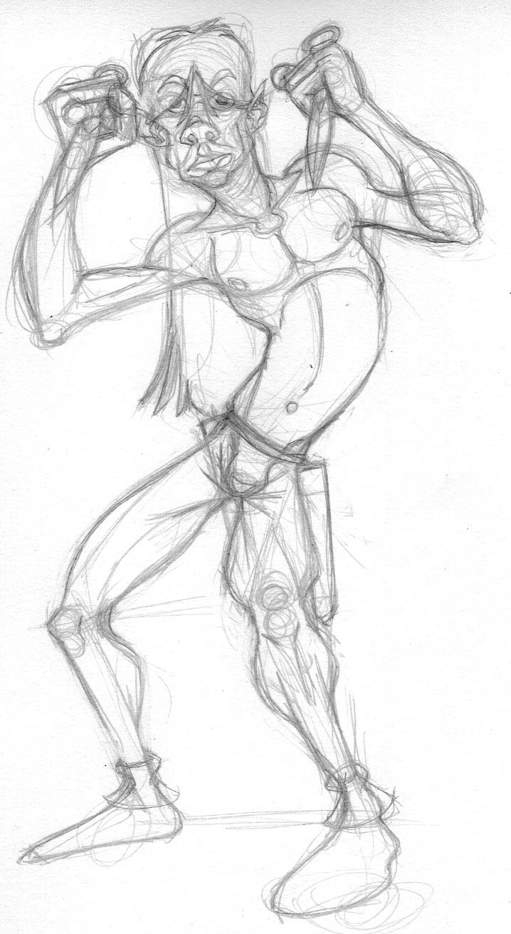

Another one of these, this time with the elf. I think he kind of looks like Iggy Pop. I might want to do more with exaggeration of the body with him though I think he makes a decent counter to Crow's broader, squatter build. I -think- I can sustain this style for a comic. It means a lot more drawing and surety of anatomy, which I don't really have. I've received a few compliments from artistic folk, which kind of surprised me. If I can do this, I will also have to be careful of things like proportion. For some reason, I tend to draw Mikilo's legs too short, as can be seen here between the pencil drawing and the finished one. Illustrator is my inking stage, so I have no trouble making corrections along the way.


So more of these. An artist friend of mine, who generally doesn't say anything about my work, though it's usually nice when she does, said she'd love to see a comic done in this style. And really, the drawing part of this is easy enough. For some reason, abstraction comes easily to me and these caricatures are just fun. Cartooning is always a challenge for me. While I think I was onto something good with the other styles, this is indeed something different. Grotesque, even. So can I make a comic in this style? Well, we'll see. Crow is still the easiest to draw, but I think the elf was the best portrait of the three. Francesca came out far better than she has in any other version. And the full body versions here of Crow are, well, twisted and interesting to my eye. Another artist friend of mine is offering to help me bring the style of the backgrounds into focus as its his fortè. This project has, really, been something I've been working on for like seven or eight years and there's NOTHING to show as of yet. I can trace this back to the original Ghiroy and tons of work done then. Delve Deep came long after, and there was tons of that. I really need to make this a STORY and not just study after study. I hope this is the kick in the ass I need.

Another redraw in the current style. I think the Hirschfeld inspired style is the way to go. Also, adding shadowing gives the characters a little extra oomph. I think Crow here especially looks a bit more European which doesn't bother me a bit. Keeping things smooth and flowing will make it more interesting to work in the Japanese aesthetic I also want for page layout. Anything that excites me to draw and get this thing going is good. Looking back through all the prelim stuff I've done for this shows, I think, a lot of growth. Let's hope it pays off. Haven't had to do this before.

Another redraw. I'm getting a handle on this kind of style and think it's far more energetic than what I was doing before. The time has come to settle and move on, though so I really need to just plant my feet and get on with it. While Tamino was a combination of Ukiyo-e, cubism and the style of the Rocky and Bullwinkle show (which is a kind of take off on Raoul Dufy), this one seems to be a mix of Hirschfeld, Ukiyo-e and Warner Bros. old school animation. Or so I think.

Did this today sort of in response to having re-watched an excellent documentary on Al Hirschfeld. While I'm not a lifelong fan of his, I suddenly became interested a couple of years ago and, being someone else who really appreciates lines it seems a natural connection. Something I used to do with my work, a long while ago, was to look for ways to connect lines all over the piece, to bend anatomy so that these lines and angles converged. It eventually led me to cubism or something like that and I moved away from it. Today, I reconnected with that and, yet again, reworked this image. Why do I keep doing this? Since I've recently realized that no one but me is going to be reading Ghiroy (except, perhaps for you, Vince!) it really doesn't matter what I do with it. No one's waiting for it or interested in it. So I might as well make it something I truly like or even, perhaps love. So, this. There's a fluidity to this that I like. I don't want to riff off Hirschfeld, but I can be inspired by him. And so I was.
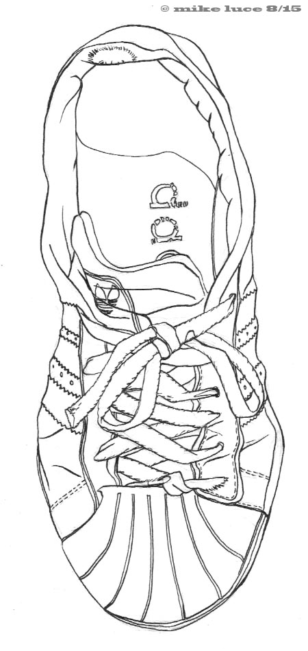
This was something I've been thinking of doing for a few days. It's a self portrait. I was feeling down, not very special and, honestly, a lot like this old sneaker I've only just replaced. But there's also something really comforting about an old pair of sneakers. They fit exceedingly well, I've had them for a long time and been a lot of places in them. They're 5-6 years old, have climbed Palatine Hill, wandered about Venice, Vienna, Budapest, Boston, Michigan, transitioned me from one job to another. At home or work, winter or summer, these are my shoes. They've had their laces sewn into the knot because they used to come untied multiple times a day. I slip in and out of them with ease but they never fall off. I'm going to miss them if I ever throw them away. The more I think about it, the more they really do represent me. I only drew one as I wanted a feeling of being incomplete about the image. Maybe I'm thinking too much about this. Or not enough. Pen and ink.

Another simple image as I play about with colors. With the sky being green most of the time, it occurs to me that at sunset, it fades to a dull kind of yellow. The sun does the same kind of thing. Lots of nice, purple shadows in this case. Also threw a filter over Mikilo to dull him and bring him into line with the shadow color. I think his new coloring works pretty well. And the logo looks nice. Just a sketch.

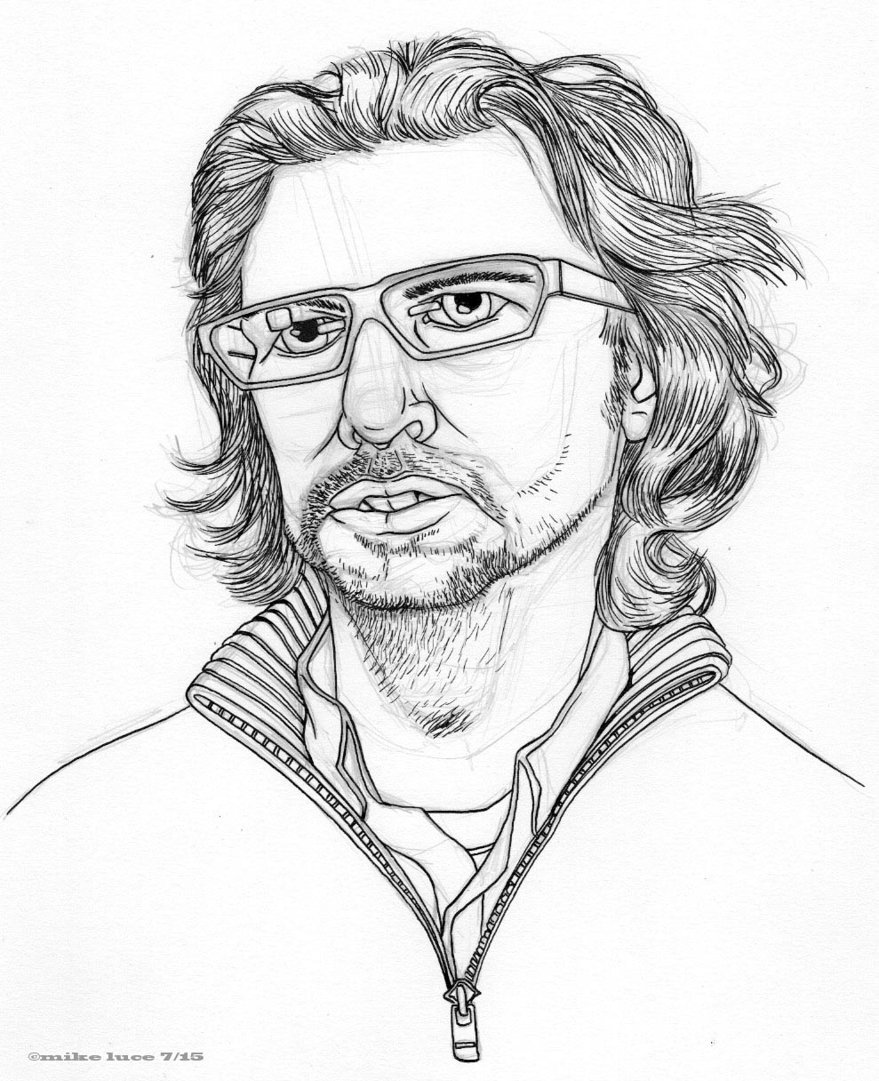
Did a quickie self portrait today, deciding that the usual poses for selfies was boring. This is me, pretty much just going 'meh.' I'm pretty happy with it, though this particular nib is getting a bit rough, which is too bad as it's one of the Schulz nibs. I still have a few left but they're limited, I'm sure. Just a bit of fun.


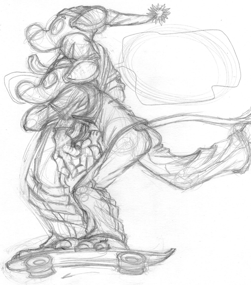
Nothing too much here, just a more detailed image of Rooster. He's the first character I've killed off, though, now that I think about it, the fates of Guz and Tamino aren't 'continuing,' though neither is really 'dead,' either. The dark background of this and the recent page of the comic is meant to signify death. That starburst behind him is a kind of halo, though this one centers around his heart, not his head. I suppose it's meant to symbolize passion or something. Rooster, like the rest of the mice was rather directionless, wandering, perhaps even lost. Certainly blind to a greater world. Maybe that's a theme behind these characters. Or perhaps I made it all up.

I haven't done a page in this comic for a bit. I get distracted, things come up, there's travel, etc. I want to get this done, though, partially because I want to include it in a volume like that I did for Tamino that will collect all the short story comics I've done up til now. As I've mentioned before, this comic has changed direction quite a bit since starting it. I'm starting to wonder if that's just how I work, that spontaneity is a part of my process. This comic, originally meant to be a snapshot, not unlike "Sound and Fury," illustrating the lack of grandeur in the lives of these characters, is now more about death, grieving and the inability of (specifically male) characters to express their feelings. The little captions at the bottom of the page, originally designed to help my partner be able to read the comic and then used to somewhat comedic effect will now be instrumental in how the story finishes. Now, I just have to finish it.


Just got this back from Apple; it's the 'definitive' version of Tamino done as I always meant it to be. The paper is heavy and glossy, the colors deep, the blacks super black. The comic was always drawn with the idea of four pages shown at a time, and in this format, I was able to do so. There's no extra stuff in here, no behind the scenes, just the comic. And that's fine. This version cost me over $100 so there's no way to ever print them this way for sale, and really, who would buy it? It was worth doing if just to have the one copy of the comic that I can look at and know was done 'right.'

Cast update image. I've been working on the comic in the background (mostly in my head) which has been a slow moving process, I admit. That being said, I think it will be a stronger story because of some time spent with and away from it. One of the big changes is the coloring for Mikilo. The reason for this is that the world the other characters is on is foreign to them. There are elements of magical space travel in the story and I wanted to differentiate one race from another more than just with words. Since I planned for the flora and fauna to be wildly different from what we know, and planned to had odd colors I finally decided that Miki's usual coloration made no sense. It sets him apart from the other two and allows them to stand out from him a bit more. There's also a hint of maturity in these versions that's missing from some of the earlier ones, I think though everything still feels cartoony, which is something I want. Hopefully, this will allow me to move a bit forward. I could use that kind of push.

Had an itch to draw and didn't want to draw me again. I've drawn me or painted me over 60 times. So I took a freeze-frame from a documentary a friend of mine made and used one of our co-workers as a model. Tom Devlin, now owner of Drawn + Quarterly was once someone I worked with at the Million Year Picnic. All that hair and the scruffy facial hair called to me to draw them, so I did. Pencils and then the inked version just for comparison. Very much glad that the effort didn't end up looking like me. And my partner, who's met Tom once instantly recognized him. So there's that.

As work on the story progresses, things change. Since the world that Crow and Francesca are on is not their native one, I thought about having the flora and fauna as odd and alien as possible. To that end, though I've got elves and such, it occurred to me that changing their colors from the obvious palette might make them feel a bit more alien. And so they do. Mikilo is now violet in color which not only really makes him stand out from the other two (perhaps too much) but the green sky and deep orange sun help make everyone else stand out, too. I will be making the foliage in colors other than green and brown. The world is supposed to suggest faerie but again, an alien one. So here's a step, even if a small one.

Spent today working on a mock page for the comic. Haven't done any visual development on it in awhile and there are some problems I know I have to overcome. The fonts are one of them. I'm not totally sold on this one, but it's closer to what I think I want. Each character will have his/her own but I still want the words more integrated into the art. Crow, being the least sophisticated I gave a kind of runic font. It works ok but requires that I do it all by hand. The background is generally what I want but I need to play it out better. And there won't be any panels if I can help it. Don't like panels. Don't know why, I just don't. That being said, Crow's not as good looking as he was yesterday. Then again, he was a little too cute yesterday so this isn't a bad balance. Really, I have to nail all this down so that I don't try and switch styles in the middle. This isn't the best page, but I think it looks pretty good and is a step forward. I could use some more of those.

Biography continues on, in tiny little spurts. This one came from my starting to read the big, heavy Drawn+Quarterly 25th anniversary collection/celebration thingie. See, I know the current owner/publisher. We used to work at the same comic store way back when. I knew him before that as he worked at the local Diamond warehouse (comic distributors). I used to drive him home on the way back to making the delivery at the store. He slept on the way. Tom's gone on to do exactly what he wanted; publish the kinds of comics he really likes to read. It's hard to compete with that, though really, I'm not in competition. As is usually the case, I veer away at the very end, not really delving deeply (heh) into my true feelings on this matter. I guess that's a theme in Biography. Hints and sudden turns. Can't confess even to myself... at least not publicly.


