Thursday, May 09, 2013

Some work in progress images of stuff for the next short story I'm working on. My pencils are fairly tight but I like to think of inking as a sort of final edit. Inks shouldn't be exactly the same as the pencils, some problems should be left to be solved in inks or it's just repetition and thus, boring. One of my recurring problems is that I cannot place figures on the page which results in things like the last sketch having feet that are cut off. Oh, well. Can and will be fixed. AS much as I've loved my brush, the crowquill is just SO wonderful. I'll probably still use the brush but this style is in my head right now.

EDIT: Here's the inked version of the last sketch, now with feet.

Tuesday, May 07, 2013

A few things; first are two sheets of sketches, just me making variations on a fox character. The inked version is just me, the pencil is me looking through my Nickelodeon book and using their styles to play with. I think it's good to try and get out of my own head, to see how there might be other ways to approach a problem or a character. I'm always hoping to push myself into something better.

The last one is the update from the previous entry. I changed the species, made him a fox and colored it. That one's just a warmup.

Sunday, May 05, 2013

Afternoon warmup sketch. I think I have another short comic story in mind, this time not for anyone or anything in particular. So I'm doing mood pieces on pub tran as that's where it will take place. More detail means more time but that's ok as I don't have an editor in this case.

Saturday, May 04, 2013

Self portrait with me as a fox sitting on the bus. I grew up with pub tran and I miss it. Ink and Illustrator.

Wednesday, May 01, 2013

Added the second character from the show. Actually watched an episode so I have a better idea who they are. I have to say, my interpretation is, shall we say, wide. But so what? The person I did them for seems to like them, so that's fine.

Tuesday, April 30, 2013

Quick warmups today as I didn't have anything set I needed to draw. The ferret is meant to be a friend of Digby's, the jay is a character from a show called, "The Regular Show." I don't know anything about the show but someone sort of asked me what my version of the character would be so I did this. Ink, Illustrator.

Friday, April 26, 2013

Finished beaver. ArtRage has a lot of potential and for my money, is a lot easier and more fun to paint with than PS. That being said, there's probably a lot it can't do. Don't know if that's going to matter to me. ArtRage seems to work more like I do with 'real' media. So yah. Here's a beaver.

Thursday, April 25, 2013

That last page of Biography went over fairly well, which makes me feel good. I think the third in the series is the strongest of the four personally but I'll take what I can get. Since I was playing with ArtRage, I decided I should play around a bit more with it. I haven't used it that much in the past partially, I think because it really needs a Cintiq type tablet to be used properly (though I think tons of people don't have one and use it just fine). So I grabbed a random character from the files and just started painting away, the goal being to make it a lot more 3D than my usual work. This is only a WIP shot, but I think I'm getting the hang of it. This is a dirt cheap program (I think there's still a free, less featured version) but it's grown and gives what I think are pretty nice results. It has the most 'real media' feeling of any program I've yet used. This image is being made with mostly just the paint and palette knife tools. I'll likely finish it tomorrow.
Last one in this series. This time I used ArtRage, a program I've barely used before but which seems to be made to be used with the Yiynova. This is far more like actual painting than does PS. I thought about painting the background as well, and I was even erasing the lines that showed through but I like the suggestion of impermanence so I left them. After all, I am supposed to be going off to watch cartoons. The lie here is that I was already watching them in the background. Ah, well. The point of this series was to experiment with different media to make what is essentially the same image. The background doesn't change (much). So I learned something. And I do like the sense of motion between the four pages. Much better than the original idea of this being four panels.

Wednesday, April 24, 2013

Finished version of the drawing from last night. Sometimes I know exactly how I want to finish a piece and even what needs to be done to get it that way. This is usually dangerous if I can't finish it before bed as it means that I'll be thinking through those steps when I should be falling asleep. Last night was, thankfully not such a night. After some brief thought, off I went. Who wants to dream in PS layers and settings anyway? There will be one more in this series, though I'm not sure how I'll finish it yet. It's actually been rather fun using this series as a means of experimentation. Only the second one didn't use the Yiynova, too. This is a good thing.

Tuesday, April 23, 2013

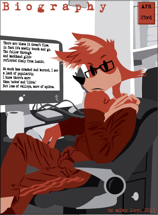
Came home from work and drew this up for tomorrow's biography. Thought I'd post the plain drawing before I did the painting that will go with it and without the continued background. Crowquill and ink.

Same setup, different approach. I took some photos and was originally meaning to do this as a four panel page but yesterday's took too long to do. So now it's a short series. Biography's been on the back burner as I do other things. Until I can get my tax return and buy ISBNs, Tamino will wait just a little longer. Otherwise, I don't have pressing matters. So, this.

Monday, April 22, 2013

Not having a bad day, I just feel the need to try and create something every day. I can't tell if it's because I love to draw or I just need to prove to myself every day that I can draw, that I've learned something that I've made some kind of progress. One of the first things I do in the morning, after slathering peanut butter on bread and grabbing my diet Pepsi (yah, I know) is to sit down and see what art is being underlined on the web. This gets me going. It's rare that I don't see something that makes me want to draw. And so I do. I think some of it comes out overly maudlin, such as today's but I don't think that's a reason not to make it. Biography is meant to just reflect what's in my head for that particular day. Apparently, this was in there. Now it's out. I can move on to something else.

Saturday, April 20, 2013

Took a little break from nearly everything and played with this today. I was painting it in PS and I might go back to it but something just made me reach for my old standby, AI. So here it is. A youth about to break his neck. Well, that's what some of them do, isn't it? Originally drew this upside down, but it looked too much like the last version of Smatt I posted. So I flipped it (which is a good way to make sure that the drawing's ok) and added the skatepark.

Thursday, April 18, 2013

Another take with PS. I was looking through a book I have on Kunisada this morning and decided to give this style a try. Took one of his prints, changed the gesture from one of a samurai with raised sword and changed it to the fox stretching. Couldn't use the watercolor brushes, so used a nice, flat oil color one. Found a decent paper texture online which helps a lot. Could have done this in Illustrator I suppose, but it still would have had to come together in PS. And since I own the program, I might as well learn how to use it. Ink, PS.

Wednesday, April 17, 2013

Did another one today before work, this one by memory from when I used to take the bus to other work. Didn't sleep on the way so much as I did on the way home. Never missed my stop. Used to sleep on the subway, too. Never missed a stop there either. Learning a bit more about this process. I should be able to use the magic wand to select areas, just like I was using masking fluid and have less overmix. I kind of like the fact that it's a little messy, though.

Tuesday, April 16, 2013

Another morning warmup using the Yiynova and PS. Sadly, I paint better with PS than I do with actual watercolor. With paint, I tend to be too heavy handed. It's an easy thing to do with watercolor, especially if you're used to paint that can be, well, painted over. Keeping a big brush size also forces me to stay loose, which is a good thing. I could see doing a comic in this style. It actually takes less time to color this way than with Illustrator and has the advantage of having some depth. So, experimentation continues.

EDIT: Did another quick one.

Monday, April 15, 2013

Playing about a bit more with the Yiynova and PS. Inked this in my sketchbook as really, I can't get quite the same effect with the tablet as I do with a crowquill pen and ink. And there's something more satisfying about feeling that nib glide (and catch) along the paper. Having just downloaded a new set of brushes, I wanted to experiment with watercolor effects. I scanned some blank watercolor paper for texture and then just went to town in a layer underneath. Set the wc paper layer to multiply, brought down the opacity a bit and there you go. Tried to keep quick and loose. I think it has a kind of Richard Scarry feel, which would be something to develop I think. All in all, painting on the Yiynova is pretty satisfying. This application and the one below from the Biography comic (I made the red shapes organically on the Yiynova with the pencil tool) feel good. What this means is that the Yiynova won't take the place of lots of my tools, it just might be another one which is fine. It's the end result that matters.

It has been a long time. Was in a kind of low mood this morning. Drawing made me feel better. Now it's time to go food shopping.

Saturday, April 13, 2013

More learning. I forgot that I came up with a kind of down and dirty process for PS painting a couple of years ago when I was trying to replicate the background style of old HB cartoons. Remembering that today, I put it into practice with the image above. With the prep done, that mouse head took me about 50 minutes to throw together. While I haven't done any extra layers for contrast or to throw contrasting colors into shadows to deepen them, I think it came out well enough. What I did to make this is to take a pencil sketch, bring it into Illustrator and define each separate element with a different colored shape. Then I export each shape onto its own layer in PS so I can select that shape and use it as a mask for the layer I'm actually painting in. Don't know if that makes sense but this is what the Illustrator image looks like that I make my selections from: I choose wild colors so it's easy to tell what each shape is. Obviously they have nothing to do with the final color choices. Once I've painted an area, I turn off the selection/mask and work on the edges, softening them a bit to keep things from being too sharp. That make any sense? It certainly makes things faster for me.

Friday, April 12, 2013

Finished this up this morning. Is it perfect? No, but it's an exercise so I don't want to spend too much time on it. I think that I'd add more contrast to the most shadowed parts and do a bit more with the transparency layer. The little I did really made some of the shadowed areas pop, such as in the hood, the ear and the neck. Also should probably think about a highlights layer on top. Live and learn.

Thursday, April 11, 2013

Something in progress. I think that when all is said and done, the Yiynova will not take the place of brush and ink for me. I'm simply too practiced in it, too fast to make it worth my while to learn a whole new tool to do something I already know how to do. Replicating skills isn't a goal I should aim for, I don't think. However. Something I haven't worked on much is learning to paint in PS. I've done a piece here and there, but really the problem has always been that I had a tiny tablet and painting while not looking at my hand was weird and off-putting. So I grabbed a sketch and started painting over it today. It's a LOT easier doing it with the Yiynova than it was with the Graphire and this is where I think it will allow me to expand. And I should learn to do this. Gets me out of my usual flat thinking at the least.

Sunday, March 31, 2013

More practice with the Yiynova. I'm getting a little better with it though there's still too much command-z for my tastes. Actually, ANY of that is too much. Adjustments were made since the last time I used it and things were smoother. Jack Kirby is always a good place to start. His action poses were simply the best. His influence is still out there today. As far as I can tell, he didn't really have any basis for his anatomy and it didn't matter. Stuff felt right and was so dynamic.

EDIT: Did another one because it was fun.

Friday, March 29, 2013

Took a little break from working on the iBook. The problem with seeing other people's work on the web is that it makes me want to get out of my own head and do something different. So I made this. Pushing my boundaries is the only way to improve. I generally make things so flat, keep in one perspective so I bent and twisted Smatt as much as I currently can. There's always more to be pushed. This will do for now.

Monday, March 25, 2013

This is pretty much what I did today. The black and white is Digby pretending it's spring. I broke my little rule and did this in ink. I was taking a break from the digital work. Then the Tamino cover, which is what I was doing on the Yiynova had to eventually be done in ink as well. Why? Because I don't know this tool well enough to produce something of equal quality to the interior. Yet. The results were decent on the tablet, but just a lot better with the pen and brush. As it stands, I'm still a lot more efficient with ink. Then again, I've had 25+ years to get that way, and only a week with the tablet. The tablet skills will come and I already feel a lot better about it. I just don't need any more delays in getting Tamino out the door. For what it's worth, this is what the line work looked like done on the Yiynova:

Friday, March 22, 2013

Another day working with the Yiynova. This is a WIP shot of work for the cover of the Tamino comic, as I want to get it done and up on the iTunes book store as soon as possible. I penciled out a drawing that was much like the mock up version, scanned it and started work inking it with Illustrator. The blob brush does a decent job acting as my brush's stand in. It's got decent variation. I just need to play with the sensitivity a bit more. Regardless, the 'inking' is already starting to feel more organic and, honestly, if I can get something out of Illustrator that looks this much like ink, I'll be a happy camper. Also, moving the Yiynova to a spot in front of my iMac and lowering the angle makes a difference. Didn't feel so worn out and was enjoying the process quite a bit. I also re-made the logo using the pencil tool and that worked pretty well. I can totally see drawing using big, fat shapes and editing them together after having thrown them together with the Yiynova and Illustrator. More to come.

Thursday, March 21, 2013

I've been working on fixing the final bits and pieces of Tamino to get it ready for release. This image is from page 96. I never liked the series from 93-96 so have been playing with them. This month, I decided to try and keep off ink so as to give the Yiynova a chance. It's a new tool and I have to learn to use it before deciding if it's for me or not. This was inked and colored totally in Illustrator using the blob brush on the Yiynova. So far the only real issue has been that the pen cramps my hand, but that's a fault of my hand and not the pen. I have this trouble with any pen if it's thicker than a pencil. I need to adjust my death grip on it. Yesterday, I was also a lot more tired drawing on it than I am inking at my drawing table. Adjusting its angle and proximity today has already made a difference. No reason not to have it as close to the set up I have for the drawing table as possible.

To my eye, the inking on this looks pretty much the same as in the rest of the comic, though this is a rather small example. If I can get the Yiynova and Illustrator to do what I used to do with ink, I'll be a happy camper. The one thing that happens every time I use the Yiynova that I wish didn't is that the resolution changes on my main monitor and I have to put everything back if I want to use my computer for regular tasks. Again, not the fault of the Yiynova, it's just the nature of the beast. So far, I'd say it's well worth its $600.

Tuesday, March 19, 2013

Did these two tonight, but with totally different materials. The color version uses a drawing made with a crowquill pen and ink, scanned in then colored with Illustrator. The second was made using my new Yiynova tablet/monitor, a much cheaper alternative to the Cintiq that I received today. This was done totally in Illustrator and to me looks very much like the ink version. I'll need to make some adjustments with both the 'brush' in AI as well as the pen/monitor combo but this is one of the reasons I'm trying to go more digital. I have a lot to learn with this thing but it does seem to be the way Things Are Done these days and if I want to continue to progress, this is one of those steps. Drawing right on the monitor is something I've wondered about for a long while, but the Cintiq is just too damned expensive. The Yiynova is a quarter of the cost. I honestly hope they make in-roads before someone buys them up and shuts them down. There needs to be competition. Wacom has had this market to itself for far too long. I'll make more experiments. So far, I like it.

Monday, March 18, 2013

Another one of these. I think he'd make great t-shirts. But that's just me. Or maybe I'll make a couple and I'll wear them. :"D

Sunday, March 17, 2013

One more of these. More successful, I think than some of the others. Think it would make a decent t-shirt. Used Frazetta as ref again because you always learn when referring to masters. Don't know anyone else that did action half as well.

Saturday, March 16, 2013

More work in this direction. Sharp's aged a bit more than I'd like, but I'm getting there. Benny looks decent. I think approach is likely the one I will go with. I've said that before, but this time I mean it!! (I hope)

Friday, March 15, 2013

One more before work.

Well, it's a new day so here's another version. This one seems more uncomfortable flashing his undies than the other one, which is a cue to me that I should use this approach and leave the cute ones for something else. Writers say their characters sometimes write themselves. Perhaps cartoons can do the same thing.

Thursday, March 14, 2013

One more for the evening. My partner thinks this version of the character is too cute, that he won't lend himself to any kind of heavier storyline. He might be right. And I suppose the design is somewhat watered down, derivative. But. I could see this on t-shirts and such. And I'm getting old enough that any kind of success with my artistic skills had better come soon or it won't come at all. Funny how much trouble a cartoon bunny can cause.

Just one more for the day.

Another one in the newer style. There's a lot going on in my head about this. It's more fun to draw, which is a major point. But we'll see.

Wednesday, March 13, 2013

Did one more for the evening.

Ok, now I'm just making trouble for myself. I doodled the first two last night out of nowhere and the lunging one this evening, using a Frazetta pose for ref as I always swipe from the best. Thing is, while I think the most recent designs of the bunnies are -interesting-, I don't think they're -appealing-, and that's a 'power word' I've read over and over again in the animation community. Yes, these versions are cuter, yes they're more mainstream and hell, even potentially marketable than the more 'realistic' ones. Is that such a bad thing? I have to say, it would be nice to have at least the potential of making some money off my comics some day. Keeping them too quirky and artsy isn't the path to that kind of outcome. That being said, I do -like- these versions as well. So.. yah.

Friday, March 08, 2013

I've been working on this for a friend's birthday. Very geeky of me but it's our current gaming group done as if their characters were part of an action/adventure cartoon show. So there.