It's -almost- tomorrow which means this could be a post from a different day. This is the Silas page with the filter level turned off. I did the graffiti in colors which I think helped the final version. I don't think I could work out how to use the limited palette on my own. So there's this. And in a way, I'm glad it's preserved and can be shown even if it is garish.
Thursday, September 01, 2016
So of course I had to do one of these because the whole world wasn't trumpeting my praises as soon as I posted that Silas page. Sometimes, this is just how depression works. Right on the tail of having someone write a glowing review of one of my older projects, I have a downswing. On the other hand, I think doing these actually helps to some extent. I like this style for cartooning, partially as I'm able to draw it without overthinking too much. Maybe this would have been my "strip style," were I ever to do one. Or maybe this is what my actual cartooning would look like. Either way, I adjusted the style so that it used the pencil lines as well. I kind of like it this way.
After dinner, I did some tweaks to this. Layout will have to be tighter in the future as really, there should only be three paragraphs shown of the song. I eliminated one and added some paintover and moved some things around. Part of the problem is not really understanding the blue lines on the comic pages. Then again, I'm beholden to no one. Still, I think this version is better. All I had to do in PS was to heighten the contrast by 8... whatevers.
Done but technically still a WIP. While I like the overall look of this, I think there might be too many words. One of the things I wanted to address with this comic was the disconnect my brain feels when I look from the image to the words. I thought by integrating them more into the art there might be less of this. Right now, it's exactly the same though without the actual balloon. So we'll see. Used a couple of intermediary layers to both unify the palette of the graffiti and to tone it all down. The crazy colors are more 'realistic,' but don't work as well. Silas as is barely stands out. I only hope this is the beginning of something bigger. Might trim the amount of text for this page down. Songs won't last long if I don't.
Wednesday, August 31, 2016
WIP version 2. The graffiti is currently way too colorful, though that's the nature of the beast. Likely, there will eventually be a layer over it to dull it all down. Still, that's something I have to contend with. So odd for this to come on just as an article comes out praising my use of very -few- colors. Ah, well!
Tuesday, August 30, 2016
Did I start a new comic? I don't know... but if I do much more planning on this, I won't do it. So I took a page from my professional comic artist pad and drew out what could be the first page of Silent City. Like Tamino, I don't want to use panels or word balloons. When I see Scott McCloud next week, I will ask him if this means it's a comic or not, because I can. Place and time will be indicated by props and color only. Here I've posted the inked page with the penciled graffiti still there. The inks will be the usual character, the pencil is just there to make the graffiti in Illustrator. After all this, I'll make the lettering for the lyrics. I had a talk with an artist friend who made a good suggestion; shoe Silas either painting the lyrics or painting over them. Make that a shtick. So I likely will. Anyway, the second image is as far as I got coloring tonight. WIP. Here's hoping.
Friday, August 26, 2016
And now for something completely different...I downloaded a cartooning manual from the 1930s the other day and was kind of astounded at how easy the artist made it seem. That being said, I do love me some rubber hose style cartooning and animation. So I took the 'lessons' and applied them to Crow from Ghiroy. It was fun. I don't think this is the way to go for that comic, but it helps make my sketchbooks look like the product of a schizophrenic. :"D
Here's two images that don't go together. First is the inked version of the last image which I think came out well enough, and second is a proof of concept of what I hope is a long form comic. I've had real trouble starting one of these since Tamino and it bugs me no end. This one would be... a musical, really an opera as I don't know that I want dialogue at all, just 'songs.' It also would start right after Tamino ends, using Silas as the main character. I HOPE I can make myself follow through with this as I really miss having an ongoing project. So, well, here's hoping.
Saturday, August 20, 2016
Well, here's something I don't do. I know some artists keep 'secret' sketch books and such in which they might have nudes like this one or more risqué stuff. I don't. This is as racy as I get. Not even sure why I did it as but as is usually the case when I try and do anything even vaguely mainstream, it gets twisted and odd. Might ink this, might not.
Tuesday, August 16, 2016
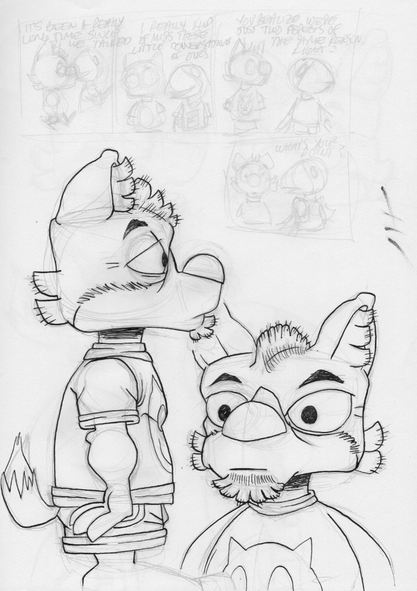
So there's this. Did a strip just to see how hard it was to do. Very hard indeed. The composition's off and I really don't do lettering that well. In this case, the AI lettering isn't that good but adequate at best. I like the idea and writing of the strip. It has HEAVY Peanuts influence, which is intentional, and a bit of meta to it as well. The rest of the images are sketches, some of character designs, some of re-draws from the strip which are, of course, better than the drawings IN the strip. Ah, well. Likely won't go too much further with this, just use the characters in the Party Line comic but they're fun to draw and sometimes it's just about the joy of drawing and nothing else.
Thursday, August 11, 2016
Spent a lot of time messing about with this style, these characters today. Mostly with the coyote. It feels a bit more standardized now. There are real parallels to Peanuts comics, especially in the poses I drew in my sketchbook and the proportion. That being said, there's still that odd sketchiness about them, too. If they remain the style I use for the Party Line comic, so be it.
Wednesday, August 10, 2016
Tuesday, August 09, 2016
Still doing this comic with some folks I know and some I don't. I keep changing styles (surprise!) but this one seems to have particularly tickled one of the guys I know least. I tried to have something both more structured and more cartoony, and kept the image rough so that it would be even more organic when through into Illustrator. Did the coloring there with the pencil tool so it wouldn't be tight. Didn't have much to say on this subject as I don't feel I do pay homage or parody anyone when I cartoon though I do TRY and absorb or even replicate styles. I'm just not very good at it. :"D
Quick sketch dump to show I've been doing SOMEthing, even if it's non-productive things. I got distracted even though I have started the next illustration in the 'print' series. One of my favorite styles of cartooning is the 80s/90s version of the Belgian comic, "Spirou." It's so lively, cute and cartoony. And it's full of lovely ink. I -think- the artist used a pen, but It might be a combination of pen and brush. In any case, I let myself get distracted with that and the Ghiroy characters, which does no one any good. So this is just a bunch of pages from a recent sketch pad. Move along.
Monday, July 25, 2016
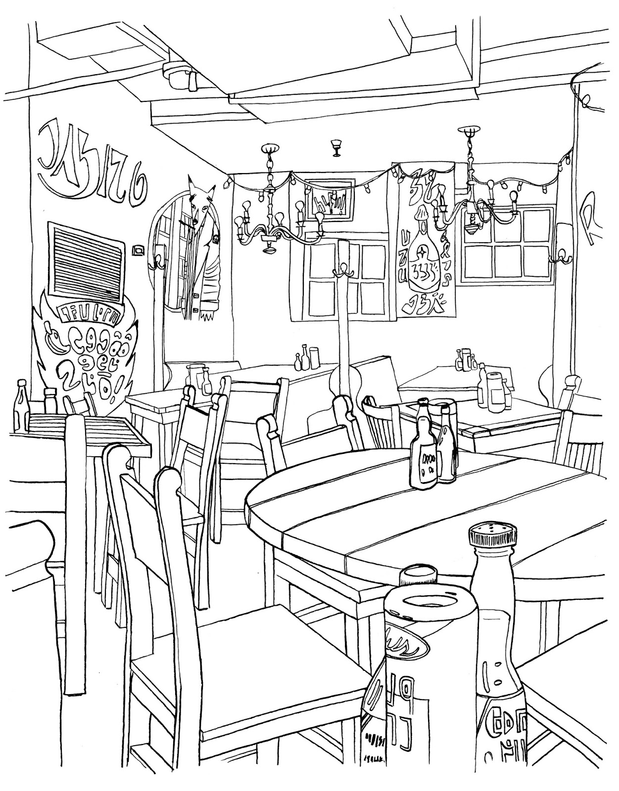
While I might do some final tweaks with this one, I think it's pretty much done. Made a lot of editorial decisions since the last version, not least of which was to cool down and darken the background considerably, warm up the foreground and tone down the color in the condiments at front. The photo I took at the Border, which was strangely empty, something that rarely happens there, is at top. The inked images I used for characters and background are next. I do them separately because it leaves me options for editing later on. I made a grid over the photo in AI, made another grid on paper and freehand drew it which helps things stay a little wonky. Wish I'd done this for the Tokyo print but live and learn. While that one was twice as hard to do as this one, it had more to do with my bungling of my own workflow. So this will be another in the 'print series,' which is just me doing some more detailed stuff to possibly sell later on. I like the big prints and once you have something done in giclee, it's kind of addictive. Not sure what the next one will be but I might go looking through some of my Europe photos and try to come up with something. There's lots of stuff, especially in Italy with tons of small details to obsess over.
Saturday, July 23, 2016
I've been working on this a bit here and there, mostly today. Pretty much all the color has been done, though none of it is final. If you compare this version to the last one, there have been some obvious changes. I both darkened and cooled down the background, swerving from the original reference photo. I'd like to make this more representational but the layers of different lighting colors and strengths would have made that, I think, rather unpleasant in this form. I also warmed up the colors of the foreground characters and I think they have more punch. Still to do; the lights along the sides of the alcove, perhaps some enlarging and cropping and final color balance. Still, it's 95% done.
Saturday, July 16, 2016
"New WIP of this image. Did a lot with the background which likely doesn't show so much. Decided to erase most of the background lines, especially around the light bulbs. The color palette and balance is going to be key with this, and currently has a warm-medium overall tone for it. What's going to be most challenging is keeping the characters forefront, separate from the background but keeping the whole image coherent.
Friday, July 15, 2016
A work-in-progress shot. I wanted to do the bricks without line work as I think it would push things back. Though I drew the signs and paintings with lines, I'll end up pulling them out when this is done. So the back wall will mostly be just done in AI. The colors for the characters aren't final, they're more like placeholders. The back alcove will also, I think have a shading layer over it to further set it back and for the lights to show up better. Already I have better feelings about this one than the last version.
Tuesday, July 12, 2016
Two things; first off, this month marks the tenth anniversary of my blog here. I have no idea how much longer I'll keep doing it, though I have no plans to stop. The internet has changed so much in that time and blogs are pretty much passè which I think is a damned shame. Everyone's moved on to things that last less time and which require more and more content produced with less and less care. Must mean I'm old. Still, I'm pretty happy with the fact that I have a decade of work here, and a record of how it was made and evidence of my progress. If no one else reads it (hi, Vince!), I will.
Then there's the image above. It's a new version of the Border cafe image. After the one of the comic shop, I realized that the reason the old one was stalled was that it was just too dependent on technology and trickery to make it work. Since the Tokyo image was all Illustrator, I thought this one had to be, too. Thing is, the Border, like the comic shop, has a kind of shabbiness that's must harder to achieve without lines. So I redrew it and changed the characters out. And I'm much happier. Progress has been much faster and I think it will make a decent print when done. So far, I have the characters and background inked separately, put together in AI and I've started coloring the African Wild Dog part. Didn't really think about the species per se, but what we have is a predator/prey situation here which, I think could have a lot of connotations impressed upon it. And that's fine. Today's political and social climate could be said to be reflected in something like this and I won't deny that there could have been some influence on me. Or it's just a furry drawing of a wild dog and an antelope in a Tex/Mex restaurant in Cambridge.
Wednesday, July 06, 2016
Got the test prints back from the printer yesterday and they're delicious. What I mean is that the quality of the print job is amazing. They look like screen prints. I got them made at 16x20 which is four times the original size. Usually when you blow something up, it gets weird, jagged or the level of detail doesn't match. This time, I think it works fine. I don't think the final image would have really benefitted from being drawn at full size, either and that might be a product of having been turned into vectors. I think I might continue to make prints like this, in very limited editions at this size. Seeing work like this is a totally different experience than looking at it on screen. While I made small prints of earlier works, the larger size makes quite a difference. I'm dying to see the Tokyo print like this as that one's even more detailed. They're not entirely unlike paintings, in a way. I think I won't make more than 10 of each one, maybe fewer of those that aren't as 'appealing.' The Picnic one kind of had a built in audience. Others will be harder to sell. We'll see.
Wednesday, June 29, 2016
Not another one of these?! No no, wait. Hear me out. For like 20 years, I’ve been using Adobe Illustrator as my main finishing tool. Up through CS5, I was happy with the product. It’s my go-to, everyday art tool, right after ink and paper. I can output at any DPI I need, even after the fact with no loss of clarity and it gives me really fine control. The problem is, Adobe got kind of greedy. Where once you could by the most recent update for $150, and it would last you a few years, now they want $20 a month for the same program. That’s $240 a year and as a hobbyist, that’s WAY too much money. Problem is, Adobe hasn’t exactly been challenged in the vector market up til now. The image above was not made with Illustrator (except for the live trace feature), it was made with Affinity Designer, a program made to work natively on the Mac, another huge bonus. The other big bonus is that it’s only $50 period. Ever. Does it do everything Illustrator does? No, but it’s getting damned close and it can do some things AI can’t. While the workflow is very different than what I’m used to, I think I can make this work for what I do and I’m going to try. The subscription model for software sucks. I’ve always bought my software, I never pirated it. I don’t make much off my work, but I still try here and there. I hope that they’ll continue to add features, perhaps even, finally, live trace so I can say goodbye to AI completely. The above image isn’t that interesting, but the fact that I could get the same result with a program other than Illustrator might mean a huge deal to those of us who can’t or won’t afford Adobe’s subscriptions.
Monday, June 27, 2016
Worked on this a bit more. Trimmed the edges, added some highlights to the background so that there's a kind of arrow pointing to the fox if you squint. Also added some shadowing to him as well. Moved the fox further into the background, which allowed me to show the whole figure and also pushed him a little further into the composition. Will likely try and have a test print made and see how this looks before utter final.
Friday, June 24, 2016
Nearly done. There are just some final tweaks to do on this one, mostly to do with the lighting in general and shadows on the fox. This print came together much more quickly than was the image from the restaurant, which tells me that there was something wrong with that one. Part of that has to do with the character. He's a lot more stylized than he was in Tokyo. Yet that image works as well. I think things were just too stiff in the restaurant one. I should revisit it, trying to do with that one as I did with this. Thinking I might try and do one of Digby in a supermarket. I like all the details, the industrial lighting. We'll have to see. Once the tweaks are done, I'll order a full size print of this. Seems there are some friends who actually want one of this, mostly because they're ex-Picnic employees. Glad to have any interest, ever.
Thursday, June 23, 2016
Tuesday, June 21, 2016
Haven't posted in a while due to illness. I'm really slowing down which bothers me. But today I worked quite a few hours on these. This is meant to be the next print in a series or something like that. The end result is meant to be something about 16x20, or in this case, 20x16. The print will be called, "The Comic Store," and is based, as mentioned last post, in my own alma mater, The Picnic. I changed Digby's style to one that's far more stylized as it felt more like what I wanted to do. Digby himself is already kind of stylized, but I wanted to take him further. I -think- I'm going to keep the lines for the background as well, as it adds an overall shabbiness that I want to capture from the photo. Everything is meant to feel lived in, moreso than the last print. These things take a really long time to do, but there's something really satisfying about it, too. Didn't want to make the covers of the books too specific; like the city of Tamino, and Lucco, I didn't want them to be any particular comics, the shop, really to have to be in any specific place. Still, coloring's going to be a bear. Fun, but a bear.