Thursday, May 07, 2015

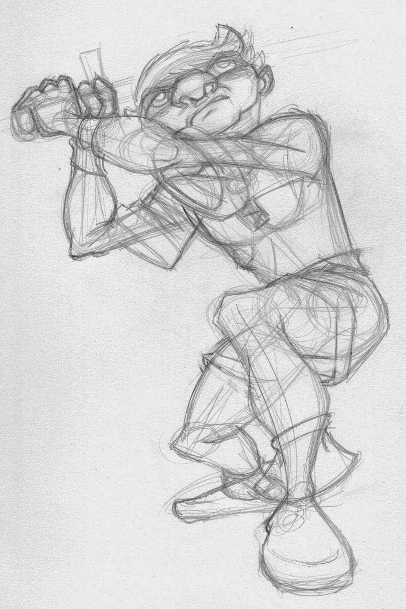
A little character design for today. This guy won't exactly appear in the comic, rather this is how Francesca will expect Crow to look based on all the stories she's heard about him. What she's greeted with won't convince her to go on the little adventure. That will have to happen from another source. I sort of based this on some of the heroic statues in Budapest. They had a Heroes' Square there and there were all these wonderful, energetic statues of brave men with the most amazing mustaches ever. I should go back and use more of those as reference and inspiration; they really were astounding pieces. Otherwise, progress continues, just mostly in the background and in a non-visual way.

Thursday, April 30, 2015

So there's this, too.

I've been watching and surrounding my thoughts with an independent production out of Denmark called "Tales from Alethrion." These folks really have it all together in my opinion. Link to their Kickstarter right here. Their first film, "The Reward," was a successful KS project and now they want to do a web series. I love their mix of anime, European and even a little American styles, I like their characters, their world and really, just about everything about what they're doing. I want them to stay independent and I want them to succeed. That being said, as is often the case, when I see something I like, I tend to want to play in that sandbox if even for a little while. This is both a good thing and a bad thing. Good because it gets me to think about my approach, flexes my skills and allows me to experiment. Bad because it causes me to doubt my way and my own work. Regardless, as I was sick over the weekend, I didn't draw anything for awhile so when I was well enough, I drew some stuff in their style to play around. Now I'm done. I have to keep focus. And really, I DO like the style I came up with for Ghiroy. This was fun, though. And I can see where there's a lot more room for expression in the way they draw things than, perhaps, the style I've chosen. So we'll see.

Monday, April 27, 2015

That other thing I do

Here's a link to the latest episode of my movie review blog, "The Movie Wrench." This time around, I tackle, "The Man of Steel." Came out a little longer than I wished; perhaps I had too much to say. Probably did. Next one will be shorter:

Movie Wrench: Man of Steel

Wednesday, April 22, 2015

So, this. Got a new Tom and Jerry DVD in the mail today. They're not as good as the Looney Tunes for sure, but the animation, at least in the ones done by Hannah and Barbera is really good and sharp. I like the music and hey, I don't have to explain. I like Tom and Jerry. So I did this. Tried to adapt the Smatt and Terry style to these two. Strangely, I like Tom better than I like Jerry. Oh well, back to the comic.

Wednesday, April 15, 2015

Haven't had anything visual to show lately as I've been writing and re-writing the outline to Ghiroy. For some inking fun, and connected to the last post, I did a quick Marcel and then I re-drew it, pushing the pose and coloring it. Nothing new, but still fun. I like to up the number of posts I made over the past year, but this one might be mostly about development. Written first, visual later.

Tuesday, April 07, 2015

This is a little one day diversion. Someone I follow on tumblr is doing an animation project where each frame is planned by him but drawn by different people. Seemed something I could contribute to easily enough so I signed up yesterday. I had some time in the evening, so completed and sent back the assignment. The pose and placement is his, mine is everything else. I'll be sure to post a link to the final project. For now, people can follow along at the project's bloodspot: Art-Imation

Thursday, April 02, 2015

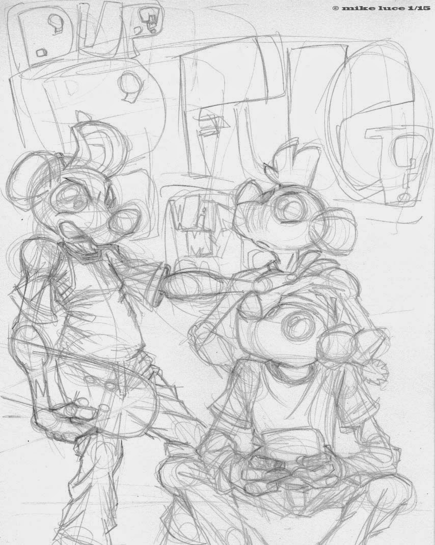
Finally got back to these guys. There's only a couple more pages to do. As should be obvious, this is another little comic about nothing at all. I think it's sort of a theme about comics I do set in the present day. Anyway, included the pencils for these, which I really enjoyed drawing. There's something about the physical act of drawing that really just gets to me. These guys have been very freeing in some ways. Scott McCloud (McLeod) saw these recently as we had dinner after a talk he gave and he said one of the things he liked most about the pages was the small areas of blank space in the compositions. I'll take that as a good thing. I don't think they were purposefully left in or decided upon but I'm not going to go back and fix them either. I think these look better with the contrast turned up a bit higher than they are here. Maybe I'll go back and do that. For now, two more pages.

Also, it might be noted that the finals are somewhat different than the pencils. Illustrator has become more and more like an inking stage for me; final decisions have always been done here, but now I have no problem taking elements and resizing them or moving things around. That's a major benefit of the tool, right? Composition always seems to be done up til the end, though now at least I'm drawing the characters together and not on separate pieces of paper.

Wednesday, March 25, 2015

Well, that didn't last long. I couldn't leave well enough alone. I redrew Crow and Francesca, the main hero and my mage. Just wasn't satisfied with them. Now I'm a lot happier. I tried to redraw the elf, but I ended up liking him the way he was.

Spent about a day and a half on this. I really wanted to hunker down and do at least one image that felt, all the way around, the way I wanted the comic to look. I wanted a composition to start, a setting, a background and I wanted to pose for all the characters. I came up with an idea that I think worked pretty well; I set my camera really low on the floor using a mini-tripod. Then, using the timer, I kept the camera in exactly the same position as I posed for all the characters. That way, they should be all in the right perspective and placement relative to one another. Beats hiring a lot of actors. It did require some moving about but not a lot. I could get over this by putting tape marks on the floor, but I don't know that it's really necessary.

I'm not 100% happy with the image, but that's ok. It taught me where I need to look and, stylistically, what needs to be worked on. First off, I don't like Francesca. She's too stiff. I went to redraw her but found that because of the way I took the photos, it was really hard to get a new drawing to fit properly where the old one was. So there's that. Also, I could easily push my acting a little and will do so. Thirdly, in the case of two of the goblins, I stuck too closely to the reference and they, too are a little stiff. Have to remember that I'm cartooning here, not copying. I was happy that I was able to get all the different body shapes and clothing cues even though I never changed what I was wearing. Might try some costuming. At the very least I think I need to buy a cheap bathrobe if I keep Francesca the way she is.

Speaking of her, she needs something of a redesign. I just don't think she's that interesting looking a character and she needs to bear the same weight as the guys. I won't have her being anything less than equal. While Crow isn't all that interesting looking, because he's wearing different layers, he's got more to look at than her. So I will work on that. Still, I think this came out decently and does have what I want for the comic. It took a long time to do, which tells me that the comic's not going to be any quickie at all.

Sunday, March 22, 2015

The best use for Photo Booth on my computer is doing expression reference. I could use my usual source for the expressions, which is an excellent book on animation design but why not draw from life? What this means is that I'll have to do more acting, learn how to show the emotions as each character would express them, not just a generic reaction to something but I hope that will add some sincerity to the comic. It will also force me to cartoon a little bit more as I learn where I can exaggerate or edit these expressions to get what I want. These are all just quickies but already I've learned some things I can and can't do with Crow's face. His nose is a little pug where Mikilo's won't be. I'll also try to have the lines of the expressions flow more with the shapes of their heads. More work.

Friday, March 20, 2015

Playing with styles is fun and a total pain in the ass. I do it because it's fun, but it's also counter-productive. It makes me second guess and waste time. This image isn't complete; there's another version of the two figures here, but they're more twisty like the ones I did yesterday. My partner had a look, wrinkled his nose and said no. Or something like that. And he's right. For this story, the characters need to look more towards the realistic side of cartoony. So I did this today with a more full background (though it still needs some detail) to get a better idea of how this is all going to work. And I think it is. There's a vague sort of Loony Tunes vibe to it, which is good. The composition is a little boring, but that's ok. I think it's a big improvement over the original version of this image. And that gives me heart.

Thursday, March 19, 2015

Ok, one more demon exorcised for the day. That's all.

Exorcising some ink demons. As I noted before, I get kind of tight with my stuff and sometimes I just need to scream, or, in this case, let it out through some goofier drawings. The one of Crow is far more twisted. The one of Mikilo is just goofy. Which is fine. These are just some curvy, inky fun.

Some more of this. A morning warm up, perhaps but since I doubt my skills, I do these to prove to myself that I can keep up a consistent style. Looking at a lot of my 'art of' books, I realize that I'm pretty conservative in my styles which is not my general outlook at all. I like to think of myself as a pretty liberal guy. Interesting that my art is so tight. For this story, I think it's necessary. And of course when I switch styles, it's hard to switch back. That being said, I like to play and that can be dangerous when starting out on a big project like this. "Book of Life," for example would seem to have nothing in common with what I plan to do, and generally it doesn't. Looking at its book, though shows me that I can flex my designs, at least for the backgrounds some, keep them in tune with my style while also adding some needed feeling to the whole product. So I'll be playing with that a bit. If I've learned anything, it's that inspiration can come from anything whether it's related to what I'm doing or not.

Tuesday, March 17, 2015

This is a design for a supporting character, a cameo, really. I wanted to make sure I could design someone else in the current style and have it work. His occupation, which is a kind of mind-power based warrior, will have direct impact on the plot, though this character in particular isn't important at all. More of a quick concept sketch really.

Monday, March 16, 2015

One more before dinner.

Decided to do some more work on the comic today, though it's still just development. One of the things that interested me was if I could draw the opening using photo ref and still have it work with the cartoony aesthetic that I wanted. Seems to be ok. Stuff's a little more solid, a little more 'real,' but still has the look I want. What this involved was me curling up on the kitchen floor with the camera set to self timer. No big deal. Later, I will draft the partner to help me out with multiple character interactions, something that's a bit scant in my work. Still, I was pretty pleased with this and think, as a proof of concept, it not only works but is a good deal stronger than the original version. I have many pages of notes and a complete first draft outline already. I'm going to try and keep any scripting loose so that I can compose via thumbnails and not feel like I'm just treading over the same material again and again. That's going to be key to keep me interested and on track.

I set out to do a comic that focused more on one actual topic which I would then discuss more openly. And I failed. Kind of. I think it's because of the format and process I use to make this comic. Generally I make some drawings, bring them into AI, then color them. The writing comes dead last and only has whatever room is leftover. This forces me to be concise but also tends to mean the comic isn't very specific. By the time I've introduced any given topic, half the space is gone. I re-read all the pages of "Biography" yesterday (there are 123 of them) and generally, I'm pretty happy with it, even if it's just a random journal comic about nothing in particular. It is, for my money, definitely the continuation of "Harlon," with a lot left out between the two. I mean, this is me, this is what I'm thinking about or experimenting with at any given time. "Hanlon" was edited in that I chose the events to draw about, leaving out lots of detail. Keep things simple, right? I did note that the earlier pages tended to be a lot more metaphorical and experimental. Don't know if that means I was hoping to reach a wider audience and I dropped that or what. Mostly, I just like to draw the rabbit-thing avatar and I hope to connect with anyone else out there. This blog is almost more journal than the comic. Eh, what the hell. Doesn't really matter as I don't plan to collect Bio ever. It's not a product. Even if vague or misleading, it's truth.

Sunday, March 15, 2015

Hadn't done one of these in a long time. I'd like to do more but I've been busy, and to take the time to do a comic about all of what's going on would mean I couldn't do that other stuff, some of which is goofing off. Anyway, this is page 122 of Biography, so there's that.

Wednesday, March 11, 2015

Decided to do something a little more complex today. Had a lot of fun posing for all three characters. I posed for the other two members of the party as well, though because this was not well decided beforehand, there wasn't room in the composition for Crow and Francesca. No big deal. Mostly I wanted to see what a more or less finished panel would look like. The background could and will be a bit more detailed. I am pretty happy with the figure work. Played with the lighting and colors a lot, using old WB cartoons, especially "What's Opera, Doc?" as inspiration. Goblins are green but cooler colors tend to recede and I wanted something that would come forward while leaving the blues in the background. Also, red denotes blood, danger, etc. and that's where the action is in this image. For Mikilo, I first added 10% blue to all his normal coloration which wasn't really pushing it enough. He still stuck out like a sort thumb. So I selected all the bits of him, merged them into one shape, made it blue then turned down the opacity to about 20%. Not only did it tone him down and make him look like he's almost moonlit, it fuzzed his details a little, helping even more to shove him into the background. Not bad for something done more or less on the fly. What this does tell me is that the comic is going to take a LOT of work, which is fine. I enjoy this kind of thing. Thrown in almost at the last minute is the ring on the goblin's finger. Wasn't satisfied with it just being gold. I came back and added some runes to it. Details like that are important and I want to do a lot of them throughout the comic. Anyway, the laundry buzzer just went off.

Tuesday, March 10, 2015

Just some elf practice as I haven't been able to draw anything for days. The lines around the outside give the images a kind of finished 'slickness' which I've decided I like. It will also help separate the character from eventual backgrounds. I wonder if people would have trouble considering this -drawing-. I mean, it is but it's kind of not, too.

Thursday, March 05, 2015

One more for the day.

More development work, this time with one of the monsters. There will be others, this is just the first one I came up with. Used a photo from one of my old Hildebrandt books. Those guys, like Rockwell and many before them used to take photos for reference for their paintings. It's something I started out doing back in the 80s with my Polaroid and have since mostly got out of the habit of doing. In this case, I think it brings a certain sincerity that was missing from the style I'll need to tell a more serious story. Since this was just practice, I used their photo instead of taking my own. I think it worked out pretty well.

A reversal from yesterday; having showed both lined and lineless versions of the images of Crow, my partner and I decided that we actually do like the lines better, as long as they're not so high a contrast to the colors of the figure as to become too overpowering. It will help separate the characters from their backgrounds, something I've been doing all along in my comics. The trick seems to be to use the one of the colors for the outline that exists already in the drawing. Also, by using one of the darker colors, it makes the face pop even more. So, slightly different pose, same style.

Wednesday, March 04, 2015

Did some more design work today. Since I've liked the images of the characters drawn from reference better than those without, I decided to see if I was going to be able to make my own poses work properly for this. So I grabbed my camera, a very short tripod and a sword we have lying around and took my own photo. Drawn from that, at an extreme angle I came up with these. Still doing versions with and without lines. Because.

Same thing as yesterday. Used some reference for Crow then did versions with and without outlines. In this case, there's a background so it's a different kind of comparison. That being said, I'm still leaning towards the one without the lines. I'm also thinking about adding texture to the backgrounds, which might flatten the characters enough on their own. This one was just thrown together to get a general idea. I also used the same color as the details on his skin for the outline so it didn't stick out so much. Still, the art here looks a lot better, more solid than what I did originally, though some of the style has been toned down. Moving on.

Tuesday, March 03, 2015

More on Ghiroy. Notes are going on in the background, sketching goes on here and there. Something that's been in my head vaguely is that the art style, which I like a lot, is a little immature for the story I want to tell. Without really thinking about it, I pulled out an old favorite for reference, Ruby's "The Human Figure," a book I've nearly worn apart (and one which I know for a fact Moebius used here and there) and used some of the poses in there both for the last images and this one. It caused me to be a little less fantastical and a little more literal. My partner liked the change, especially with the filled out story. The color palette, too made an impression on him which is a big deal because he generally doesn't like my work, especially if it's more cartoony or abstract. Mikilo's a little 'prancy' here but that's ok. He IS a little prancy. Working on the visuals while I work on the story. Little bits and pieces, but NOT just the aimless work like I did for Delve Deep. This is MY story, it's personal. And that makes all the difference.

The two versions here show one with outlines, one without. Since I'm referencing a lot of animation stuff (especially old WB cartoons), it made sense to give the lines a try. I don't think I'm going to use them, but it's not a bad thing to try things out.

Thursday, February 26, 2015

There's a lot going on with Ghiroy these days, mostly in my head and in notes I'm taking. While all that work on Delve Deep didn't lead to a comic, it wasn't a waste of time. It showed me the kinds of things I needed to do to get where I need to go. Having seen Scott McLeod, an old friend, speak recently, some gears started turning that haven't in awhile. I think I was going about Delve the wrong way; I was trying to use existing structure to dictate the story I was going to tell. Instead of having a story -I- wanted to tell, I was trying to construct one based on a formula. While that works for Hollywood, it doesn't work for me.

Out of nowhere, better ideas started to tumble out for Ghiroy. In a matter of a couple of days, I had a structure for the overall story, questions which popped up were just as quickly and logically answered. I have what I hope is my Pamina. I've been looking for so long. Ghiroy is meant to be a love letter to RP gaming, especially the world I've been able to play in for the last 30 years. There have been other inspirations, too. A book I got a few months ago about the work Maurice Noble did on the Warner Brothers cartoons has me thinking more seriously about the whole comic and my approach to it. This is what led me to the image above. There's a lot of talk about color there, both for backgrounds and characters. I realized that I'd chosen colors based on preconceived notions and not on what would work FOR those characters. So I've made some readjustments for the general coloration of the three majors. Mikilo, for example had his skin tone darkened which brings out his eyes which also more clearly focuses attention on his face. Also, because the character is meant to be an elf, and very long lived, I didn't want him to be wearing bright colors as washed out colors had more a suggestion of a slow burn. Ghiroy, on the other hand, is done in much warmer colors. He burns bright and hot. Short temper, intense. Francesca, too had most of her clothing toned down, but I left her with brighter lips and eyes that pop to suggest that while she, too is generally on the level, when she explodes, it's in little, intense moments. That's how her magic works as well. So basically, I've been trying to think a lot more about WHY I'm doing what I'm doing. Art is all about choices. To me, art that's less successful is art that has been made without making enough actual choices or decisions.

If the comic goes where I want it to, it's likely to be big. Perhaps as much as 4-500 pages. This will mean years. This is a good thing. I've really wanted a big project and this one is starting to flow just like the old ones. I'm hoping that, as I learn things from various sources, I'll get better and be able to produce the kind of comic that I'll not only be proud of, but one that others might be interested as well. So art might be less frequent for awhile, at least that which I post online. This one has to have at least an outline, a color script and breakdowns. Can't do it in the old style of just -doing- it. Here's hoping.

Saturday, February 21, 2015

While working on the story aspects of the comic, I decided to up the ante on the background style for it as well. What little backgrounds there were in the first 30 pages really weren't up to snuff. They were kind of style-less and lacking in detail. While there doesn't have to be tons and tons of detail in every panel, and in fact I'm thinking seriously of keeping it very minimal in close ups and two shots, there really should be a goodly amount for establishing and pulled back shots. So I worked on this for awhile today. Shingling the roof was a pain and likely more work than I really needed to do. I also think this is too fussy and the timbers and such need to be thicker. Still, this is more like what I think is needed for the comic.

Thursday, February 19, 2015

Haven't updated in too long. There's probably only a couple pages left for the skater mouse story, but I've been dragging my feet. There WAS a trip to Boston in there and work's been very tiring lately, too. Also, I got to see an old friend give a talk on his new graphic novel. That seems to be going really well for him. It's already been optioned for a movie. He also made me think about Ghiroy. I stalled on Delve Deep partially, as I now realize because I was trying to -make- a story instead of tell one. I had a structure and I was trying to make characters and details to fit that structure instead of tell something I wanted to tell. Ghiroy is meant to be a love letter to gaming, playing certain characters in our RPG for decades. That's stuff near and dear to my heart. As such, I think I'm more interested in it and tied more deeply to it. Sharp was sort of like one of those characters, but more image than depth. Ghiroy, or Crow Cooper is based off a character I began playing in the middle 80s. Though he's more or less retired, he's the favorite of all I've ever played. He is my fantasy. So telling a story about him feels more personal. And, if I can manage, the comic will also be a metaphor for something else. In any case, I've gone back to writing or at least plotting it. I'll likely start again. I don't regret the 30 pages I've already done and will have to redraw. They got me to a place I can really begin. So. Here's a page of just Ghiroy posing for no reason other than to draw him, and a page of goblins as there's going to have to be monsters. Goblins are a great, generic dungeon monster.

Monday, February 02, 2015

Finally got another page of this done. This one was a biznatch. I had to do a lot more masking, cutting and editing to get the lines in the background to work properly with the transparent word balloons. My own fault. It's because I don't plan these things out ahead of time. I could have had a lot easier time but no. That's ok, it was still fun to draw. We're nearing the end. Another short story about nothing at all.

Saturday, January 31, 2015

Last post of the day. Probably. First image is the quick sketches and layout for the next page of the mice comic. Note the Rembrandt in the upper left which is the basis for the painting mentioned in the last post. I then went and took photos for ref and the bottom image is of the pencils for the next page. What's hard to remember is to shorten limbs and such so they fit the mice and not my sort of lanky frame. Still have to get the background in there, but I'll do that afterwards. Right. Now, off to that OTHER job.

This is what distracted me from the mice. I started watching some artist documentaries on YouTube (always a dangerous thing) and started sniffing at fine art again. This is dangerous as it always takes me out of the mindset of doing comics. Or whatever else I'm working on. And at this point, I was really enjoying the mice. But I enjoy this, too. Luckily, it hasn't blown up into another selfie project, though this time using Rembrandt as a source. Did two ink drawings and then decided to do a little something in PS... or wait, I think I did the PS one first. And there's an Illustrator one in there, too. Just because. I was trying to make a street art inspired take on some old master's work. I didn't really achieve that, but I made these. And there's a half completed painting sitting on my drawing table, too. *sigh* Inspiration can be a bitch sometimes. At least I'm not on a deadline with someone else. So I guess my being distracted doesn't really matter. No one's waiting for any of this so who cares when it gets done?