Sunday, February 21, 2016

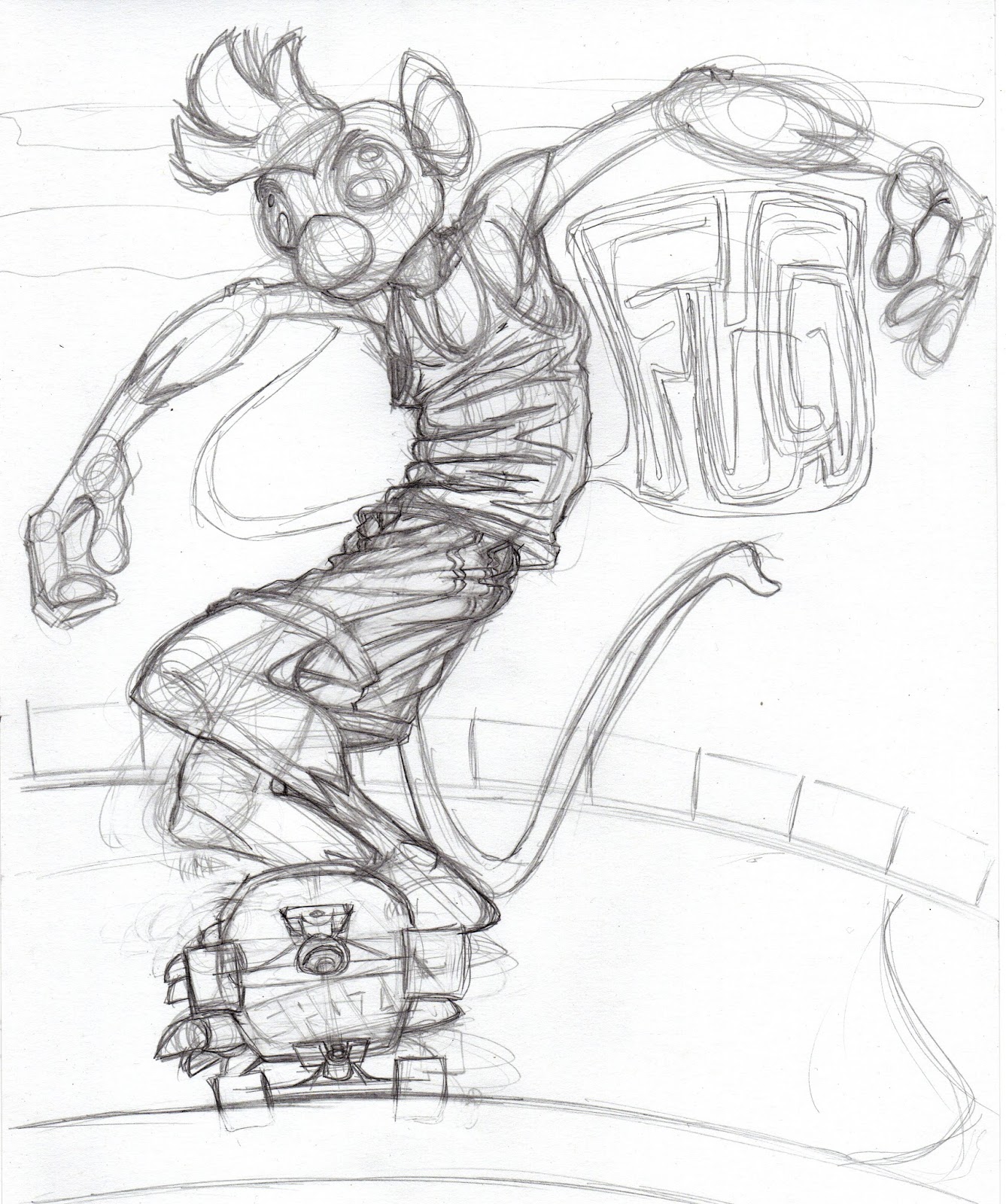
WHAT am I doing? Redesigning. WHY?! Well, here's the thing; I'm not getting any younger. I'm in my 50s and I won't be able to attempt this kind of project much longer. "Ghiroy" promises to be something around 500 pages, bigger than anything I've done before and while the length itself doesn't intimidate me, I know we're talking at least five years, likely more and when you're my age, that means I could well be doing this til I'm 60. Gah, that's a frightening thought. So I need to make as good an attempt as I can at something with more broad appeal. If I ever hope to make anything off my art, it had better be soon. At least with comics. So the designs needed to be softened. I've been looking at some Disney and later Pixar films. I don't want to make my stuff look like theirs, but I can take some lessons from them. So I did these, and the nude Crow yesterday. The expressions are from photos I took of myself. I think there's enough reference in the design while remaining cartoony as well. As has been the case all along, Crow's easiest. Mikilo is a little more challenging. The colored versions here aren't specific enough, so I did the pencil versions afterwards and like them better. The mage is next. She will be the hardest, but I think now I can figure out my variables and should be able to apply them to other characters as needs be. There will be monsters, too. The plants I think I have down, at least enough that I can move on from here. So.. every step closer. I swear it.

Friday, February 19, 2016

So much to do these days. Have to finish that city illustration with the fox and monkey, I have another of them to do, perhaps two for a panel I'm going to be co-hosting in may AND I have to really put my nose to the... thing and work on Ghiroy. I thumbnailed out the first chapter, but since I want this to have a broader appeal, I, once again, took a look at my character designs. While I like them, the characters aren't exactly appealing. So, after having bought some art supplies today (it's been months since I actually had a sketchbook), I started drawing and this came out of nowhere. And I think it's exactly what I need. It's really hard to not copy too much from the source material, to abstract it as a cartoonist would and keep things consistent. But I have to try. So here's another first step, one of many.

Sunday, February 14, 2016

Spent a lot of time working on this thing. This illustration is a lesson in what NOT to do, i.e. do NOT decide that perspective is something that can be winged or can come later. Gah. Spent most of the day fixing everything on the right hand side because I am a bozo. Well, there you go. Dumb ass lesson learned. Made some progress past that, but really this one's a killer. I'm going to be helping a friend do a panel at a convention in may that's all about the importance of background so I want to get as many of this kind of thing done before I go. Next one, I think, will be an interior, based on photos I took inside my favorite restaurant while in Boston. So yah, slow progress, this.

Haven't done one of these in a really long while. It's not that there's been nothing to write about, just that I've had other things to do. This comes from a conversation I had with a friend in Boston. While he doesn't mean to, he can be quite harsh. He doesn't like Biography as he thinks it's just wallowing, not understanding or ignoring the fact that it might be of benefit to me. On the other hand, he likes comics like Tamino and some of the short stories because they are self examination. I see that as rather contradictory. And, honestly, it made me angry. I can tell because I'm still thinking about it. Also, I got some neat lenses for my phone's camera and wanted to make a drawing based on a fisheye photos. So there's that. First new one of the new year, and a new color.

Wednesday, February 03, 2016

Today, there was little time to draw or do other art before work. I bought some brushes for PS I'd wanted to try a week ago, so I took an old sketch and just painted over it for fun. I love the fact that there are brushes that not only mimic real media but that are messy and as 'random' as possible. This isn't meant to be a finished piece, just one that feels more traditional than digital.

Monday, February 01, 2016

Yah yah, more of this. Doesn't look like a lot's changed, but I totally redrew the monkey. Why? He was too stiff. Just wasn't satisfied with him. I'm a lot happier with a more flexible monkey. All the other images I have of him are like this. Then I got started on some of the closer elements. Those are going to take the longest as they'll have a greater amount of detail. There are some sandwich boards with menus on them. I am NOT looking forward to those. I only hope this is worth it. I've had to redo a lot in this as I go because I didn't approach it right in the first place. Well, live and learn.

Saturday, January 30, 2016

A quick update on this. Put in a few hours yesterday though it probably doesn't look it. There were some readjustments all around as well as some building. Just trying to keep the documentation on this going, for what it's worth.

Thursday, January 28, 2016

Haven't had a chance to work on this lately because of the video. That being said, I put a few hours into it today though it's not so obvious. It's all in the background. Notice, perhaps, that butcher shop with the sign for steak on sale in the window. Oh sure, you can't see it from here, but if you zoom in 3-400% it's obvious! Will this matter? Dunno, but since I want to make the final print perhaps as big as 16x20, it might. This means slow progress. Also might mean a better print. Moving forward...

Saturday, January 23, 2016

Well, this time it's a non-art entry, though there was art made specifically for this project. It's another episode of my movie/rant blog, "The Movie Wrench." I decided to use green screen stuff this time around instead of moving around the house for every shot. I think I like it better this way, and it certainly makes shooting it easier, even if the editing is more complicated. I took on "Avengers: Age of Ultron" this time around. It's the fourth episode and it took far too long to get around to it. I wrote the script at the end of October and then, what with holidays and all, never got around to the next step. Editing of the script happened while shooting and a whole section that was shot was accidentally left out in editing. When I noticed the mistake, I decided that the missing section didn't really add that much and, since there was a problem with the mic, I'd just leave it out. That being said, this is the longest episode by far. I'm trying to make them shorter and failing miserably. Ah, well, I think the performance is a lot better in this one; I'm far goofier and outgoing, which is something I wanted to work on. So watch, and despair! "Movie Wrench Age of Ultron!"

Tuesday, January 19, 2016

Update on this image. I think when all is said and done, I will like this. I'm decently happy with it as it's coming along, though I think that I didn't make the background enough 'mine' in this one. I found an artist via CartoonBrew today that does a similar thing with watercolor and with a much more cartoony approach but he makes the backgrounds really HIS. So the next one will be a bit more me, I think. Still, it's coming along. Was able to add a bunch more this morning after not having been able to work on it all weekend. Should have some more time today, but for now, I'm off to run an errand or two. When I get back, I have to build a cardboard and tin foil robot costume. Shooting Movie Wrench tomorrow.

Monday, January 18, 2016

Ok, this is just a bit of geekery. I hope to start filming the new Movie Wrench in the next couple of days (I've only had the script written for like three months). It's been suggested that I use backdrops and green screen techniques instead of needing to wander around as much as I do. So I thought, why not use the Newsroom backdrops from the Mary Tyler Moore show? Almost no one will get it. And that's fine. They're just for me to giggle at. Still, it was a quick bit of work to adapt all three of those I could find via Illustrator. So there you go.

Sunday, January 17, 2016

It's been slow going on this. If you look closely at the sign, it's obvious that I started over again with the graphics. It's a matter of not only redrawing what's in the photo so that it's no longer Japanese but Lucco-speak but that it's my style and not just trying to be photographic as well. Sometimes this takes me awhile. At least the cobblestones are done and now I have a better handle on what needs to be done. Weekends are bad times for art. I usually have to work straight through and this one was no exception. Should have more time this week to work on this.

Thursday, January 14, 2016

Here's a 2x version of the current version of the image. Finished all the cobblestones today. Here's a lesson; next image will NOT have cobblestones in it. I like their look, the organic quality, but they were a pain in the ass. Now I've started constructing the signs. There are going to be many layers to this. There's already like 11 and I've just started. There's also a lot more uses of things like gradients and other types of transparency in this than I've ever used in an illustration. I think, though that the level of detail will match and enhance the characters, or at least I would hope so. Anyway, this is where I am.

Wednesday, January 13, 2016

Ok, so this is kind of cheap for another entry, but the image from the last one was made a few hours' work before this one. I still have a lot of cobblestones to go. And even when I finish the background, there's going to be a lot of color balancing to do. Still, this is progress.

So this is the next step in the illustration I'm working on. The last few days have been spent drawing little squares, cobblestones. There are tons of them. But if I did this any other way, it wouldn't feel as organic. I'm using a screen capture of a 4k video of Tokyo as my background and wanted very much to make a very detailed illustration. This means lots of tedious though rather enjoyable work. Ok, the cobblestones are a bitch but making all the signs and storefronts are tasks I look forward to. At this point, we can see the characters (I traded out the second monkey's head for the original as I liked it better) with their colors, before adjustment and the shadows atop the cobblestones as I have them now. This is going to take awhile, and that's ok. I want this to be something that really catches the eye and also takes some time to look at. I've never made giclee prints before and if I plan to try and sell them, I think they should be something worth looking at. When I'm done, I'll try and post as much of a flow of assembly as possible. For those interested.

Monday, January 04, 2016

Well, here it is, the first post of year ten of this blog. A lot of people have left theirs behind. I still see the value in them, especially for being able to take down and record thoughts of the moment, of having to do with the art posted. Sadly, everyone seems to prefer things like tumblr which is nice in its way, but has no real way of communicating and is, by its very nature, something that almost requires short posts. I plan to continue this one as I've done for as long as I can. Might well be that Blogspot eventually just closes down, which would be a shame. I think there's still very much a reason to have long form blogs. Anyway.

I've been reading a very cool, huge book on Chuck Close that I got for Xmas. While there might not seem to be a connection between his work and this, there is. Close deals in details, lots of them and, pretty much through his entire career, has been obsessed with them. I have numerous styles. The heavily detailed, more 'realistic' one is one that I haven't played with much lately. So as is often the case, when I start looking at art books, I get inspired and move in a specific direction. I plan to redraw these two and place them in Tokyo as I recently came across some stunning 4k video of that city and want to get lots of detail and rendering in. I probably will always love ink and should stick with my loves. So, this.

Thursday, December 31, 2015

Well, this is the end of the year and the last post in this blog for 2015. This was not my most prolific year and in a way I failed it; I like to try and make more posts every year. This one didn't make it. The first image I have here is a sort of overview, one I posted on my tumblr that has a selected image for each month of the year. There's a lot of the mice and Ghiroy in there as that's what I focused on most. On the down side, I didn't start Ghiroy, though I did a LOT of work on it. On the plus side, I did start and finish a short comic of which I'm proud. I progressed, and that's the whole point. So next year, I'll shoot for more posts, more art and more improvement.

The second image is a preliminary drawing for a portrait of artist Alex Katz. I've been reading a book I got for Xmas about Chuck Close, one of my favorite artists, and I got nudged back into portraiture for the moment. It won't last, never does. I enjoy the problem solving in making portraits. Close is so dogged and so detailed in what he does. I really appreciate the work he does though I don't know that I could ever get that into a piece myself. He takes months. My best paintings have been completed in under an hour. This is not to say that I'm anywhere near his league. I'm not even in the same artistic country as he is. It's always hard to look at others' work and think about how I -don't- do things their way, or can't do what they can do, etc. It's something I've been trying to wean myself off. It's not easy.

This particular portrait is very much like the style I've been using in the past, though I'm going to see if I can't combine even more two of the things I love most; ink and paint. I think that's where one of my untapped strengths might be. While I've pretty much decided I'm a cartoonist, I'm one with Fine Art aspirations. I'm not the first one, and certainly not the most successful, but if I can better combine my interests instead of keeping them separate, perhaps I can grow a bit as well as make something a bit more worthwhile.

In any case, for the few (one) who read this blog, happy new year (Vince!). I wish the best for you all.

Saturday, December 19, 2015

Ooh look, an image dump! Well, really what this is meant to be is a 'how-to' for anyone (hi, Vince!) interested. I start off with a pencil sketch. So far, I just can't loosen up as much digitally as I can with a pencil and paper. I scan that, bring it into Illustrator and set it to the top layer and drop the opacity to about 50%. Then I draw in shapes the figure below it. Once that was done, I selected all the parts of the figure and pasted them atop the figure on a layer above. I melded those pieces into one silhouette, colored it orange and dropped its opacity to about 50%. At this point, I noticed that, as usual, while the orange layer affected the one below it, it flattened out the contrast as well. I figured I'd have to assemble this all in PS, which is fine. It must means an extra step.

After this, I did the same thing I did with the orange layer, but used it to make a shadow layer that I placed atop everything else. Then I went about cutting holes where I felt the light would be hitting the figure. This was probably the longest step of the whole process.

After this was done, I poked at things like the background, added a few very transparent clouds by using the same gradient as the background but reversing the flow of dark to light and dropping the opacity to about 10%. I wanted them to barely be there.

With all of this done, I had to export the image in three pieces; the main image with no lighting or shadows, then the lighting (orange) layer all alone and finally the shadow layer all alone. I opened the main image in Photoshop then each of the other layers separately. I selected everything in the orange layer, pasted it on the main one, erased out all the parts that weren't orange then did the same thing with the shadow layer. I had to play about with the opacity and layer settings, finally deciding on 'multiply' for the orange layer and 'illuminate' for the shadow layer. This way, the details all remain visible and the colors are deeper and richer. I wish layers worked this way in Illustrator so I wouldn't have to lose quality but I can always make another version of this at any DPI I want.

There, a little 'tutorial,' like I'm one to teach. Thing is, I rarely meet other artists that use Illustrator and some folks are just afraid of it. I admit, it does have a steep learning curve. Vectors, though, are SO useful and highly used in the animation industry for good reason.

Monday, December 14, 2015

Did this yesterday as a quickie. Was doing chores most of the day and wanted to do SOMEthing. Rooster's still in my head. Don't know why, he just is. Strangely, this one and the last one of him have done better socially than other recent work. Don't know why that might be, but I'll take it. Might be because I made the comics free. Anyway, just a quickie as I try to add posts to my yearly total. I know this year is down from last and it's weighted heavily towards Ghiroy and the mice. Should be more variety. Or something. As long as I'm still creating things, I don't suppose it matters.

Sunday, December 13, 2015

Been a few days and I've neglected this little blog. Big news, such as it is, is that I've finally re-packaged the comics other than Tamino and made the available for download on Gumroad. Fite is now in one volume, Harlon is back up and all the short stories, mice included are collected for the first time. The only thing I didn't bother with was Biography. Can't see that anyone would want a collection of THAT and even if they did, well, I just didn't feel like bothering.

After that was done, I went back to play with Rooster and PS, wanting to get more of a painting look to one of him as I did with the other two. Thing is, it really just didn't work out well. Couldn't get the hang of it. So I took the same sketch (last image) and threw it into AI as I always do. Tried to keep the lighting behind, which was new and I think worked out pretty well. Very happy with the image even if it's without context. I kind of thought of it as 'Rooster in heaven,' or something like that though I don't believe in such things. Whatever, it was fun and a half-level up from the rest of the comic, a kind of maturity of style. Or something. I liked it. There, I said it.

Monday, December 07, 2015

Another couple images from the finished comics. There are a few things I want to go back and tighten and this page was one of them. I really didn't like the head on Smatt in the original so I redrew and replaced it. Easy enough with Illustrator, a pain in the ass if I had painted this. The other image is another painted version of one of the figures from the comic that I'd inked. I like the approach but I think I need to work on the overall aesthetic. Still, good to use some of those brushes I keep buying.

Monday, November 30, 2015

I've been looking at the work of Ashley Wood recently and really enjoying his loose and flowing brushwork. To be fair, I've done this kind of thing in previous work, mostly with the portraits I've done in acrylic. I've been buying 'real media' brushes for PS for a long time and only rarely using them even though I like their effects quite a lot. So, since the comic is pretty much done, I thought I'd take one of the images I'd inked and poke about with some digital paint as well. I can totally see doing a comic in this style thought I MUST RESIST redoing this one all in this style, as appealing as it might be. A good bit of fun before work.

Sunday, November 29, 2015

Last page of the comic. It turned out a good deal sadder than I thought it would and I'm ok with that. I'm sure tragedy like this happens to young people all the time. It's likely a reflection of my own grief in the loss of my mom as well. I think, too that there is still a huge pressure on the 'average straight man' to not show emotions other than anger or some happiness, the latter only mostly in regards to sports or other 'manly' things or with intimacy. Anger is ok for some reason as it's 'manly' or something. I don't know. I know that when it came time to grieve for mom, I couldn't do it in front of anyone, not even my partner. I have no idea why. So this throwaway comic is for all that, more serious than I thought it would be and it allowed me to explore some stylistic things as well. I'll likely continue with this style to some extent in Ghiroy, though not so wrinkly. I can easily see painting more with this kind of style and will likely do so.

This is the longest piece I've done since Tamino ended. Not sure what, if anything that means.

Friday, November 27, 2015

Page 30 of what is definitely not the happiest comic I've ever done. One more to go. Then I'll likely go back and edit the thing as a whole. I've had some feedback here and there on it, and it's quite obvious that I didn't do this all at once. The style change from page 1 to now is quite startling. Then again, I kind of like that, too. It's almost as if we're watching Smatt grow up.

Thursday, November 19, 2015

Inked another one of these. I might well ink them all. At the very least, it preserves the drawings better than leaving them as pencil only.

Wednesday, November 18, 2015

Today's live stream went pretty well. It started out a bit quiet but that's ok. At the very least these things have helped me be really consistent in getting work done. Seems like a good addition to making Ghiroy and I plan to make it a part of the process. Pencil sketch, finished page and the poster I did for the live stream. This is not the happiest comic I've ever done. That's ok.

One other thing I did today was to update the Gumroad page that has Tamino on it. I did this because they now allow multiple images, which is something I think has been very lacking. I also sent a link to the comic to io9 because they say they're always looking to showcase 'cool' artists. I'm not that, but I've seen worse promoted there. And since the comic is free, I would think it's a draw. I wouldn't mind the exposure at all. I do wish I had a functioning web site, but even my clanky old one is down for good now. Too much to do, too little time...

Sunday, November 15, 2015

Two more inked images from recent pages of the Smatt and Terry comic. While I don't want to go back and change the look of the comic, I did enjoy inking these and like the way they turned out. I miss ink and all that that implies. If anything.

Friday, November 13, 2015

Snuck in another page yesterday. Didn't do it as a live stream as I wasn't planning on getting to draw and didn't want to overcomplicate things. That being said, it went just fine. Today, I decided to ink the pencils just because it's been a long time since I inked anything and I miss my ink. That being said, there's things to be said for either approach though I'm glad I went with the direction I did. One thing likely lost here is that the caption at the bottom actually applies to Smatt, not the unseen characters. The point of the bottom captions, originally, was to translate the graffiti-speak because my partner (and likely others) couldn't read it. Then it became a way of interjecting some humor as well, as the captions obviously were sort of the 'polite company' version of what was being said. Now they're translating for things that Smatt simply can't say or express, and that's the point of the comic. A lot of men in American society are still made to expect that showing emotion other than excitement or anger simply isn't 'manly.' As such, they can be somewhat broken inside, unable to express what they feel without worrying about showing weakness. Smatt is very much like this and, to some extent, so am I. What was a little throwaway comic has become something of an expression of my feelings of loss over my mom two years ago. So there you go. We all deal in our own ways.